This Victorian house is unrecognisable after a small extension — discover the design secrets
Lydia and David Bishop waited nearly a decade saving up to rearrange the internal floorplan and open up their Victorian house with a small glazed kitchen extension
While living in a terraced house in Shropshire, Lydia and David Bishop visited friends nearby with their newborn. “We spotted the house on the street and just fell in love with it. We had a look around and put our house on the market the same day,” remembers Lydia.
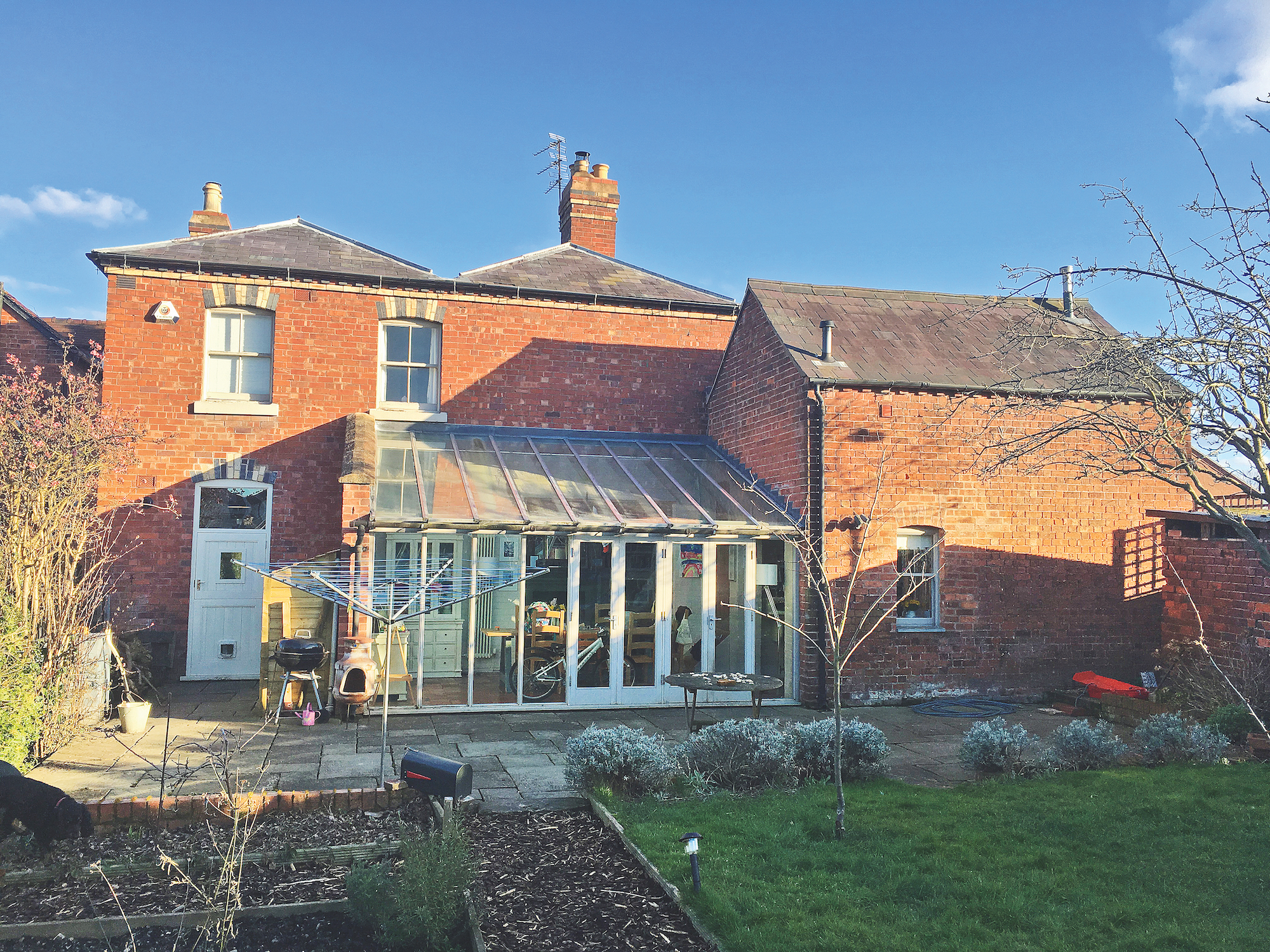
The property is a farmhouse built around 1840 and while the living spaces were enticing, it was extremely cold for the young family.
The couple decided building an extension was the way forward, but with a limited budget, they decided to wait until they could afford something special. Here Lydia explains the hard work and clever design ideas which went into creating their stunning home.
1. Fixing immediate problems with the house
“We did the classic thing and spent money on boring things you can’t see like making it watertight by fixing leaks and putting in new timber windows with double-glazing. It was quite expensive but so worth it,” says Lydia.
The poky bathroom upstairs was also knocked through into a small box room – which was not big enough to fit a bed – to make way for spacious family bathroom ideas. Although the couple knew the awkward ground floor layout wasn’t right, they sat tight for eight years while they saved.
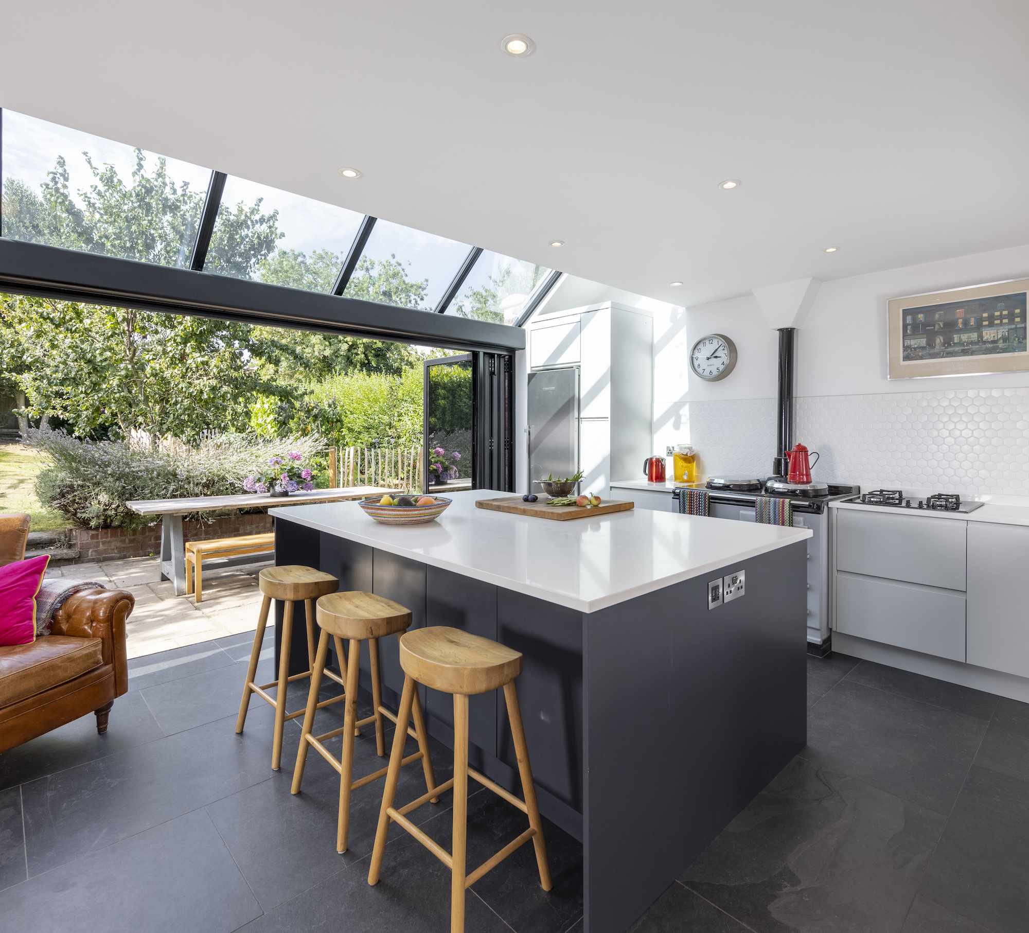
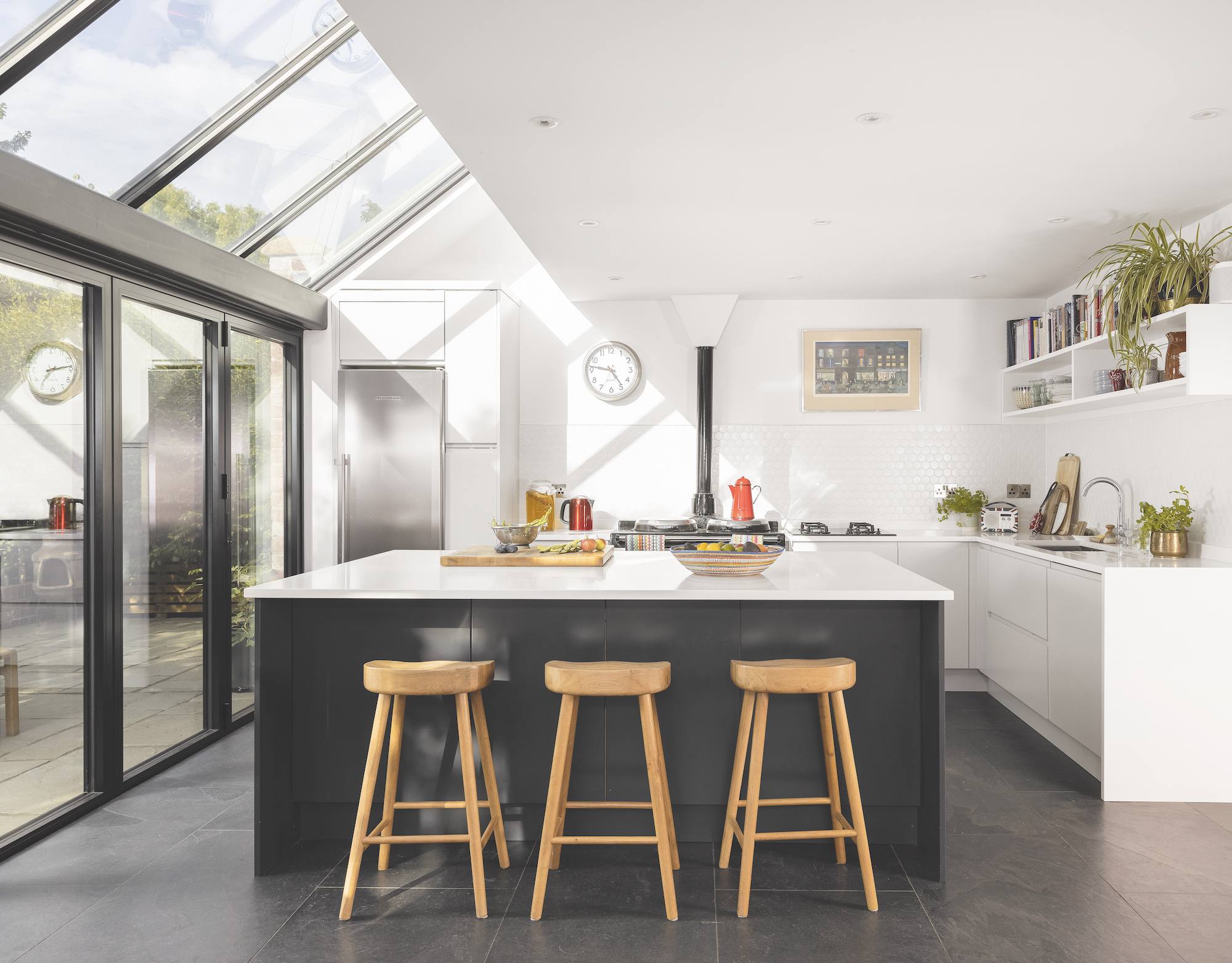
2. Confronting a disjointed layout
“The kitchen was previously in the coach house section. It was a tiny L shape with a staircase cutting through it to give access to guest room above,” explains Lydia. “We spent most of our time in there — often perched on our daughter’s mini table and chairs!
“The layout meant the guest room had its own staircase away from the other rooms, which wasn’t great when my mum was looking after the kids. When we came to do the project we basically wanted to move the kitchen for more space and we thought we would have to build a double storey extension where the old conservatory was to provide a new bedroom.”
3. Making big impact with a small extension
As the house is in a conservation area, Lydia and David worked closely with their conservation officer who was keen for any new addition to sit behind the roofline of the coach house so it wouldn’t be visible from the front and side approach.
After going back and forth trying to find a solution with their architect, Camilla Monk of Architecture Ventures, Camilla (who was involved throughout) worked out that they wouldn’t need to add an extra bedroom if they simply linked the coach house bedroom with the main house.
“Camilla just said, let’s go back to basics and started sketching small house extension ideas and a design that didn’t really add to the footprint or add another storey but removed the staircase and linked the upstairs spaces. Overall we just needed an internal reconfiguration and a bit of imagination, really,” says Lydia.
4. Introducing modern glazing beside a traditional building
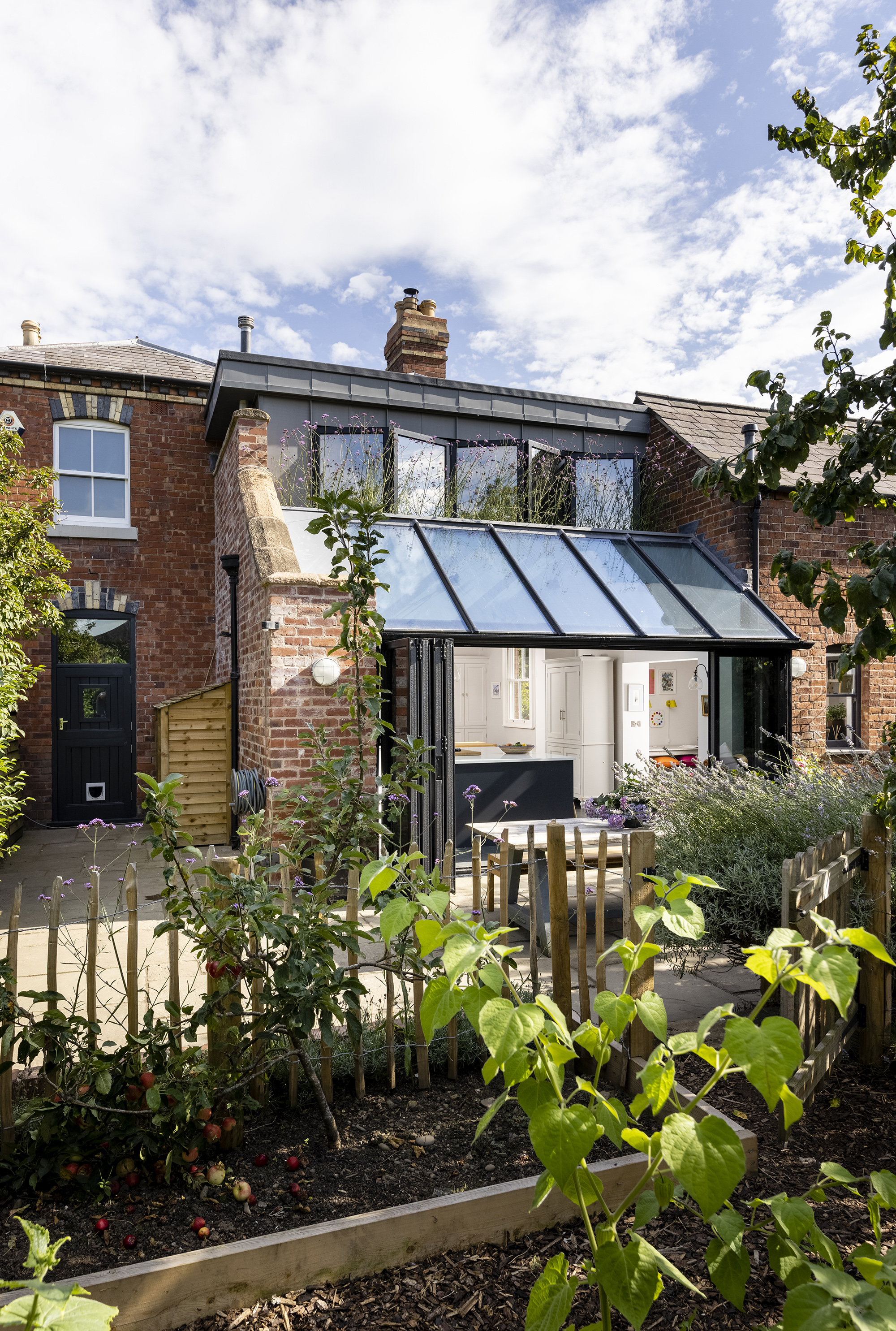
The conservation officers were clear that they didn’t want the new addition to be a Victorian pastiche and that they’d prefer something completely different. “We were more than happy to go along with that,” Lydia continues. “We knew we wanted glass because the space faces west and the light just pours in.”
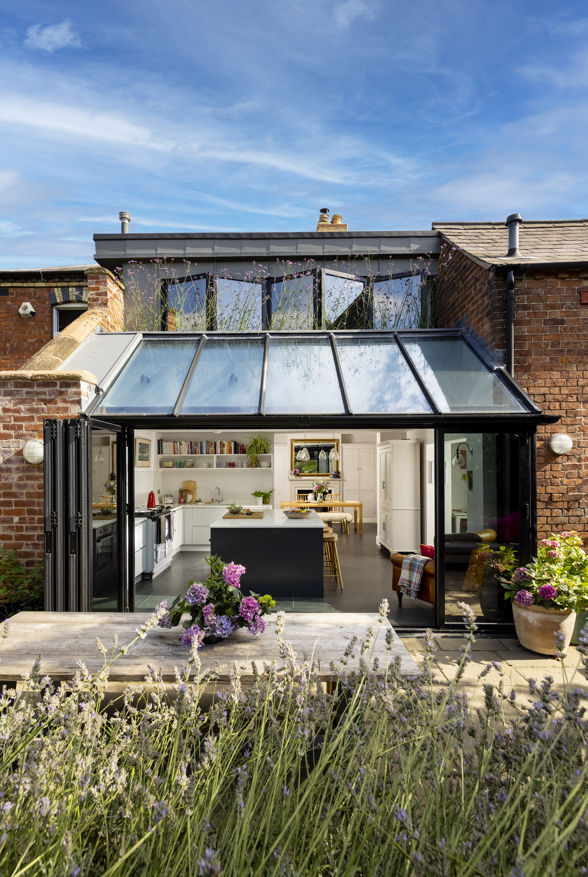
In contrast to the traditional front elevation of the house, modern extension ideas have been celebrated in the new extension around the back. It is modern and light, thanks to the black-framed windows, zinc and large swathes of glazing.
5. Keeping to a budget and living on site
As much of the project was localised at the rear of the house, the family remained living in the house while the building work began. The separated spaces in order to survive living on site while renovating. “We could carry on using the old kitchen and dining room the whole time and we were able to sit down at the end of the day in a clean room, which I don’t think should be underestimated,” recalls Lydia.
“The builder was lovely, we were basically family by the end of it! I took a break from work and project managed the entire time — it worked out that if I didn’t do that it would cost us more money overall.”
With fixed finances, Lydia worked hard to build a budget extension. She scoured the internet for the best deals, including sourcing the slate flooring from an importer rather than a showroom to save on costs.
She also worked with a carpenter friend to help designing and fitting the kitchen herself. “I used a company called DIY Kitchens who don’t offer a design service,” she says. “I think I dreamt about spreadsheets and measurements for weeks because it was all down to the millimetre. A local carpenter, Peter Konieczny, put it in – with me helping – over a weekend, which was a huge saving.”
6. Reworking in the internal layout
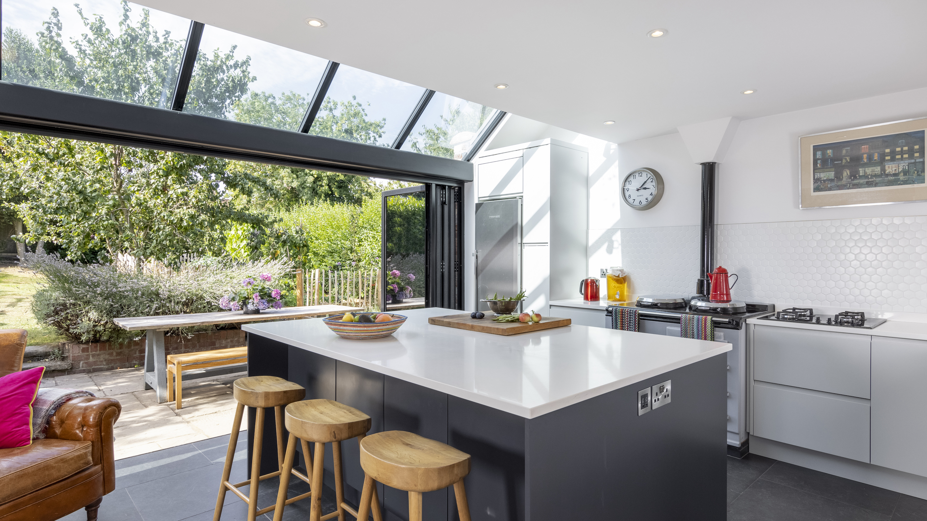
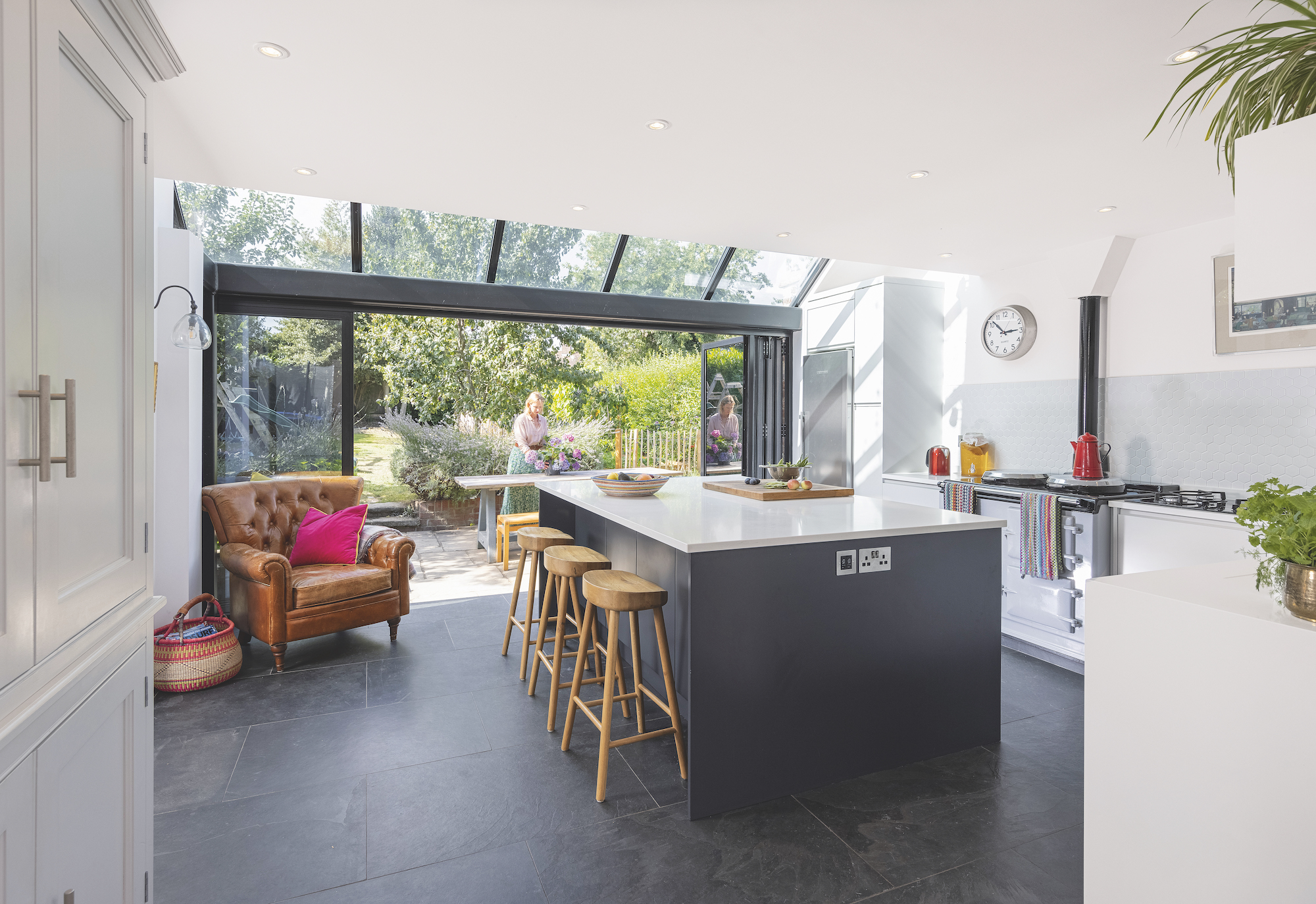
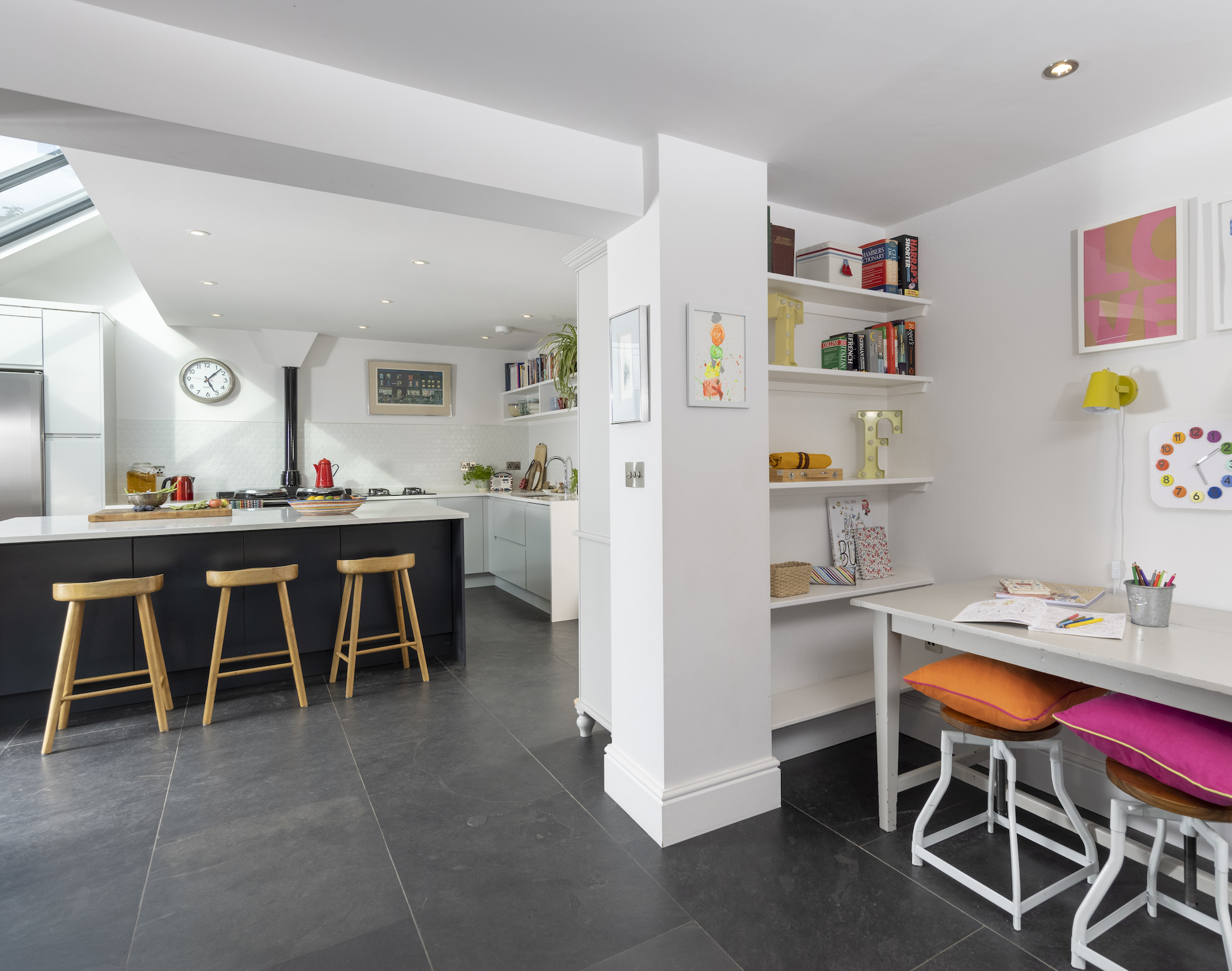
Tucked between the coach house and a rebuilt brick wall, the glazed kitchen extension has barely added half a metre to the house’s footprint, but has made a world of difference to Lydia and her family.
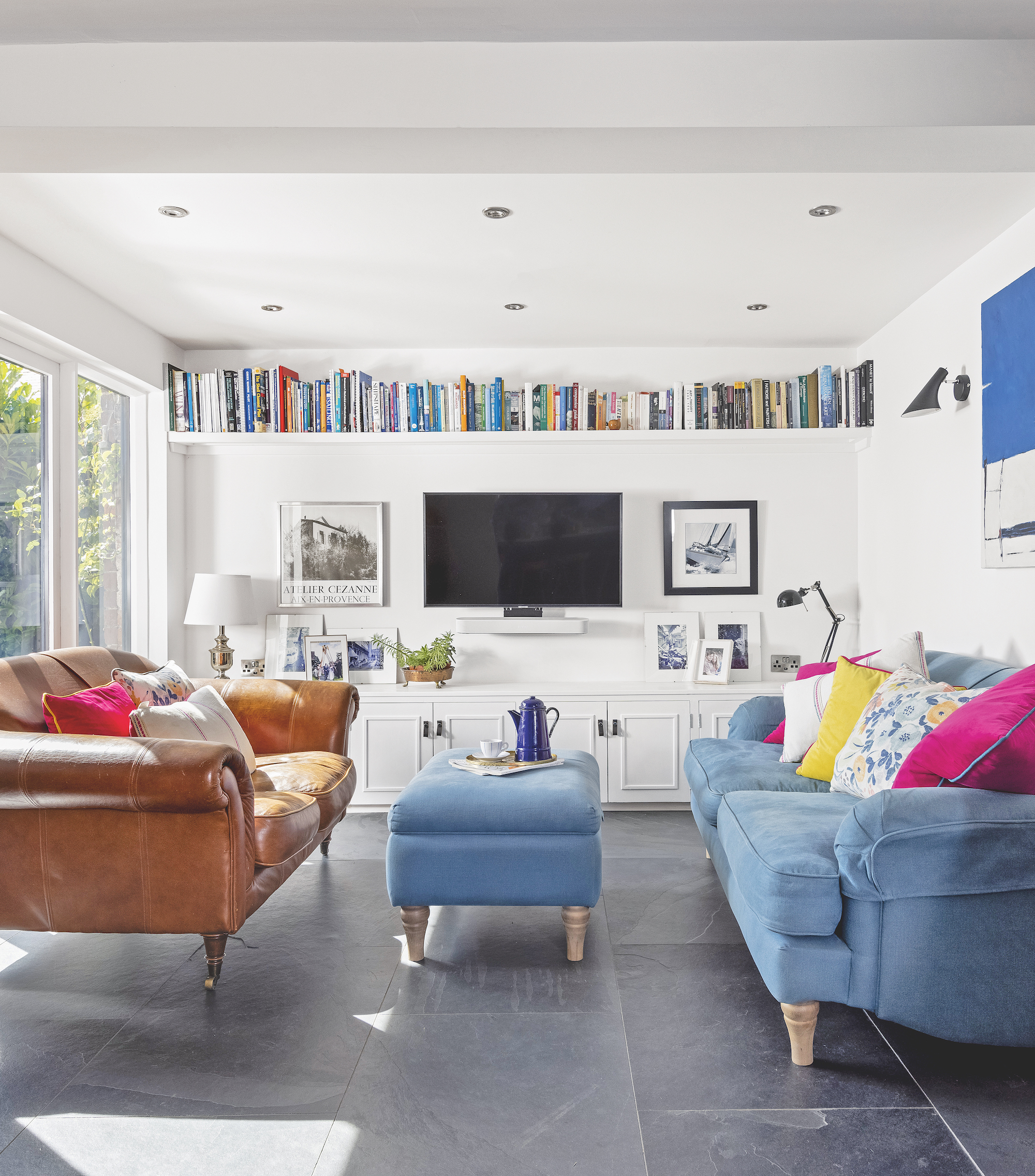
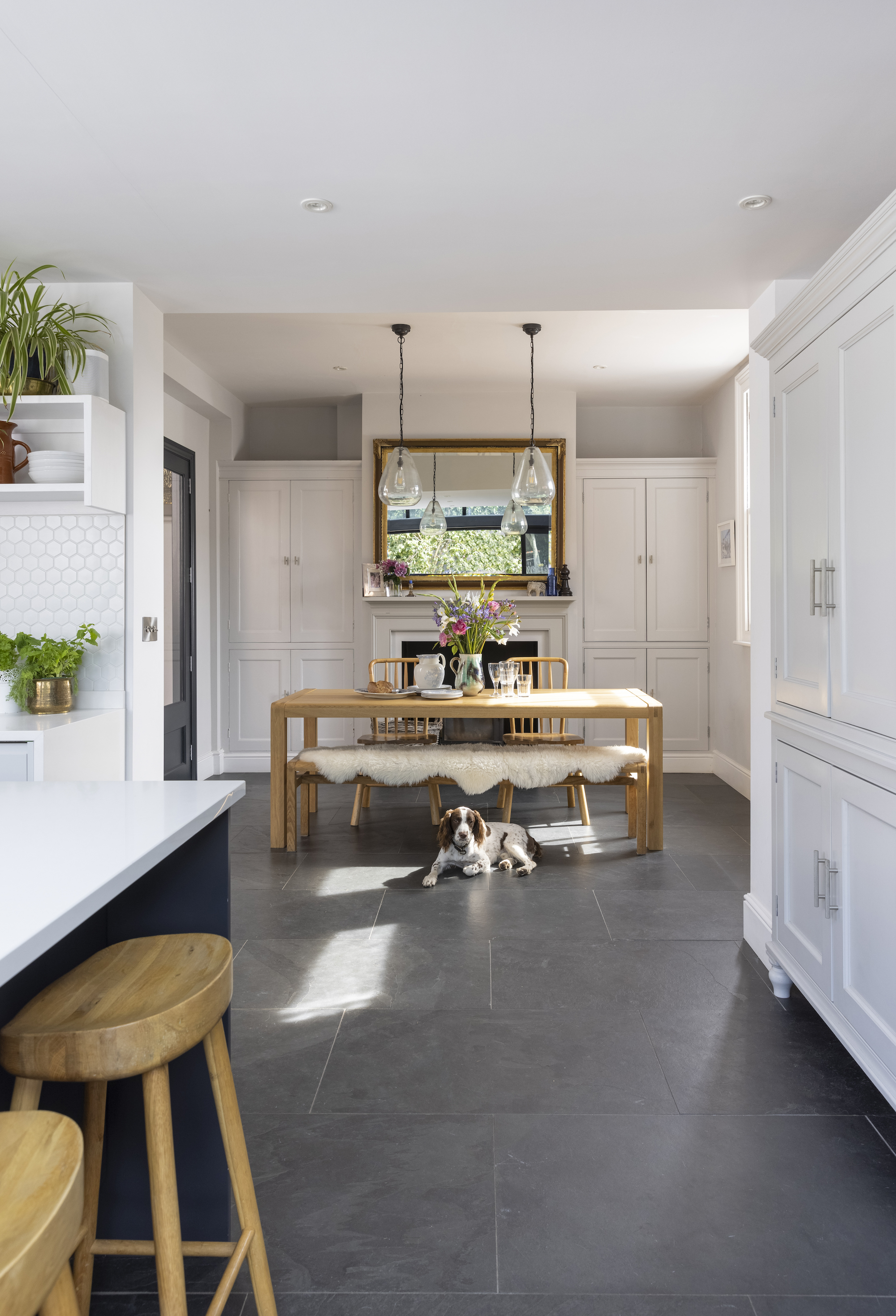
The L-shaped layout features the kitchen in the centre with a large, social island. “Off the kitchen is the sitting room with a cubbyhole with a desk for our kids to do their homework,” explains Lydia. “This is where we spend most of our time."
"On the other side of the L is a dining area where we can sit 10 people (or 12 if we know each other well enough!),” says Lydia.
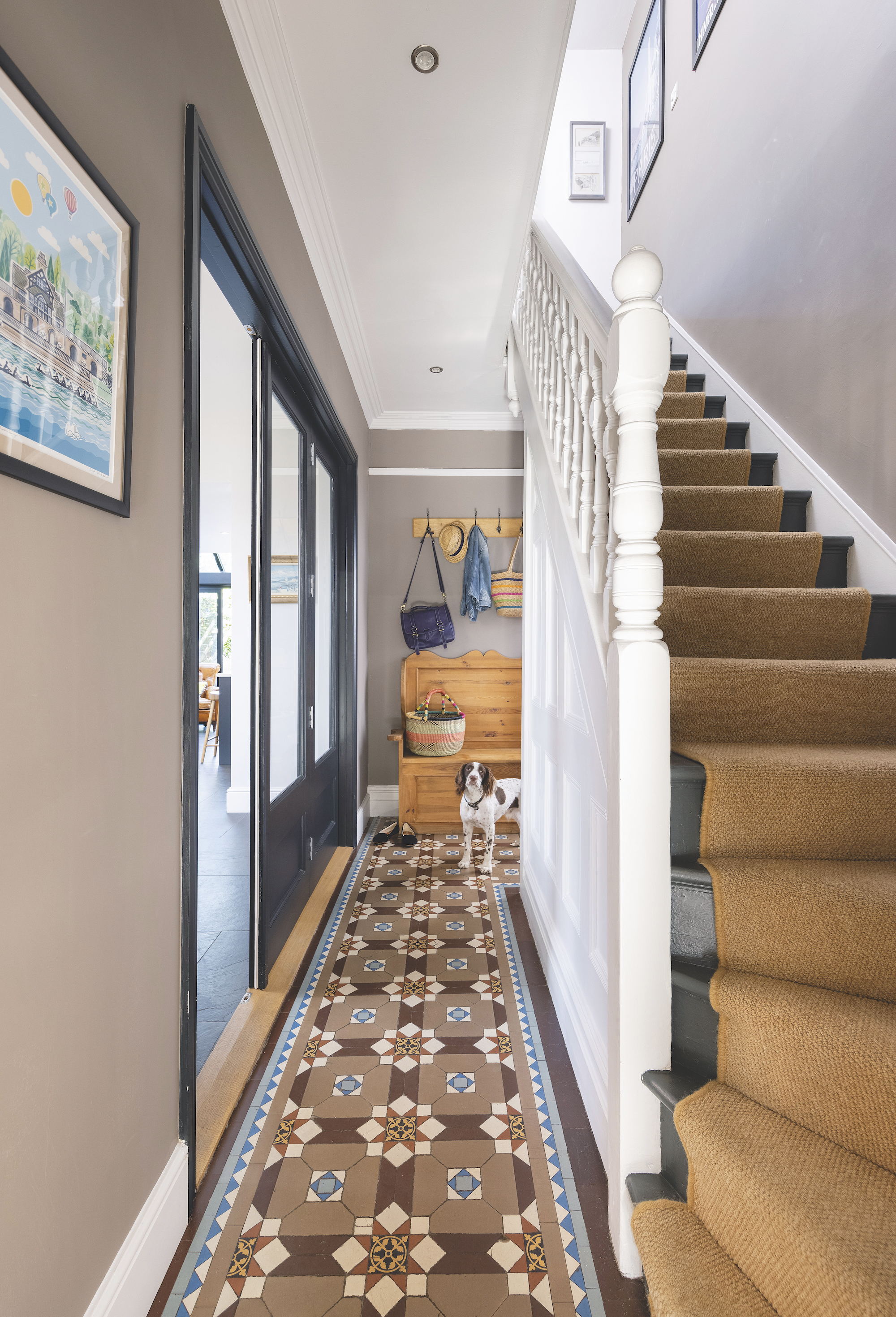
Peter matched new cupboards on the right of the fireplace to match the original on the left, and installed glass doors to seal the space off from the hallway. “Because they’re partially glass we can see into the lovely Victorian hallway with the tiled floor but keep the noise from going upstairs while the kids sleep,” Lydia says.
“I like being in the sitting room and looking back because I can see the kitchen and the light flooding in. It’s a lovely place to live.”
7. Building the upstairs link
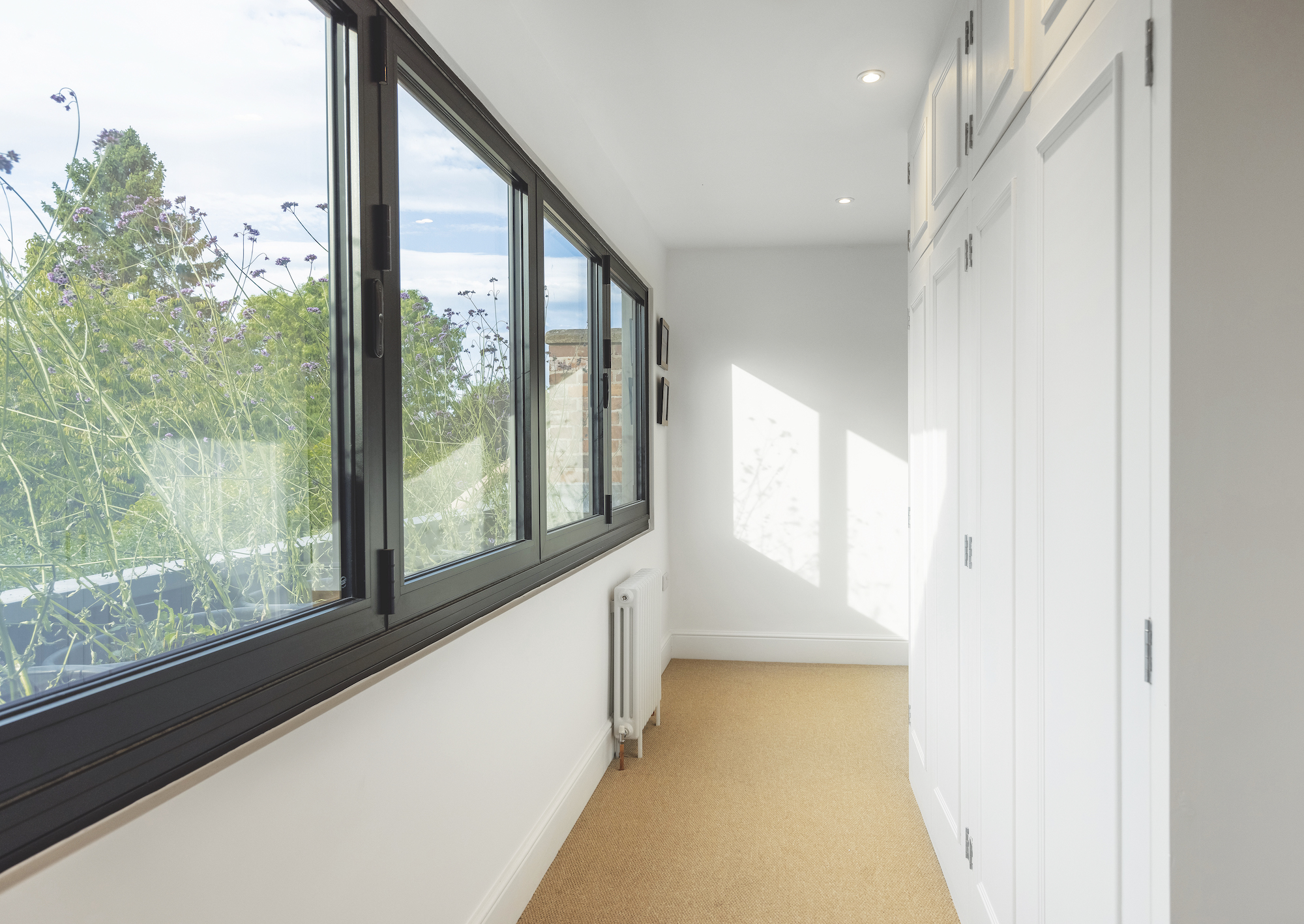
In addition to the ground floor extension, architect Camilla designed the upstairs corridor, which links the guest and main bedroom together, features clever detailing to make the space feel a special part of the house, rather than simply a functional feature. Wardrobes line the corridor to one side and bifold windows span the full width on the other, allowing the space to flood with light, just as it does in the kitchen below.
“We needed the space to extend out, but with the windows set back and tucked behind the coach house roof. We decided that we would have a deep trough and plant it up with loads of verbena plants from my mother’s garden. They grow really tall so they also give a degree of privacy. It’s great to have really modern lines but I like the juxtaposition of something quite soft,” says Lydia.
Get the Homebuilding & Renovating Newsletter
Bring your dream home to life with expert advice, how to guides and design inspiration. Sign up for our newsletter and get two free tickets to a Homebuilding & Renovating Show near you.
Amy is an interiors and renovation journalist. She is the former Assistant Editor of Homebuilding & Renovating, where she worked between 2018 and 2023. She has also been an editor for Independent Advisor, where she looked after homes content, including topics such as solar panels.
She has an interest in sustainable building methods and always has her eye on the latest design ideas. Amy has also interviewed countless self builders, renovators and extenders about their experiences.
She has renovated a mid-century home, together with her partner, on a DIY basis, undertaking tasks from fitting a kitchen to laying flooring. She is currently embarking on an energy-efficient overhaul of a 1800s cottage in Somerset.

