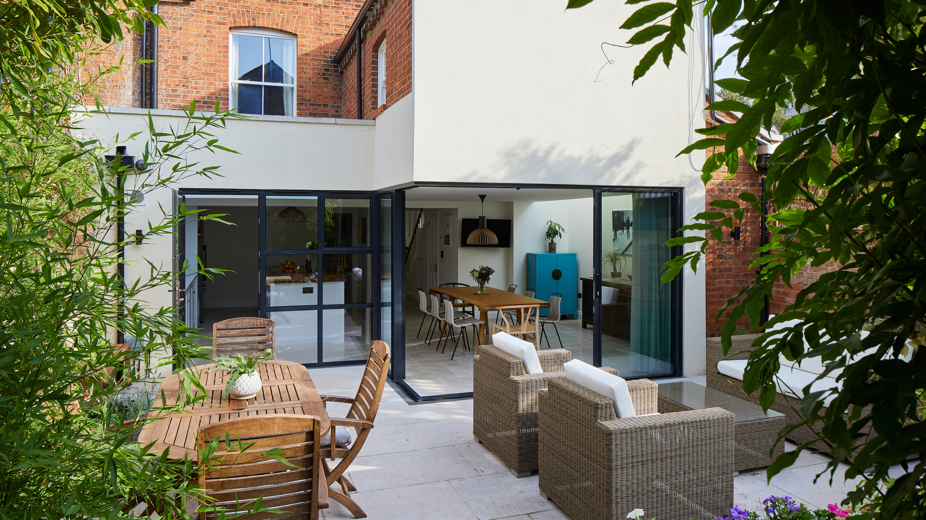
Discover how this dark basement kitchen has been transformed into a light-filled space
Lisa and David Mason engaged Sheldon Peever Studio to redesign their dark, disconnected basement kitchen — here, the project architect details how they did it
Bring your dream home to life with expert advice, how to guides and design inspiration. Sign up for our newsletter and get two free tickets to a Homebuilding & Renovating Show near you.
You are now subscribed
Your newsletter sign-up was successful
Dark and disconnected from the rest of the house, David and Lisa Mason's basement kitchen was in need of intervention. They contacted Sheldon Peever Studio to analyse the space and to take steps to improve access to the garden and natural light.
As the rear garden was limited in size, Christine Peever of the practice took strategic steps designing and building an extension that was small, yet impactful in order to create a social, open-plan space the Masons desired.
1. Identifying issues with the existing house
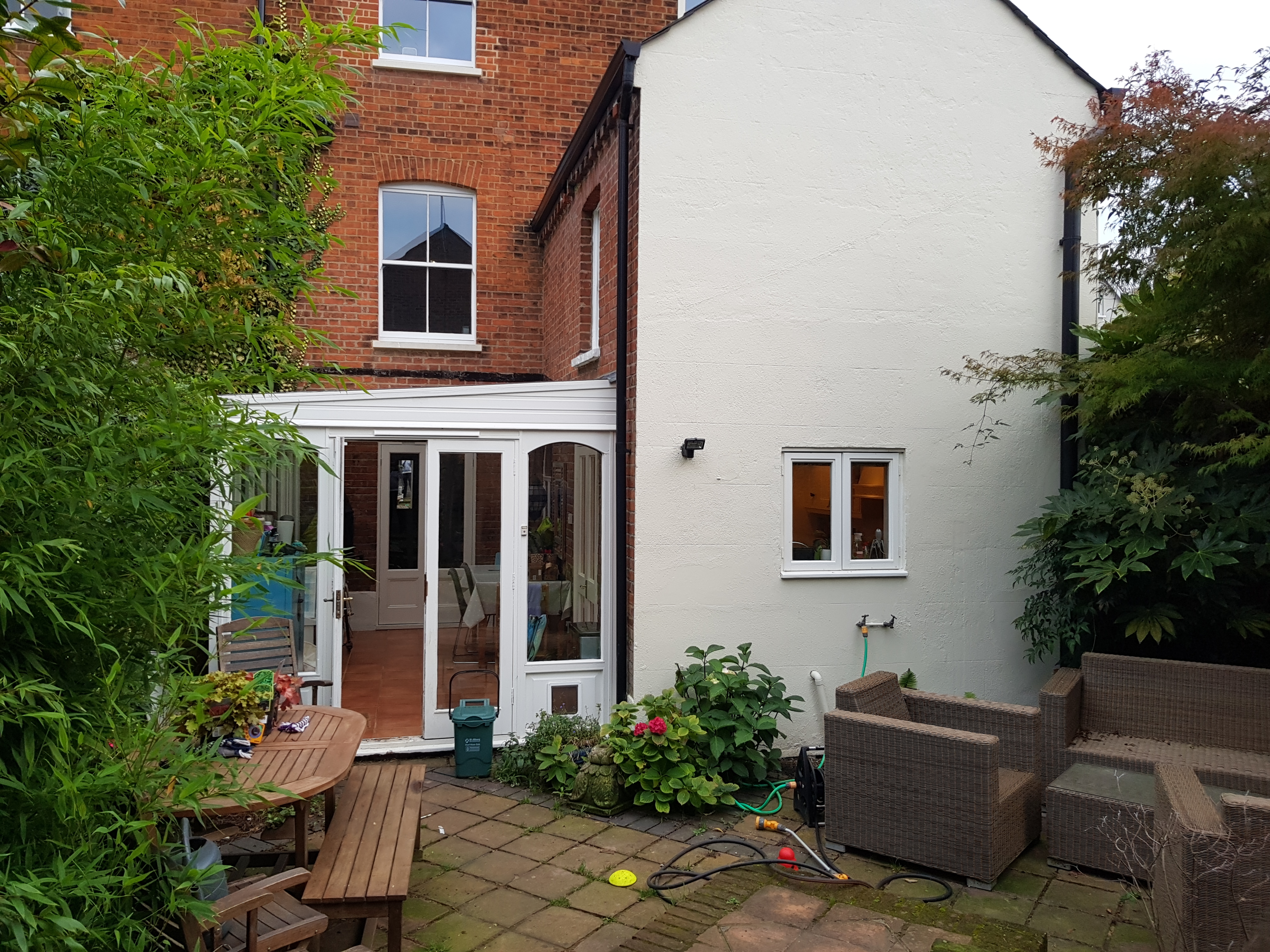
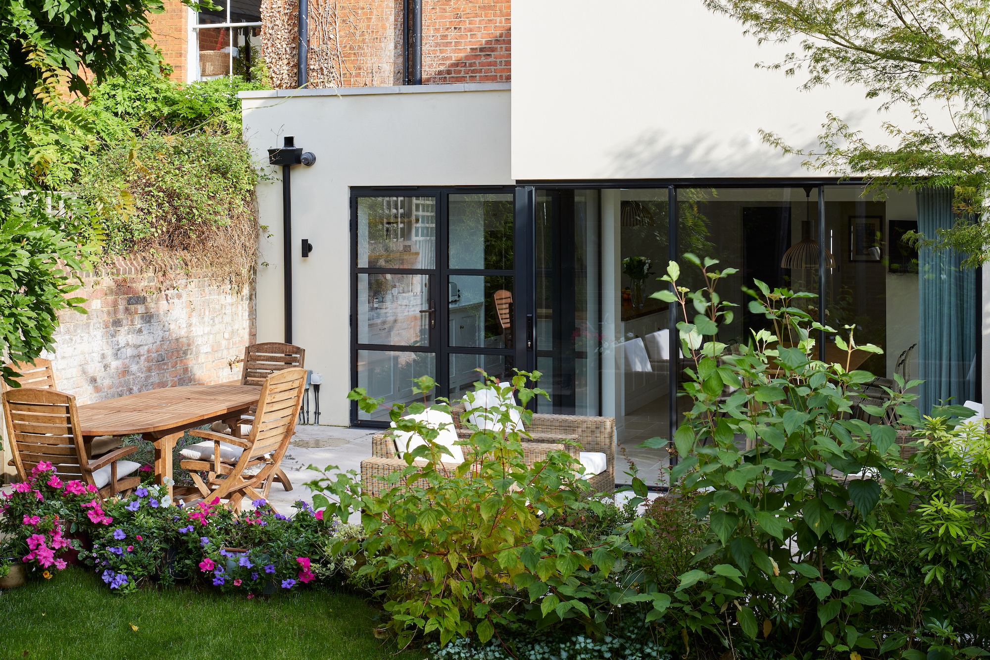
Previously sporting a dated conservatory, the basement level of Lisa and David's three storey end of terrace house was awkward and disjointed.
Article continues below"The kitchen was small and cut off from the rest of the house and the homeowners had to constantly have lights on during the day," explains Christine Peever of Sheldon Peever Studio, the project architect and project manager. "There was no relationship with the garden and it just wasn't working for them at all."
"The key issues to solve were to bring in more natural light and make it feel less like a basement. Lisa and David's children are mostly grown now, but they wanted a more sociable space as they like to entertain a lot. The rest of the house is a lot of sectioned off rooms so they wanted to have one big space to have their friends and family visit."
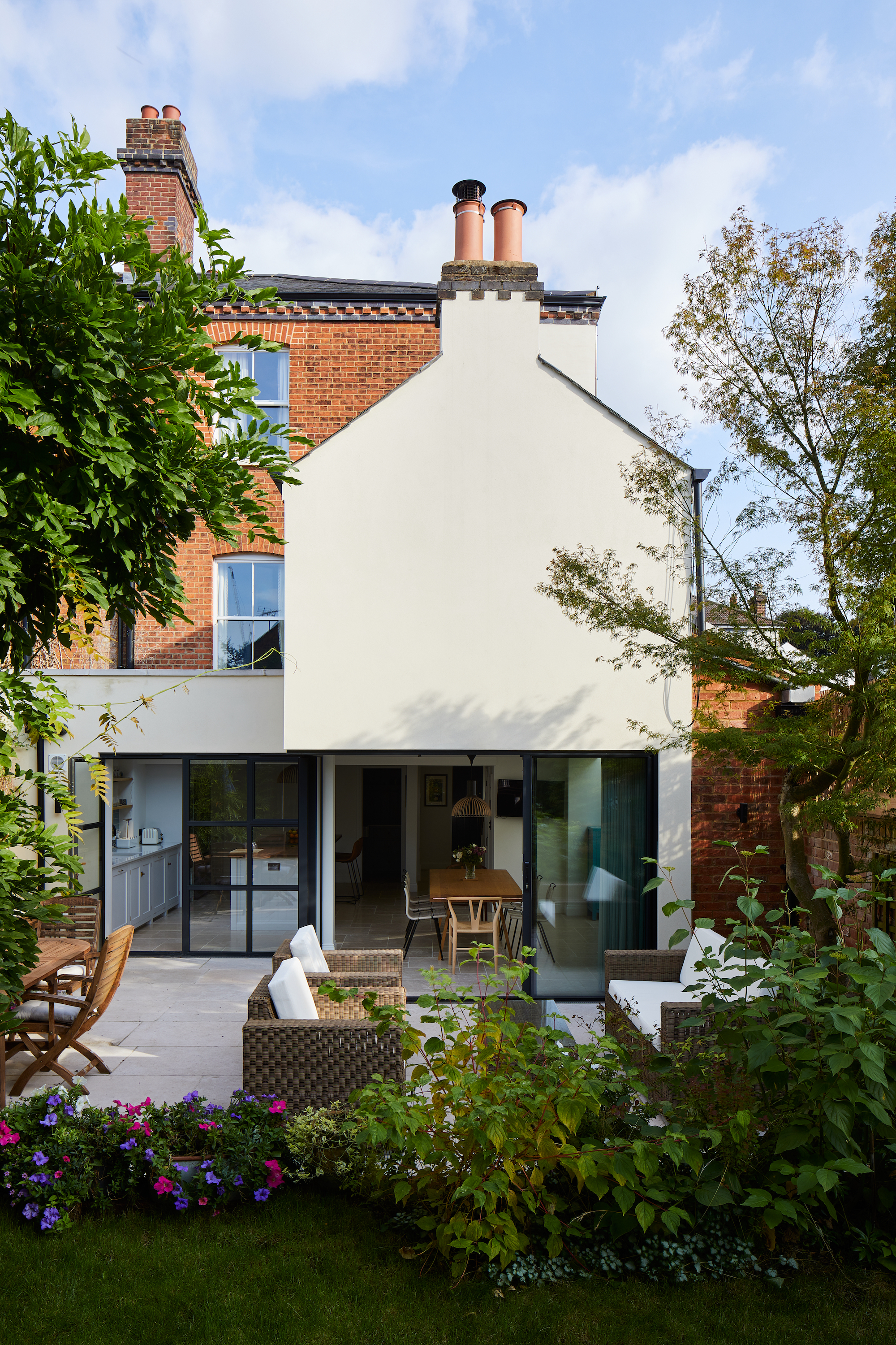
Christine's solution to these issues was to create a small strip extension to the road-facing side of the house and a compact square addition in place of the conservatory.
(Feeling inspired? Take a look at our favourite basement conversions for more inspiration and advice.)
Bring your dream home to life with expert advice, how to guides and design inspiration. Sign up for our newsletter and get two free tickets to a Homebuilding & Renovating Show near you.
2. Navigating the planning permission process
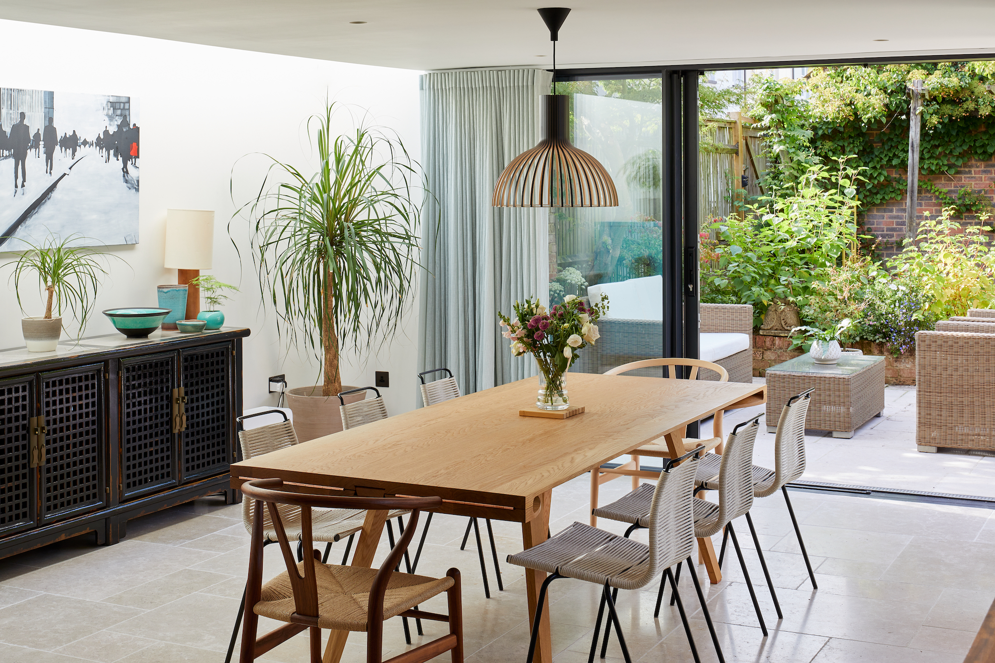
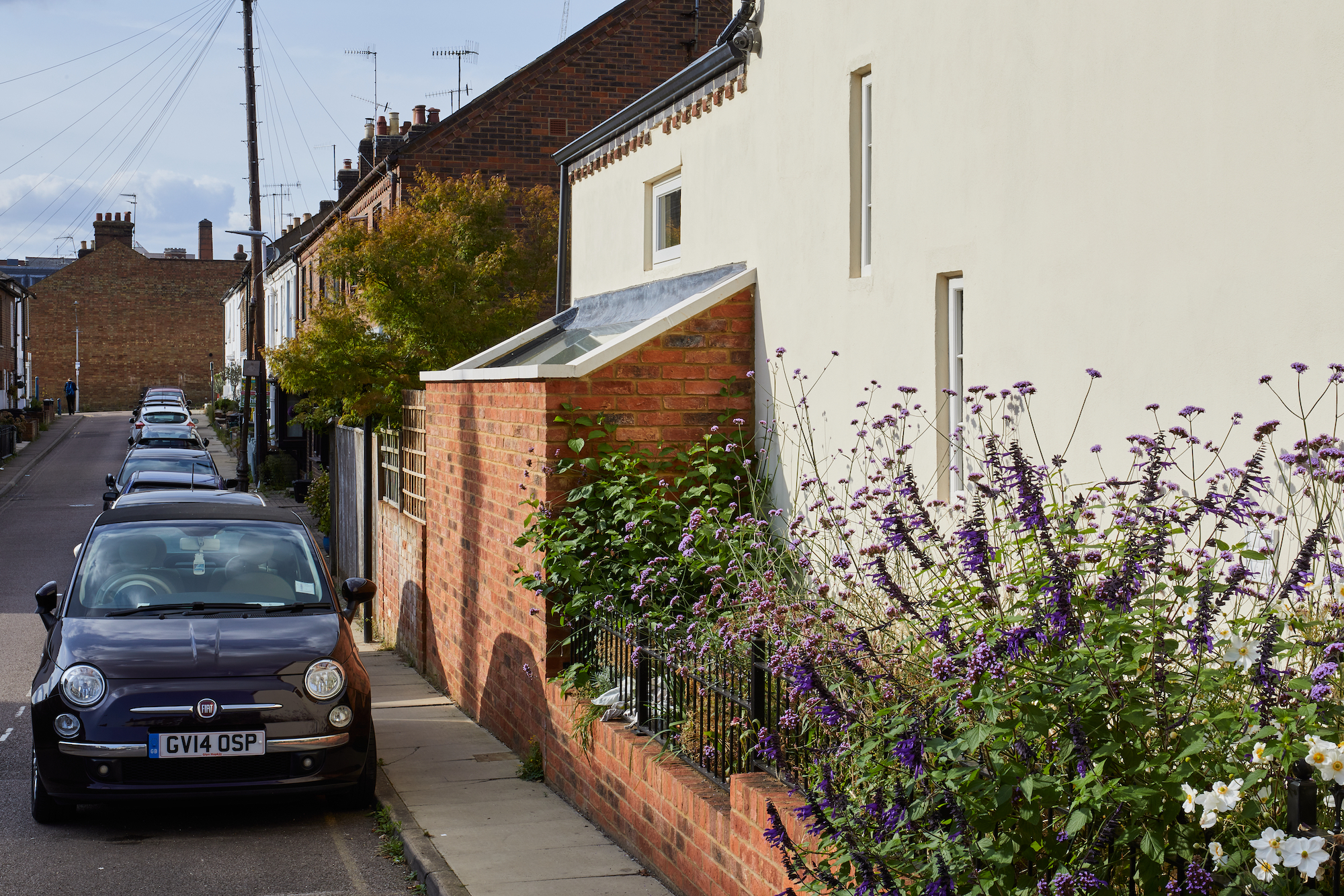
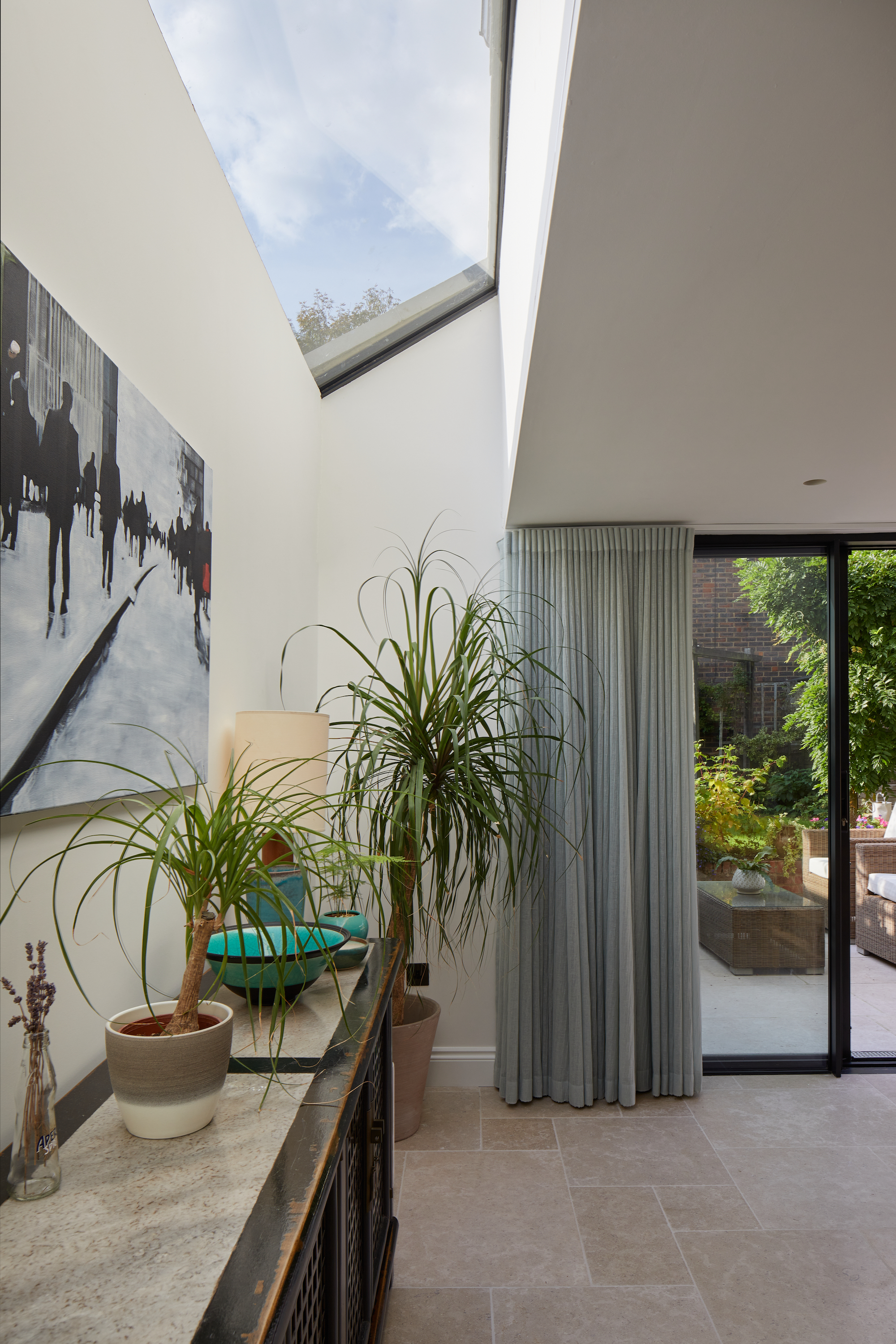
With the house being in a conservation area and locally listed – thanks to the ornate Gothic windows to the front elevation – Christine, Lisa and David had to ensure the new design would be approved by the local planning department.
Unfortunately, even their proposal for two small extensions took eight months to gain approval. "The front of the house is higher on the street so we wanted to maintain privacy by using a flat roof on the side extension, but planning permission dictated it had to be a pitched roof," says Christine. "So, we compromised to make it taller so people couldn't see down when walking past on the street."
3. Rethinking the layout
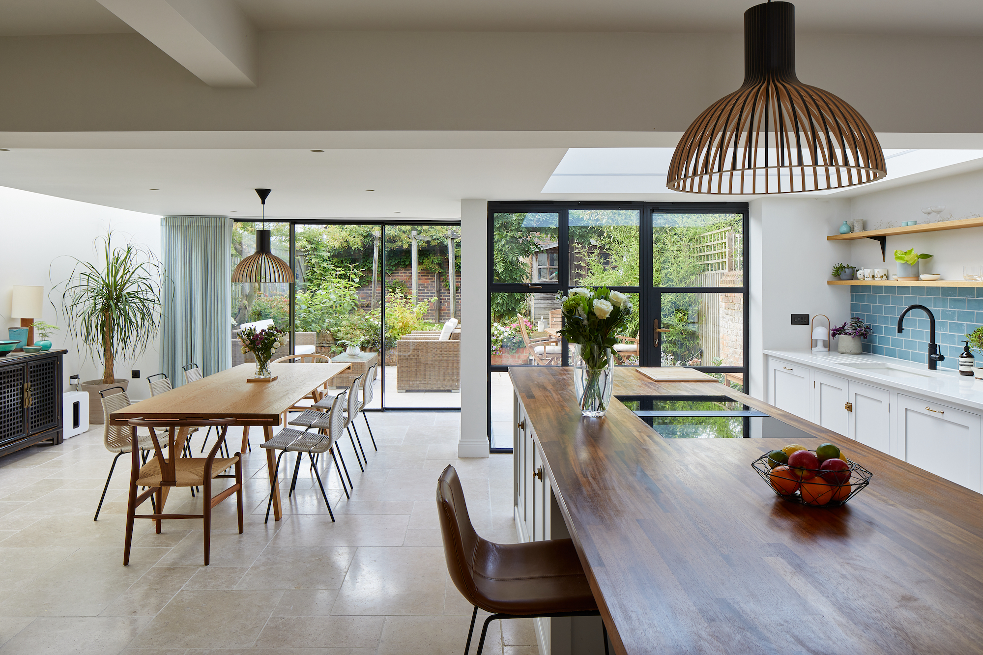
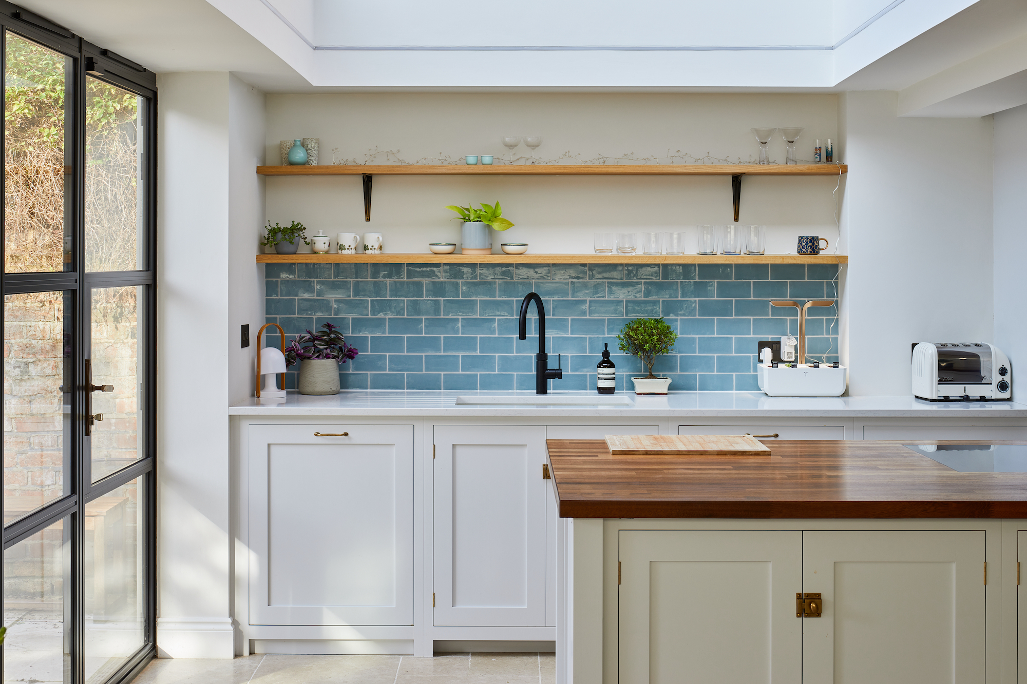
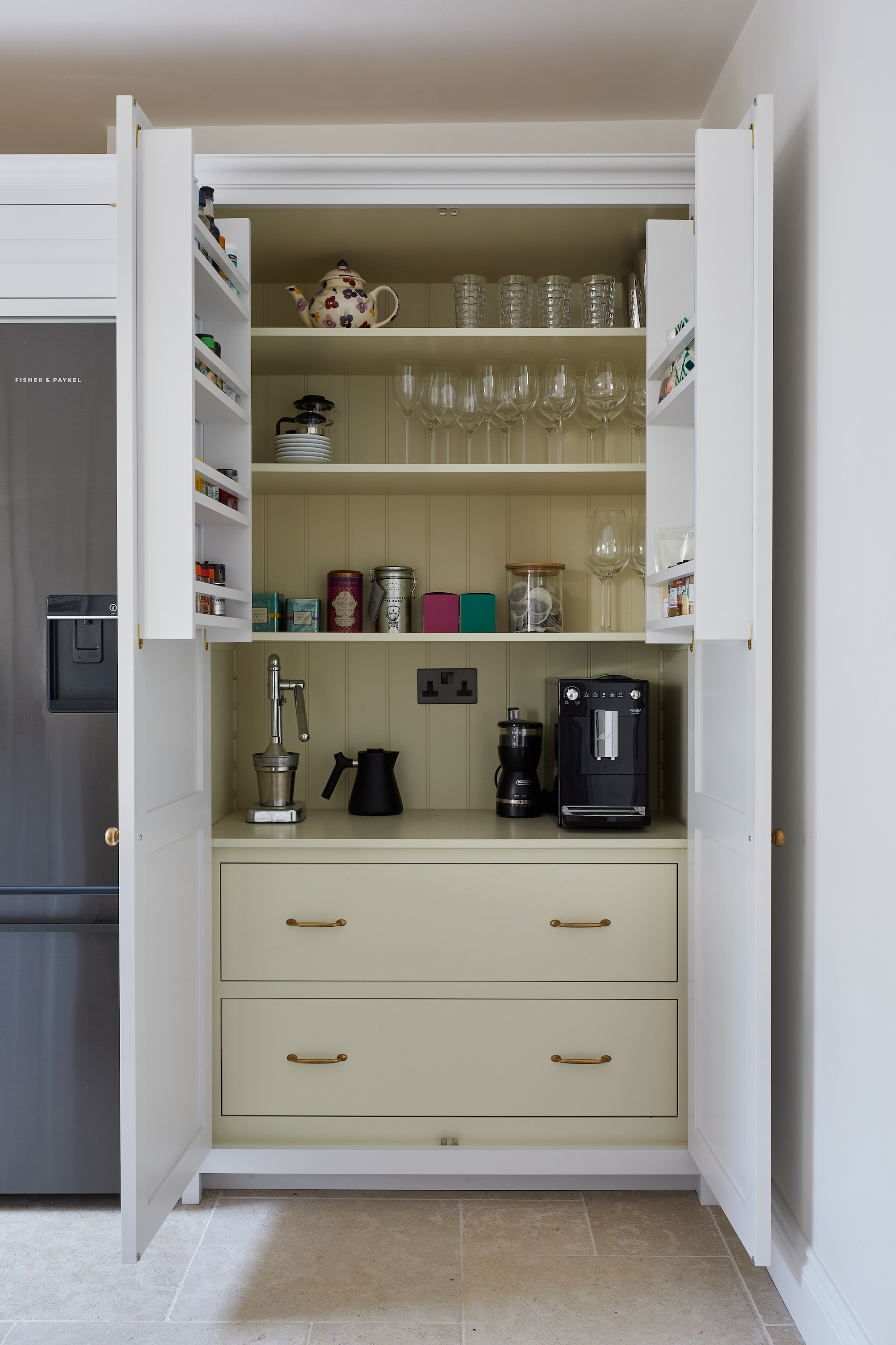
The walls in the basement were mostly removed to create a large, open plan kitchen diner space for the Masons.
The previous downstairs loo was converted into a handy utility off the kitchen and a pantry cupboard was built in.
"The kitchen layout was mostly planned around the island with a sink and worktop area behind and full height units along the back," says Christine. "Lisa and David worked with deVOL Kitchens to work out the finer details to create a balance for the worktops, plinths and knobs."
Tactile materials such as the marble and timber worktops and limestone flooring bring a contemporary feel to the classic shaker-style units.
4. Introducing light with clever glazing solutions
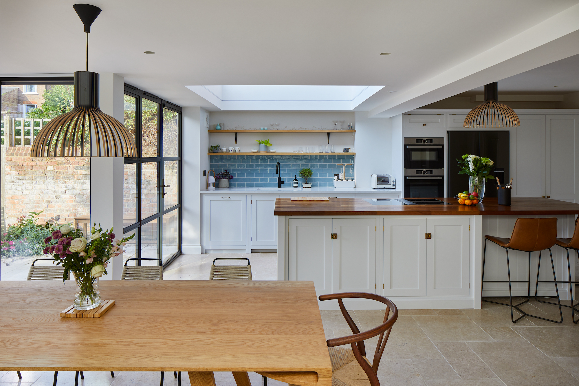
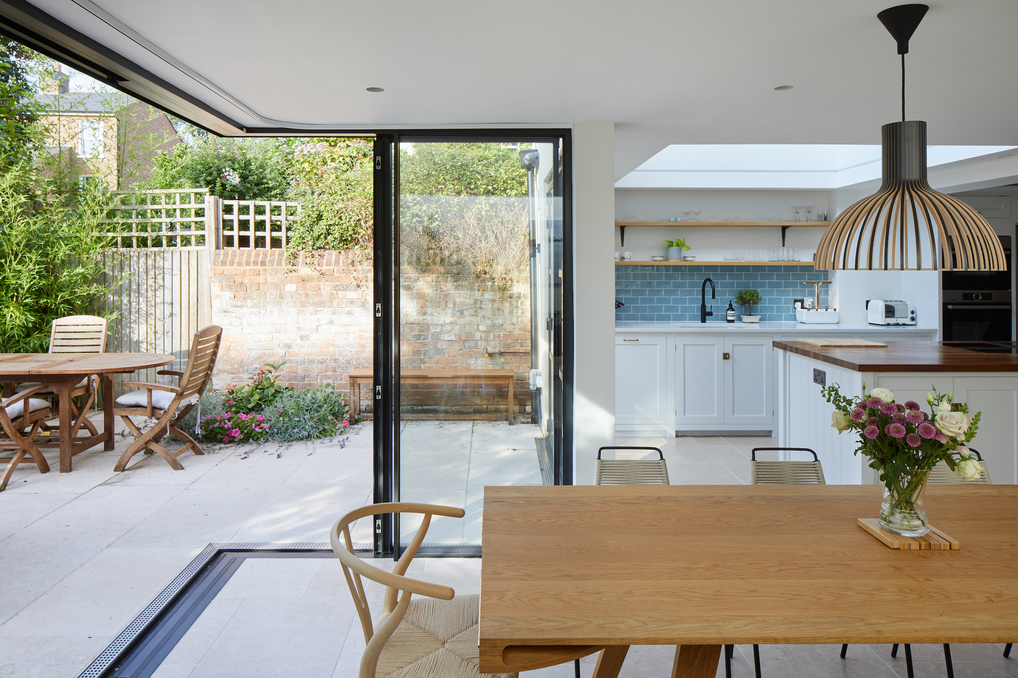
"We've been quite clever in the way we've positioned the rooflights. The long rooflight [by the dining area] is south facing and brings light to the previous dark space. We got quotes for different configuration of panes for this rooflight to weigh up costs. The clients ultimately chose to splash out of the single pane and I think it makes a big difference to the style."
The large rooflight above the sink was planned so that, using the direction of the sun's path above the house, the kitchen area is never at risk of overheating as it faced north-east. The result means that while the kitchen benefits from the natural light, it won't feel too hot in the summertime.
5. Opening out to the garden

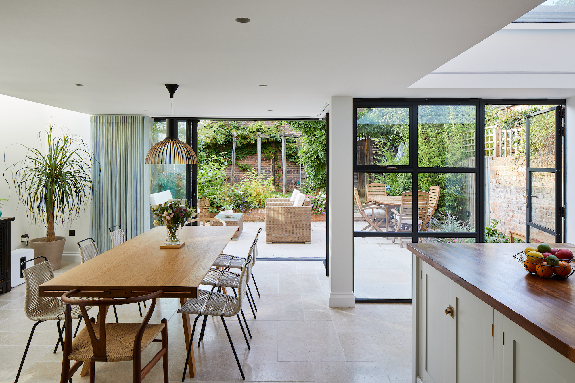
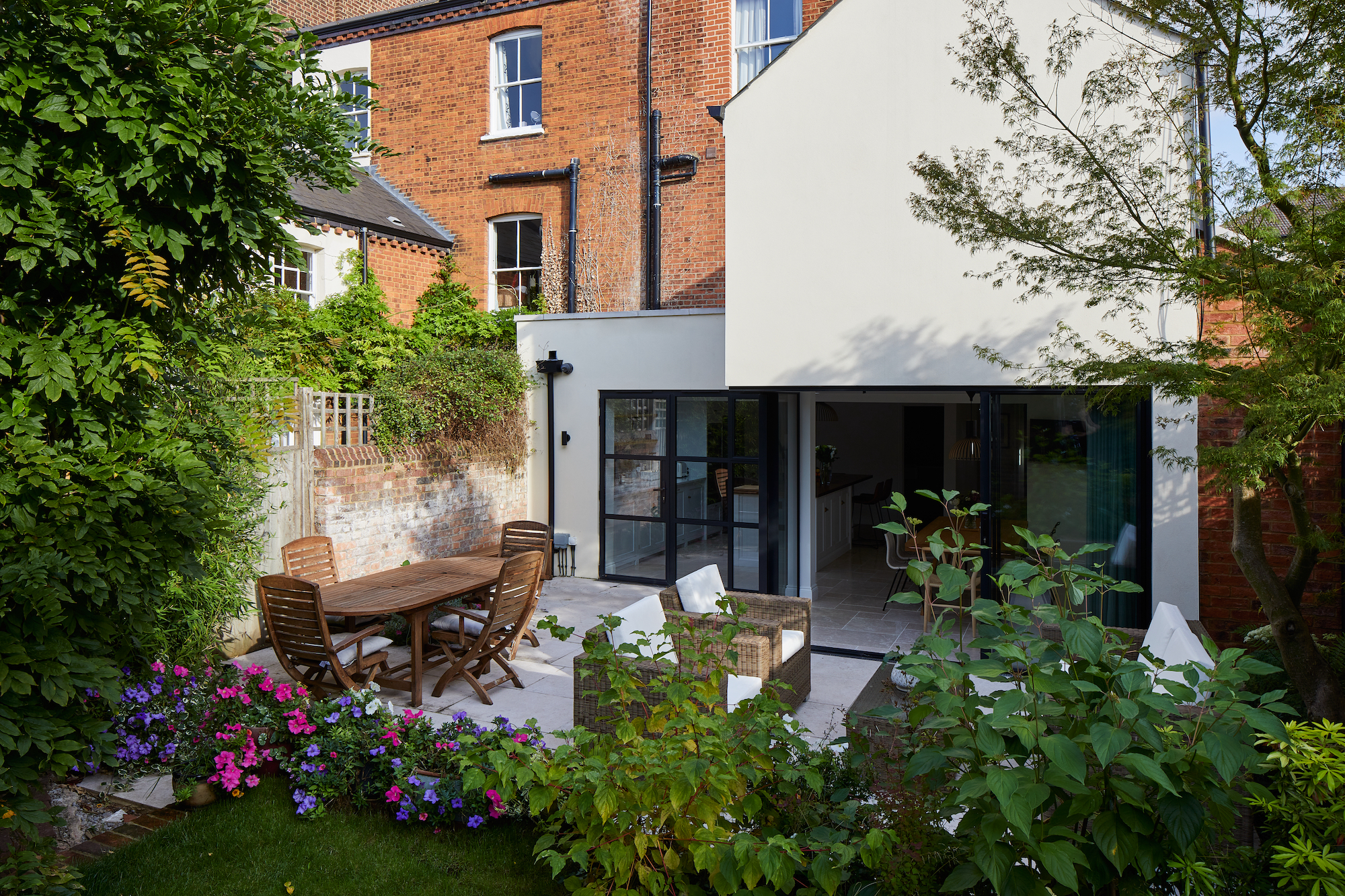
The basement was previously very closed off to the garden so the Masons and Christine worked hard to establish a connection between the two spaces.
Large sliding patio doors in a heritage steel-frame style offer slimmer sightlines than the bifolding doors that was initially conceived, while the limestone flooring inside has been sealed and continues outside for a seamless flow.
To ensure the new extension also fit with the existing house, the traditional brick and block construction has been rendered in the same palette as the rest of the house. "We purposefully used materials at the back which relate to the historic gothic front, like the render, capping stones and sliding doors to have slimmer sightlines," concludes Christine.
Amy is an interiors and renovation journalist. She is the former Assistant Editor of Homebuilding & Renovating, where she worked between 2018 and 2023. She has also been an editor for Independent Advisor, where she looked after homes content, including topics such as solar panels.
She has an interest in sustainable building methods and always has her eye on the latest design ideas. Amy has also interviewed countless self builders, renovators and extenders about their experiences.
She has renovated a mid-century home, together with her partner, on a DIY basis, undertaking tasks from fitting a kitchen to laying flooring. She is currently embarking on an energy-efficient overhaul of a 1800s cottage in Somerset.

