8 small landing ideas to make the space feel bigger, lighter and more functional
Be inspired by the clever tactics that can transform small landings into stylish and useful areas
Adopting clever small landing ideas can transform the entrance to your home into an area that looks larger than it really is as well as more welcoming.
Small landing ideas can be good for more than simply passing through, feel more spacious than their dimensions suggest, and be attractive parts of your home to boot with good planning.
We’ve put together the best small landing ideas to ensure you can make the most of both. From using natural and artificial light to adding neat built-in storage, these tactics will maximise space and style.
Small landing ideas to stretch space at home
They may have limited dimensions in comparison to other parts of your home, but small landing ideas can nevertheless visually expand these spaces and make them more useful. Whatever your hallway design or landing size, these suggestions can give them a boost.
Small landing ideas
1. Introduce light from above
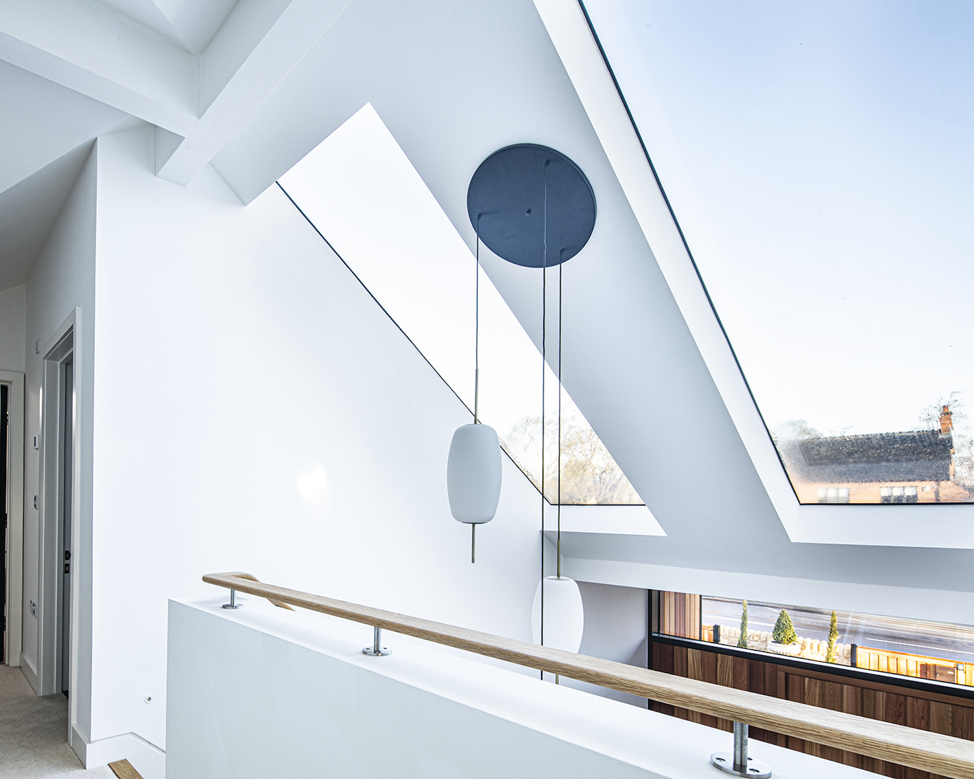
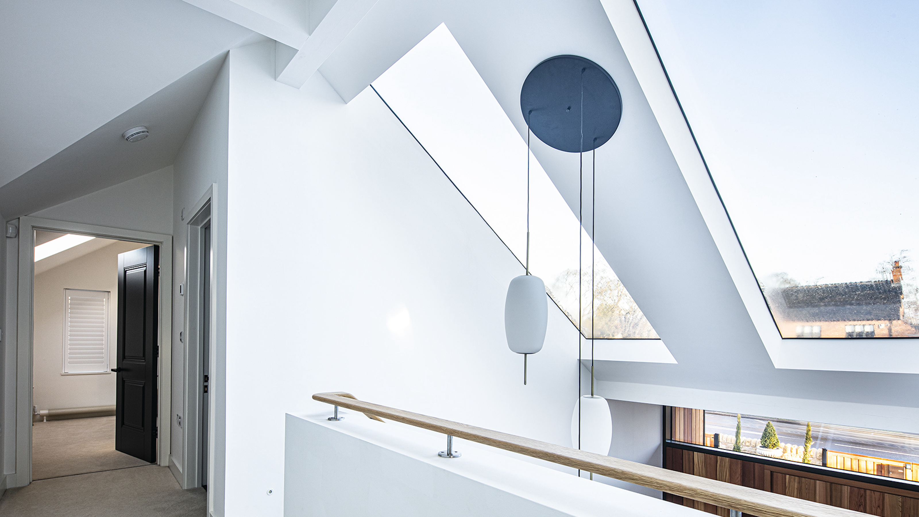
Adding rooflights or roof windows is a great way to optimise the light that reaches a landing. Roof windows provide more light than a window of the same dimensions that’s fitted vertically, brightening either space so it looks larger.
Team the glazing choice with white walls, as seen in this home, to best reflect the light gained.
These Pitchglaze roof windows from Glazing Vision meet the requirements of the conservation area in which the home shown here is located, while also making an impressive staircase lighting ideas with the addition of the pendant between them.
2. Use a narrow area as a library
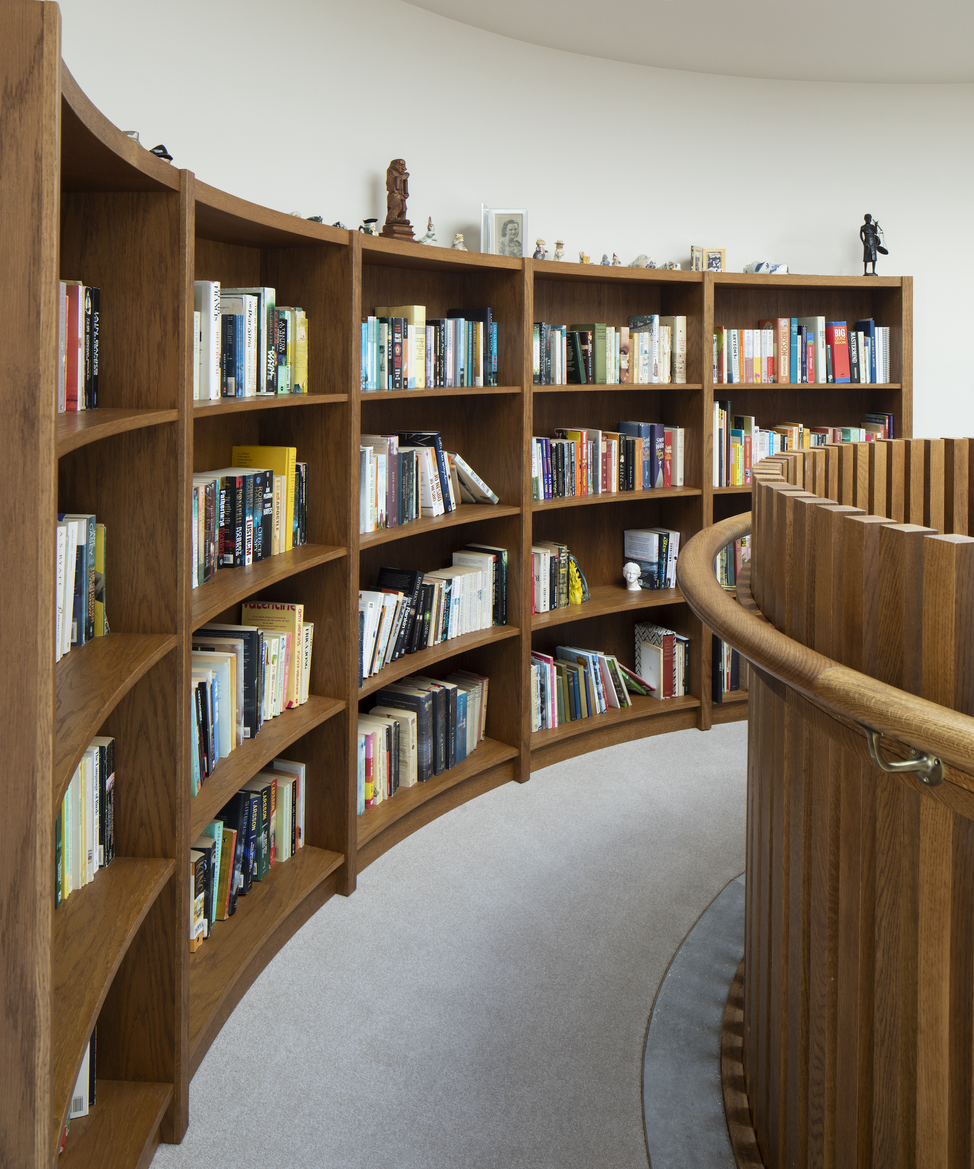
If you think you don’t have room for the library you covet for your home, a landing could provide the answer – even when it’s narrow.
In this home, a landing at the top of a three-storey staircase provides extensive shelving and there’s even a neat reading nook at one end.
“The oak bookcase was handmade to follow the curve of the wall and to complement the staircase design,” says Melanie Clear of Clear Architects. “Space was left at the end of the rounded ‘corridor’ to place a chair so that it makes a snug mini library that is light filled from the roof lantern above.”

Melanie Clear is the founder and managing director of Clear Architects, a sustainable architecture and planning practice which specialises in highly designed architectural projects for residential and commercial builds.
3. Expand a hall and landing with colour
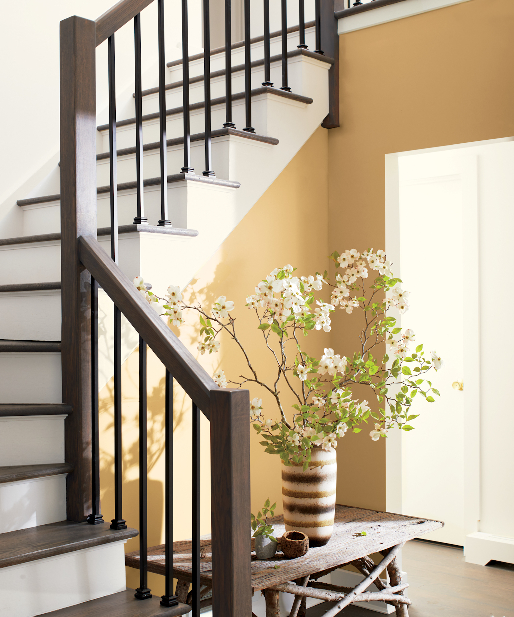
Hallway paint ideas are a low budget way to transform small landings but because these areas often lack natural light consider the colors selected carefully – and bear in mind that different hues can be used for the different zones.
“Using a light and warm hue like Chestertown Buff is a great way to balance a dark landing,” says Helen Shaw, director of marketing (international), Benjamin Moore, of the scheme shown above. “This sumptuous yet earthy honey hue enlivens both rustic and modern schemes and will create a warm and welcoming atmosphere for guests. Its appearance cleverly shifts with the light – when there is more natural light, perhaps with a skylight or when the front door is opened, it reflects beautifully creating a soft glow resembling that of the sun.
“Pair this golden hue with a fresh, youthful white on the stairwell and landing to open up the space,” she continues. “These smaller, darker spaces benefit from warm undertones, such as the flattering touch of pink seen in Atrium White.”

Helen Shaw is part of Benjamin Moore’s UK division. Colour expert and international marketing director Helen and her husband Craig are founders of Shaw Paints, acquired by Benjamin Moore in 2020.
4. Let flooring boost small spaces
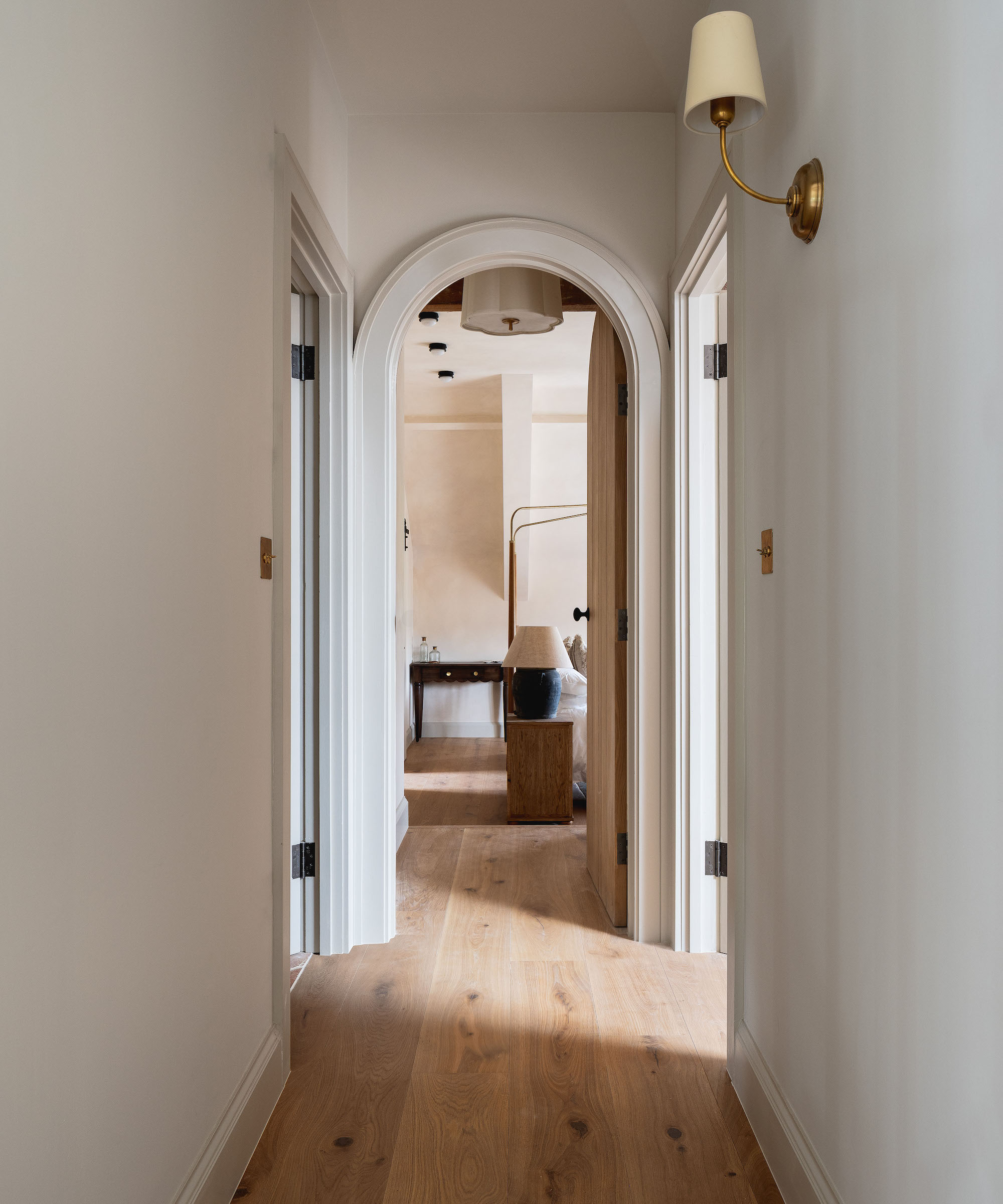
Every element counts when you want a space to feel bigger and one that makes a major impact is the flooring.
There are two ways in which the floor of the landing can help it feel more expansive. “The best flooring choice for a narrow landing depends largely on the property’s style and décor,” explains Ian Tomlinson, MD, Chaunceys Timber Flooring.
“If the space lacks natural light, lighter-toned oak flooring is an excellent option to brighten the area and create a more open feel.”
Pay attention to the flooring’s dimensions, too. “Opting for wide, extra long planks can further enhance the sense of space by reducing the number of visible joints, making the landing feel less confined,” he says.

Chaunceys Timber Flooring is a family-run company based in Bristol with Ian becoming the managing director in 2012. The company has been supplying sustainable, high quality timber flooring to homeowners, award-winning architects, design and build companies, and renowned interior designers since 1988.
5. See beyond with a mirror
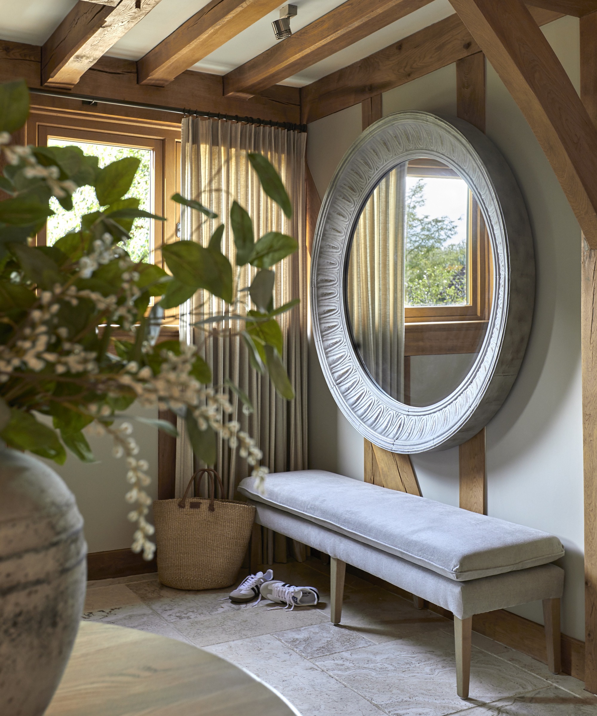
A mirror can be a hard worker for a small landing. “Using mirrors is highly effective, as they reflect light and create a sense of depth, making the landing feel more expansive,” says Claire Garner, director, Claire Garner Interiors, who designed the space above.
Optimising both daylight and artificial light, a mirror helps eliminate gloomy corners that make the space look smaller. Choose a decorative frame and it creates an attractive feature as well as visually sizing up a compact space.

Claire has over 15 years’ experience in the interior design industry, and over a decade running her own interior design studio. Her ability to design is well known as is her skill in creating beautiful designs through layered simplicity; evoking a true sense of depth and calm in her spaces.
6. Go vertical with the radiator
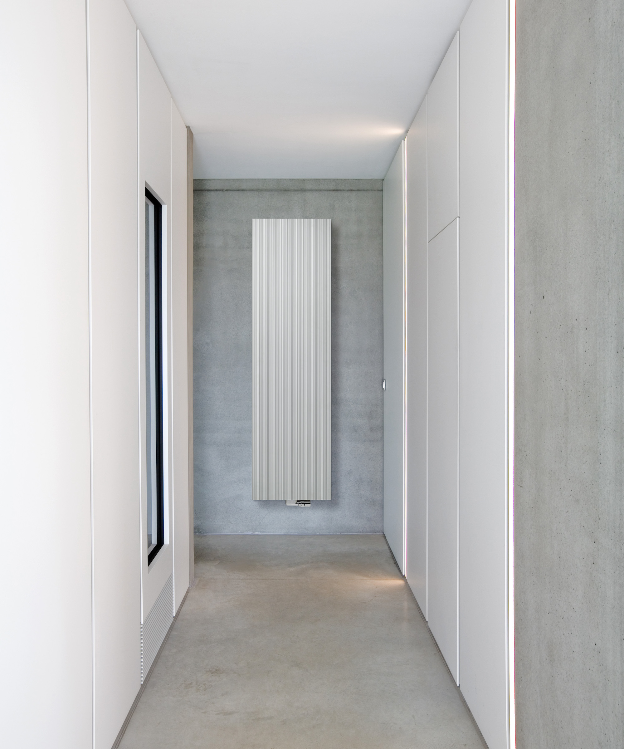
It’s important not to add fittings and furniture that will impede circulation in a small landing, so think slim vertical designs when you’re choosing radiators.
“Vertical radiators are a good choice for a hallway as they provide ample heat whilst not taking up too much wall space, which is often needed for coat hooks and pieces of storage furniture,” says Nick Duggan, managing director, The Radiator Centre.
“There are a huge range of slim or vertical designs available allowing homeowners to select a finish to blend in with the rest of the interior scheme or make a feature of it with a bold colour or an art radiator.
“Another great option is a mirrored radiator design, many of which don’t appear as a radiator at all, serving a dual purpose and making the hallway feel lighter and brighter.”

Nick Duggan is MD at The Radiator Centre and is an authority on all things heating-related.
7. Panel with mirrors
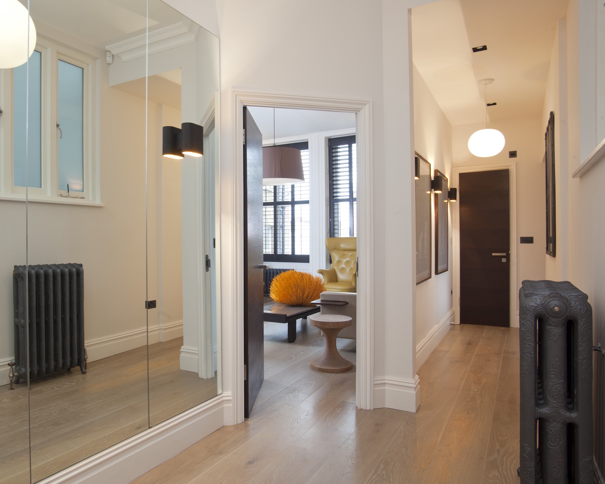
Panelling is a favourite choice for hall walls, but rather than using wood, consider a run of mirrored panels along one wall to transform a narrow corridor into a more expansive space.
These mirrors are full length to provide maximum reflection and they’re combined with Oak Silver White engineered boards from The Natural Wood Floor Co that also reflect light to keep the space as well illuminated and spacious feeling as possible.
8. Add a focal point to a small landing
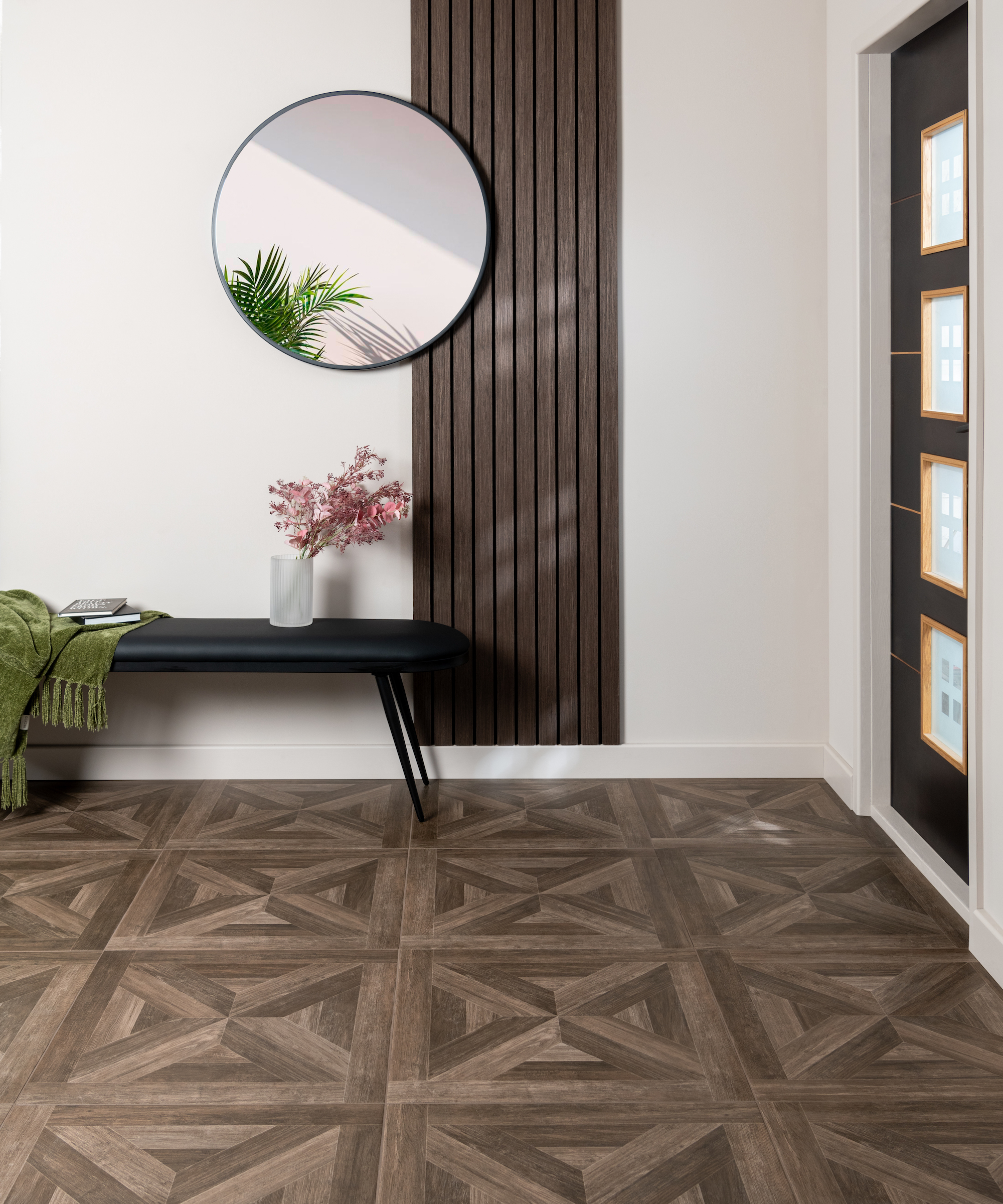
Be bold with a focal point to make a small landing feel larger. A design with height can draw the eye upwards to make the ceiling feel further away.
“Using slatted wood wall panels in a small landing is an excellent design strategy for making the most of limited space while creating a stylish focal point,” says Louisa Swannell, head of creative design at Walls and Floors.
“The vertical slats help elongate the landing visually, while the natural wood texture brings warmth and personality to a space that is often neglected.”
A slatted panel can also visually enlarge the hall in other ways. “One of the subtle but effective benefits of slatted wood panels is the way they interact with light,” she says. “Whether it’s natural or artificial light, the slats can create interesting shadow effects, adding depth and dimension to the hallway. You can accentuate this effect by positioning wall lights near the slats, which will cast soft, linear shadows and emphasise the texture of the wood.”

Louisa is head of creative design at Walls and Floors. Founded in 1987, Walls and Floors is an award-winning tile specialist with an unbeatable range of tiles and wood panelling, available to purchase online.
FAQs
How small can a landing be?
A landing can be compact in its dimensions. Approved Document K of the Building Regulations, which applies to England, specifies: “At the top and bottom of every flight [of stairs], provide landings the width and length at least as great as the smallest width of the flight.”
How can you make a small landing look bigger?
Think functionality and style to make a small landing look bigger, advises Claire Garner of Claire Garner Interiors.
“Built-in storage solutions, such as slimline cabinets or shelves, can maximise space without overwhelming the area,” she says. “For example, using vertical storage solutions like tall bookcases with rattan baskets or hooks for coats and bags will help maintain a clutter-free environment.
“Multi-functional furniture like benches with hidden storage compartments are excellent for keeping shoes and accessories neatly out of sight while providing a convenient seating option. Incorporating mirrors can enhance natural light and create an illusion of more space, making the hallway feel larger and more inviting.
“Good lighting is also crucial; consider wall-mounted fixtures or pendant lights to brighten the space and add a touch of sophistication.”
When planning the design of a small landing, it's worth considering your staircase design too. Perhaps you want modern staircase ideas, or go for a more traditional look with staircase panelling.
Get the Homebuilding & Renovating Newsletter
Bring your dream home to life with expert advice, how to guides and design inspiration. Sign up for our newsletter and get two free tickets to a Homebuilding & Renovating Show near you.
Sarah is a freelance journalist and editor writing for websites, national newspapers, and magazines. She’s spent most of her journalistic career specialising in homes.
She loves testing the latest home appliances and products, and investigating the benefits, costs and practicalities of home improvement. She is an experienced renovator and is currently remodelling the ground floor of her new home.
She was Executive Editor of Ideal Home and has worked for Your Home and Homes & Ideas. Her work has published by numerous titles, including The Guardian, channel4.com, Houzz, Grand Designs, Homes & Gardens, House Beautiful, Homes & Antiques, Real Homes, The English Home, Period Living, Beautiful Kitchens, Good Homes and Country Homes & Interiors.
