14 long kitchen ideas to make the most of awkward spaces
The best long kitchen ideas turn tricky to work with spaces into rooms that are user-friendly, stylish and practical. Here, we have rounded up some of the most beautiful examples
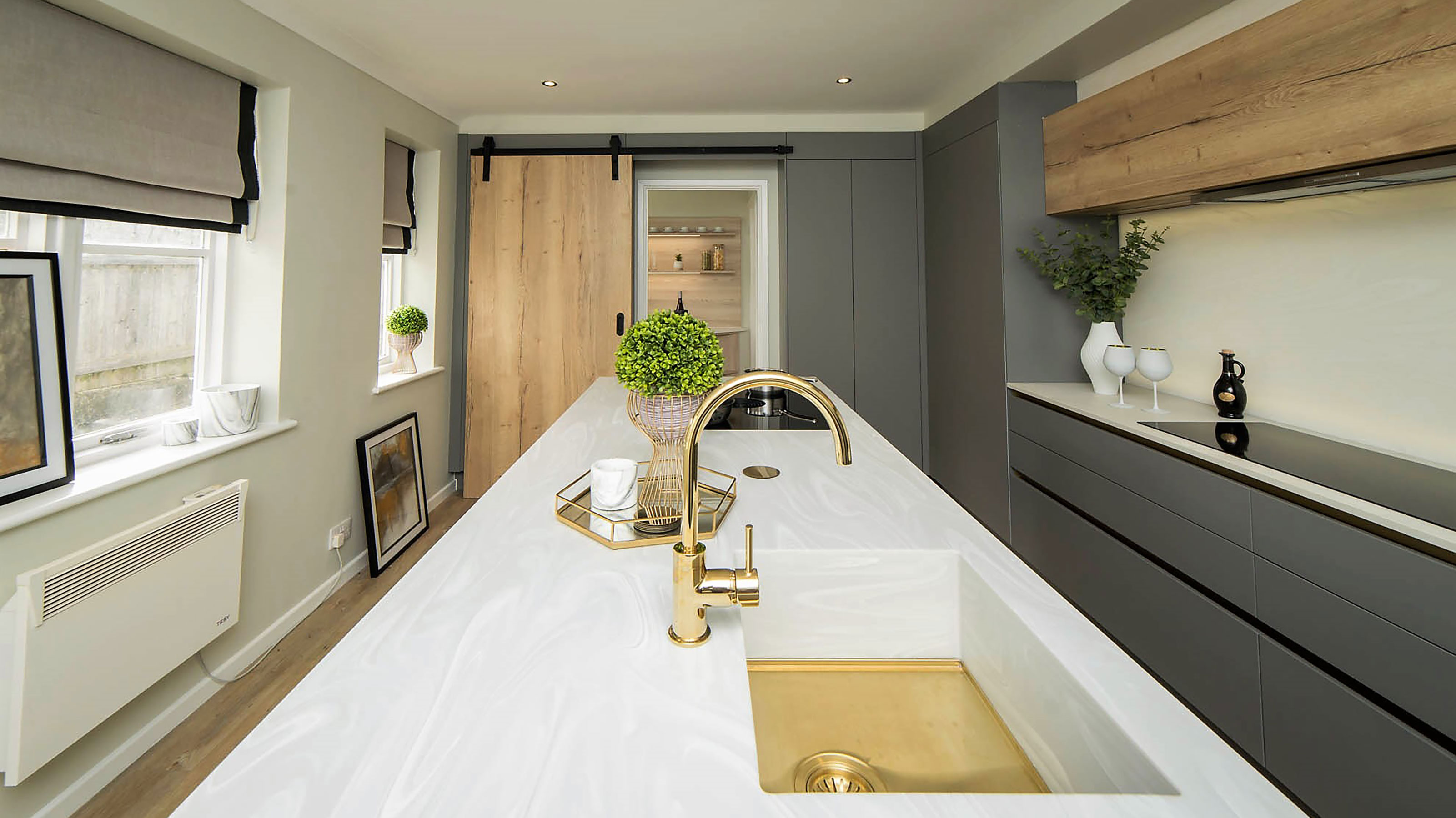
If you are on the hunt for some brilliant long kitchen ideas then you have come to the right place.
When designing a kitchen, one of the key considerations is how to make the very most of the space you have available and, in the case of long rooms, it can be hard to make the whole space feel unified.
A lack of natural light can also be an issue faced by owners of a kitchen of this type, as can ensuring the space feels comfortable and logical to move around. If you want to entertain in the kitchen too, you will need to look at ways to incorporate seating spots that feel sociable and within family kitchens you will no doubt be keen to ensure there is plenty of circulation space around your fittings where younger members of the family won't get under your feet.
Here, we take a look at a range of approaches that you might like to consider if your kitchen is longer than it is wide, all showing the best ways to make the most of a room with these proportions.
1. Long kitchen ideas to rethink the kitchen island
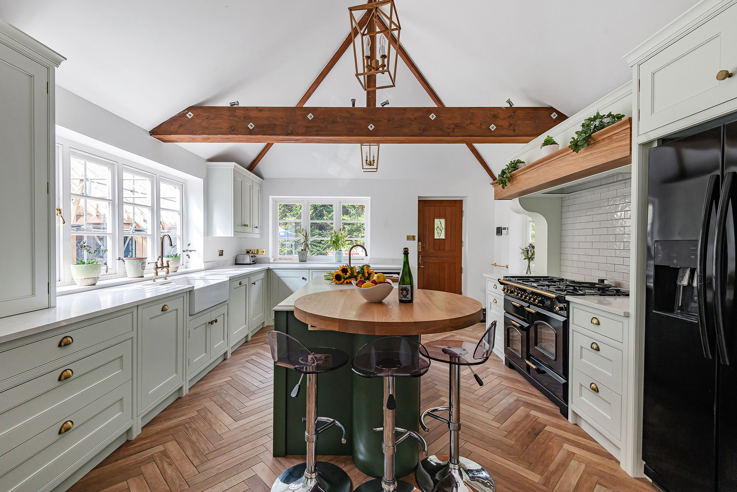
There is nothing in the rulebook of kitchen design saying that kitchen island ideas have to be square or rectangular — curved and circular kitchen islands not only look very striking, but they can also help to break up a long kitchen visually.
Breaking away from long, linear shapes will ensure that the space feels less one-dimensional and can even help the room feel wider than it is. Circular islands and tables are known for fostering a sense of sociability, encouraging people to gather around face to face and this is really important in long kitchens.
Within this bespoke, hand-painted kitchen from Et Lorem, a circular section at one end of the island serves as a dining spot while the two shades of green also help to break the area up.
2. Keep things super simple and fuss-free
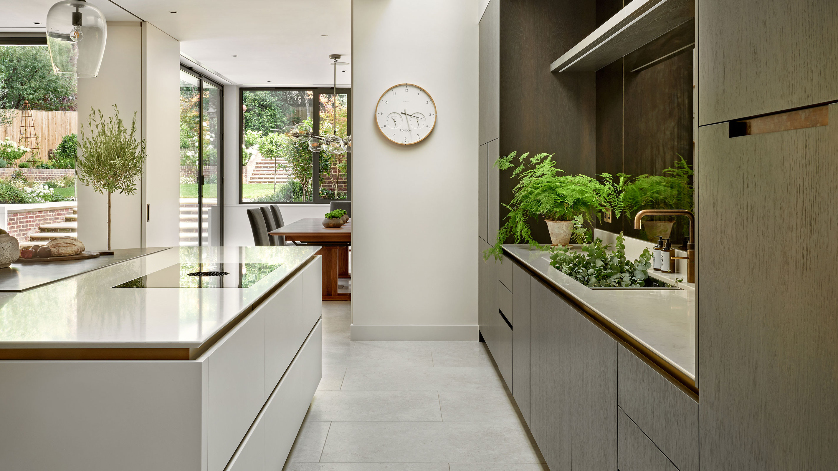
Sticking to an unfussy, simple colour palette is a wise idea when it comes to narrow kitchen ideas or those that are longer than they are wide.
Opt for a selection of fairly neutral shades, select units that lie on the sleeker side of things and opt for built-in appliances. This tends to be more advisable in narrow kitchens — if you have a little more in the way of width to play with you could go with a little more extravagant detail.
In this contemporary kitchen, by Brayer Design, charcoal-stained hand-veneered oak cabinetry has been combined with space-saving drawers and integrated lighting and appliances.
3. Incorporate curves for another dimension
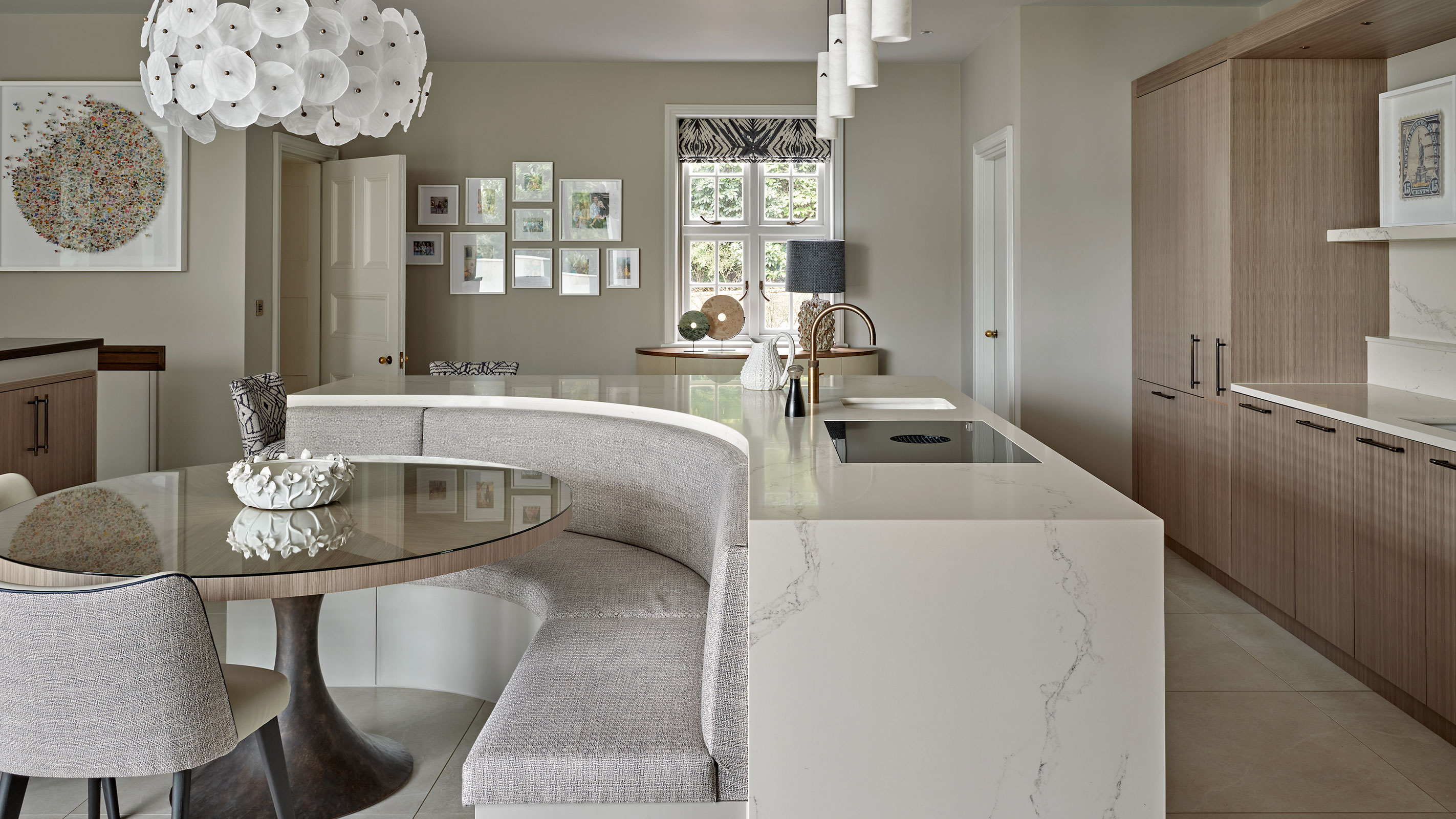
Gently snaking curves and rounded edges ensure that long kitchens feel more welcoming and less stark.
You could choose to introduce curves in your kitchen worktop ideas or incorporate a circular dining table or island or even build in a crescent of seating.
In this beautiful space, by Brayer Design, the proportions of the room have been softened with a curvaceous island featuring cosy integrated seating to one side of the unit.
4. Don't discount the idea of the 'working triangle'
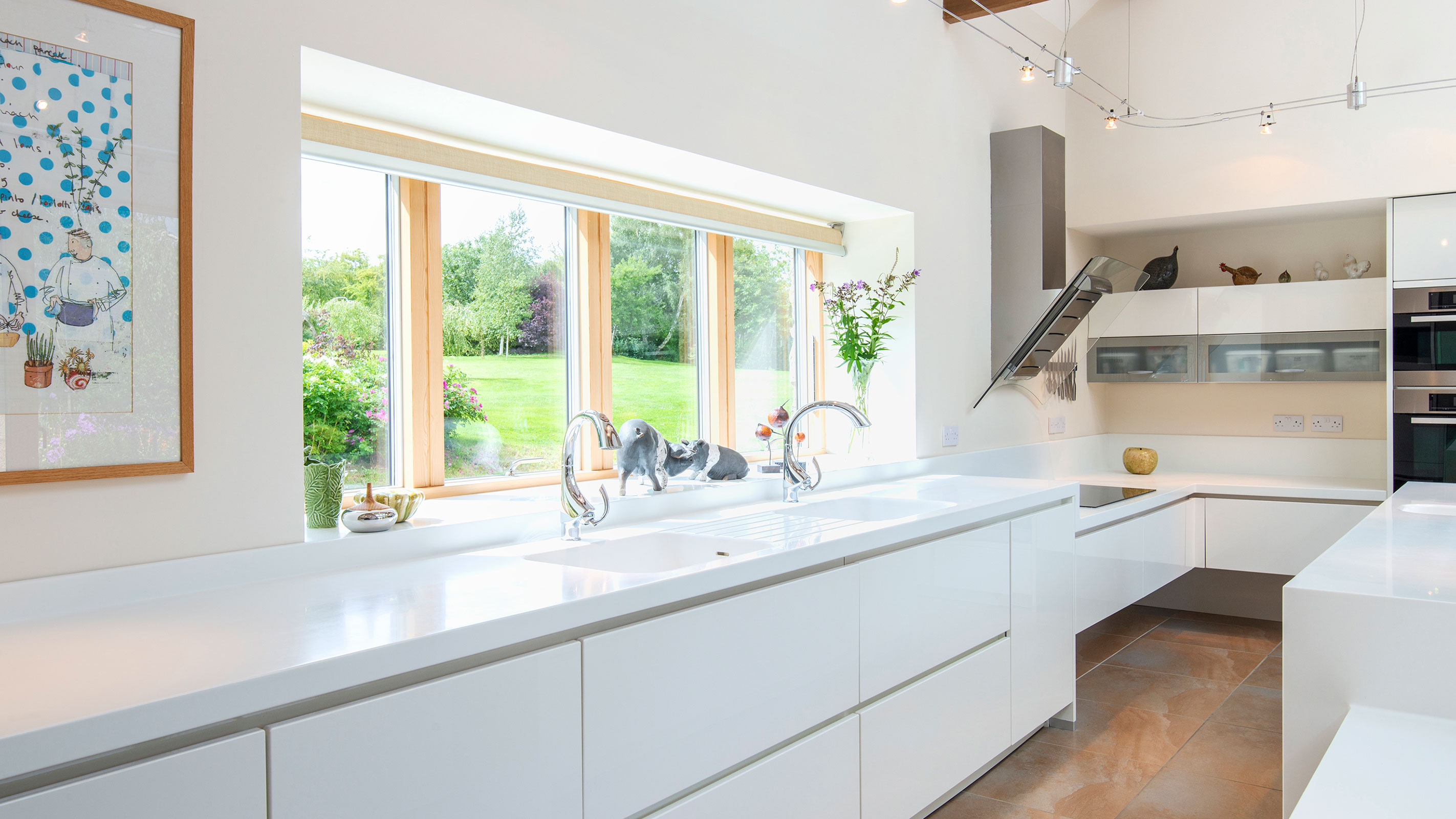
While the idea of the working kitchen triangle can sometimes feel a little restrictive and old-fashioned these days, there is actually much to be said for loosely following the idea — and there is no reason why you can't do this in a long kitchen.
In simple terms, the kitchen triangle concept states that the three main functional points of a kitchen – cooking (oven/hob), preparation (sink) and storage (fridge) – should all be placed so that they form a rough triangle.
Those with long kitchens might like to bear the idea in mind to ensure that they can move between these key areas comfortably and safely, although there is no need to feel constrained by them.
"It is a design principle that can be broken — but it is a good place to start," says Keith Myers of The Myers Touch
This space has been fitted out with a preloved Alno kitchen from Rehome. The hob, fridge and sink form a loose triangle at one end of the room, while storage is taken care of elsewhere.
5. Add built-in seating for a smart kitchen diner
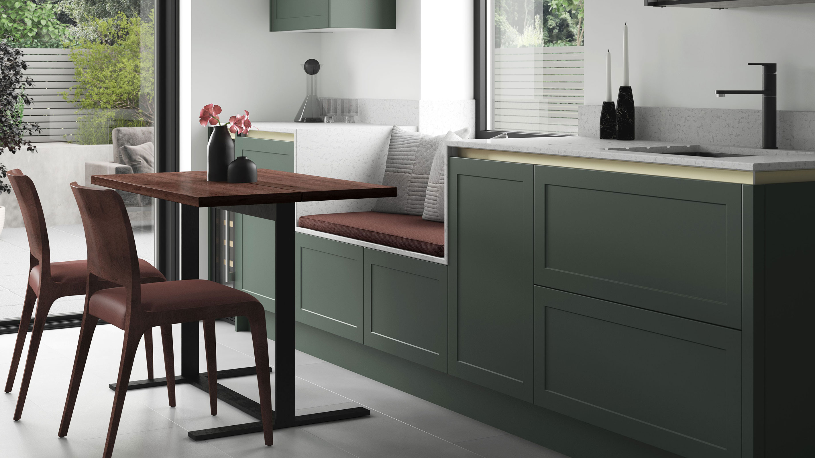
Built-in seating is a great idea in many types of space and is not only ideal for those after small kitchen ideas but also anyone scratching their head over the best layout for a long kitchen.
By building seating in to one side of the room, a neat and unobtrusive dining area can be created.
The handleless Cambridge kitchen from Benchmarx, shown here in Forest Green, comes in a range of configurations for all kinds of room shapes. Additional seating has here been created within a run of units that also houses the sink.
6. Draw the eye towards wider spaces
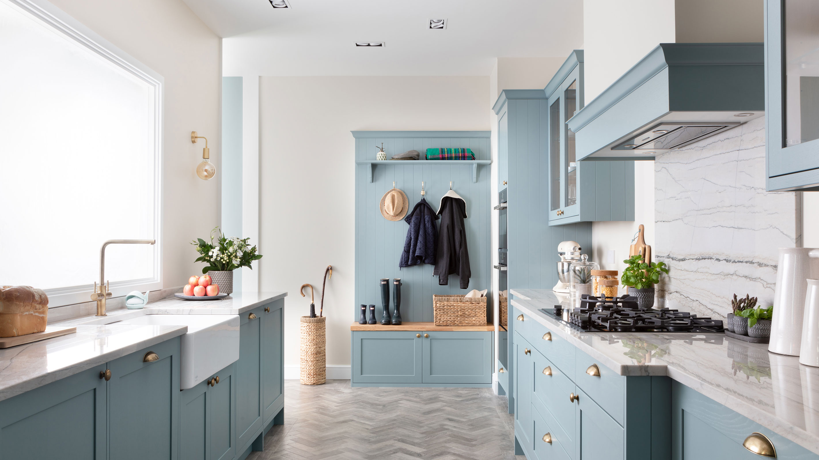
Leading the eye away from the long, linear proportions of a room and towards an area of a more generous width is a great way to break up a one-dimensional feeling in the room.
Keep any wider areas open to the kitchen to ensure they remain visible — the space might be used as a dining area or, as has been done here, to incorporate boot room ideas. By using matching units within the two spaces, along with a stylish herringbone floor, the two spaces feel united.
7. Opt for an all-white kitchen design
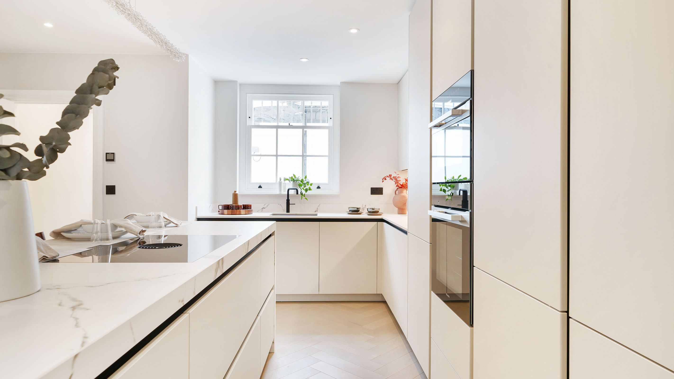
All-white kitchens keep things bright and breezy and this can be something that can be hard to achieve in long rooms where windows can be few and far between in some cases.
White units and work surfaces not only look ultra modern and clean but they also help to reflect light.
This kitchen was designed and installed by Et Lorem. The design includes Rotpunkt furniture in Kashmir and Dekton Kairos worktops, along with a hob featuring downdraught extraction for an entirely sleek finish.
8. Opt for handleless units in tight spaces
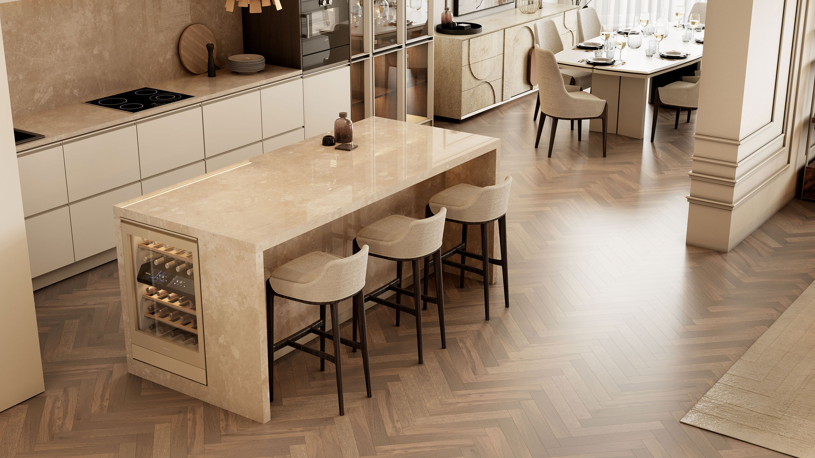
If you are working with a long kitchen that also happens to be a little on the tight side proportionally, opting for a handleless kitchen is a brilliant idea — less chance of catching clothing on handles or bumping into them. It can visually help make a room feel more capacious too.
This fantastic example is great for anyone after kitchen diner ideas. It has been installed in one long space of the open plan apartment it graces and enjoys super sleek units that tie in beautifully with the neutrals of the dining spot. Finally, the herringbone floor that has been used throughout draws the whole scheme, which uses products from Caffe Latte, together.
9. Use full-height kitchen units
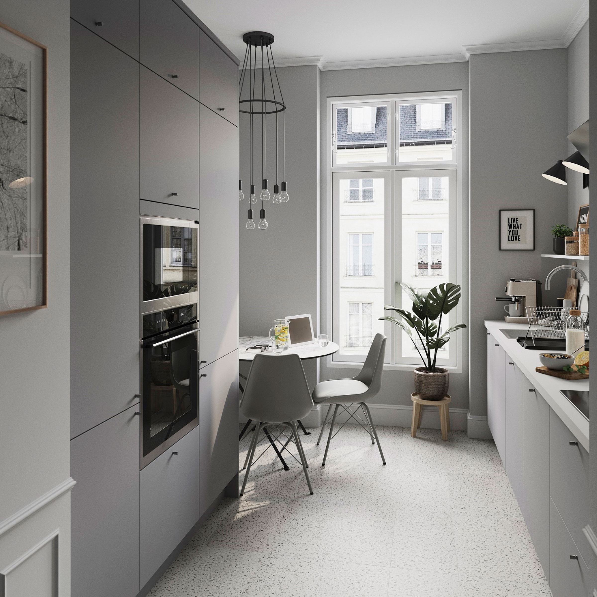
Rather than use a somewhat traditional combination of base and wall kitchen units in a long kitchen, it is better to stick to either just base cabinets with open shelves on the walls, or to use the entire vertical face of one wall for full-height units. This will make the space feel less cluttered and more serene to spend time and work in.
The available space within this rather awkwardly-shaped kitchen diner has really been maximised using cabinets fitted with Stevia matt pewter grey slab doors from B&Q. A small dining/work-from-home space has been located to one end.
10. Stick to a more limited colour palette
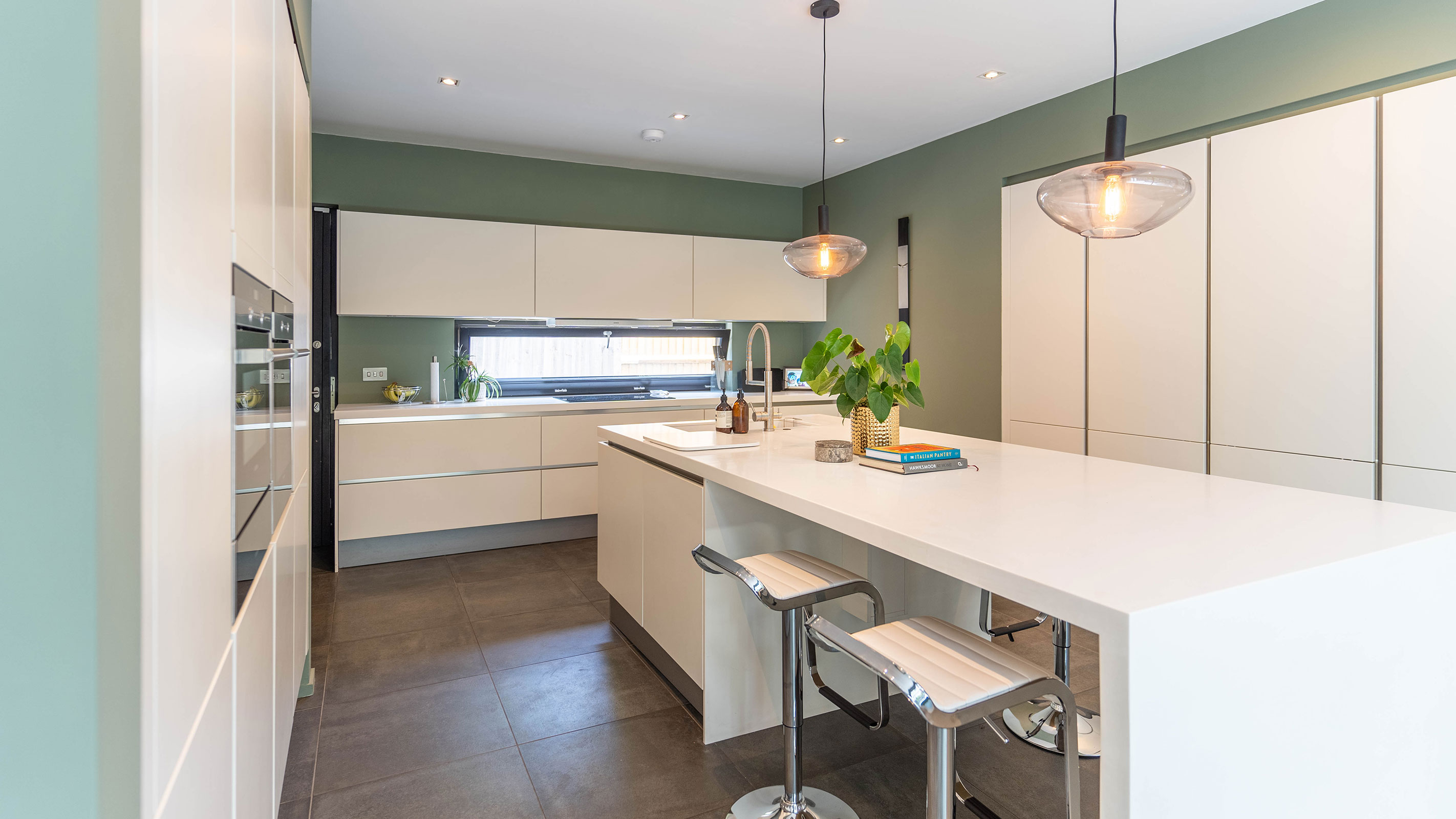
Aim not to overwhelm a long kitchen with too many different colours. While bold shades can work well in small spaces where they embrace as opposed to shy away from the more compact proportions, a multitude of hues can feel a little oppressive in long rooms.
Stick to just one or two shades that work harmoniously together. In this kitchen, designed by Copper Dust, a 'Japandi' style has been created. Japandi is, as the name suggests, a combination of Japanese and Scandinavian design that incorporates 'wabi-sabi', a Japanese ideal that embraces slow-living and simplicity, alongside 'hygge', the Scandinavian concept of creating comfort and wellbeing.
11. Discover the benefits of herringbone flooring
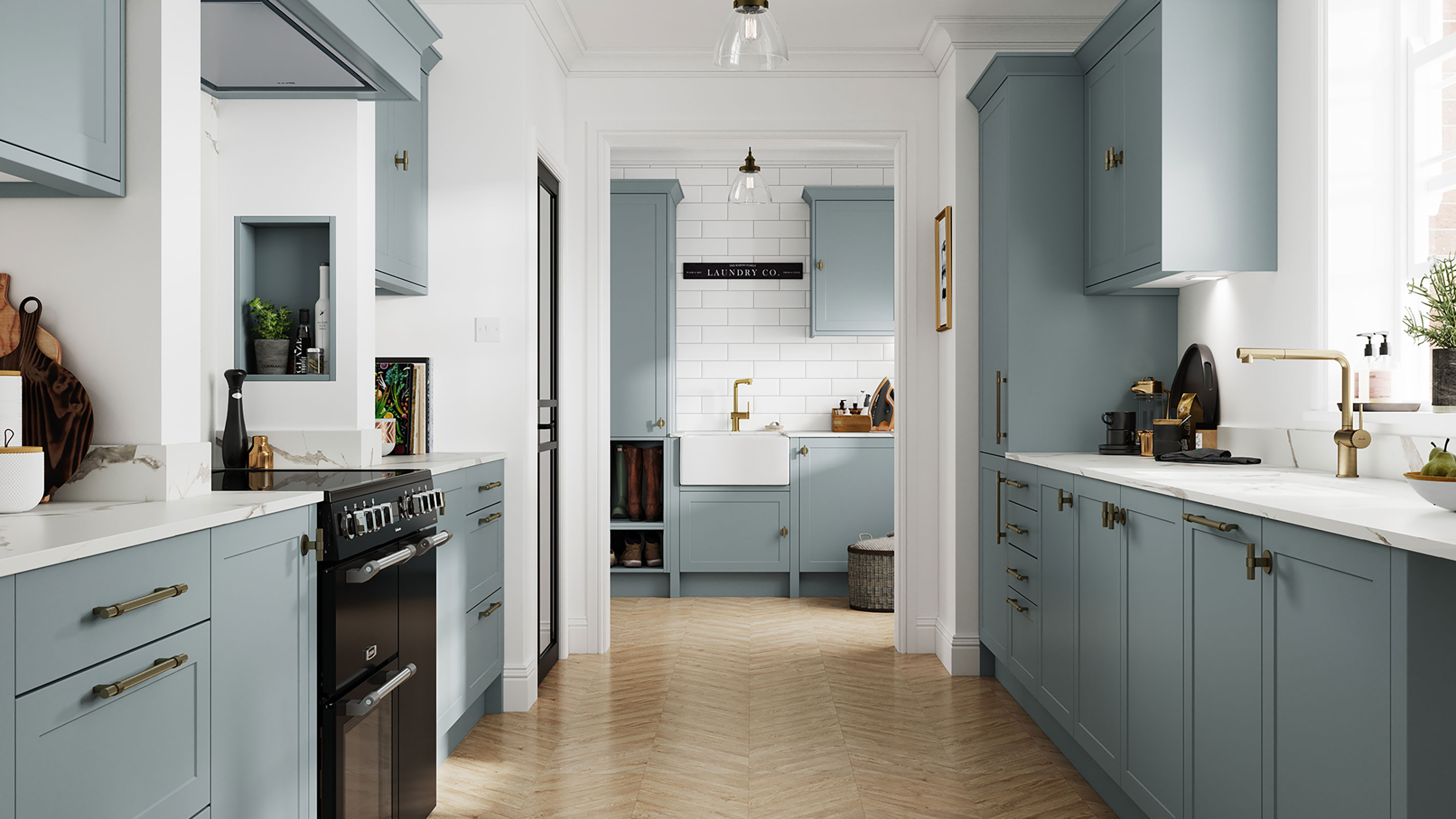
Herringbone flooring remains hugely popular and can be used with a number of types of flooring, including timber, tile and LVT.
This style of flooring is a great choice for those working with long rooms as it draws the eye towards the distinctive zig-zag pattern, giving extra 'movement' to the space. Opting for herringbone flooring in a lighter shade can also make the space feel wider than it is.
Here, the Cambridge kitchen in Driftwood Blue, from Benchmarx Kitchens, has been paired with fresh white worktops and leads off to a co-ordinating utility room to one end.
12. Design your kitchen island to maximise space
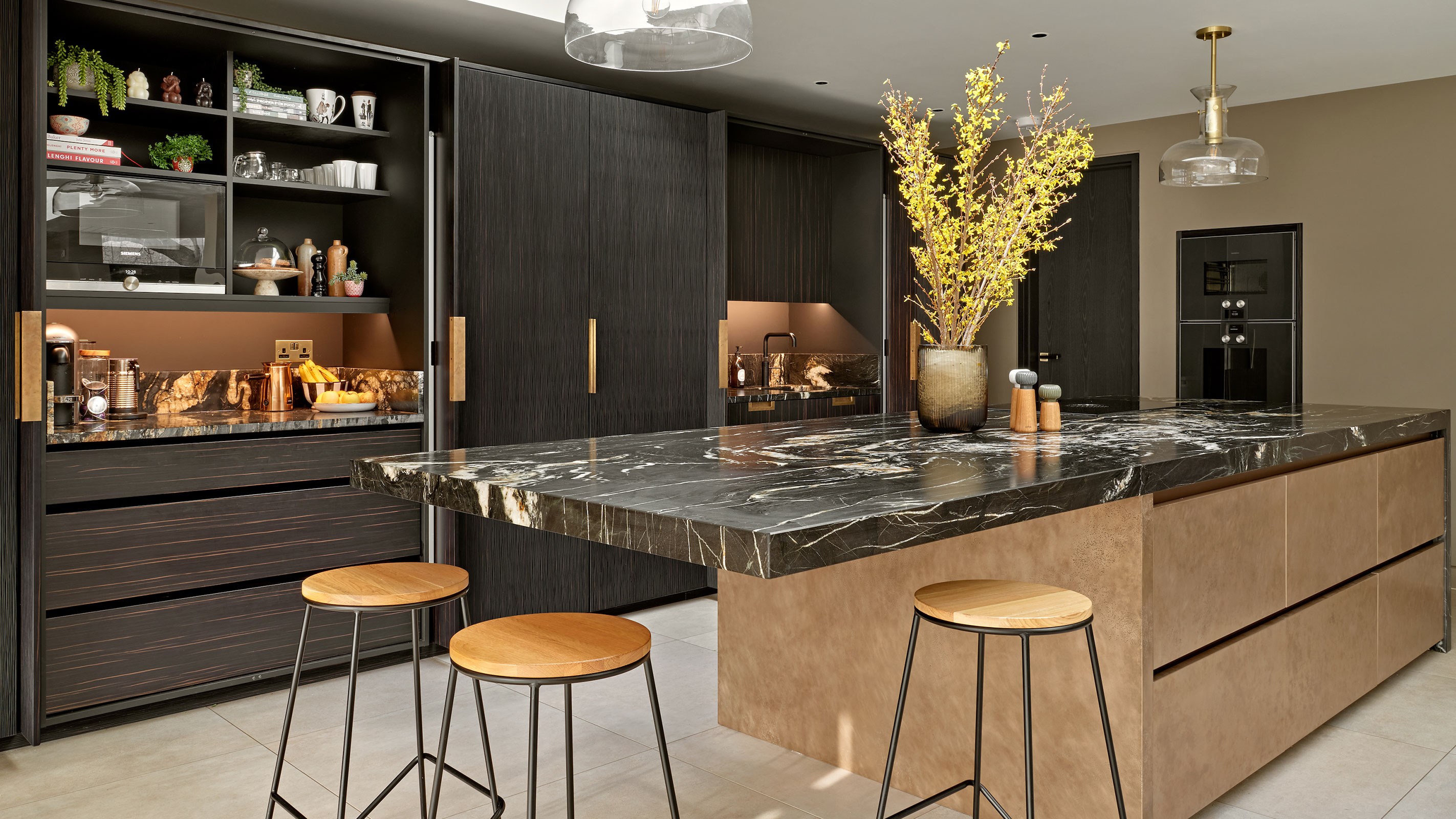
When designing a kitchen island you should base its shape and size on the proportions of the room and tailor it accordingly.
"As a general (but loose) rule of thumb, when planning the kitchen island it’s best to map it out based on the idea of half width to length," says Al Bruce, founder of Olive & Barr. "Rather than restricting yourself to specific measurements, think about proportions rather than size. This rule prevents the kitchen from feeling too long and skinny or wide and square. Those who are planning on having appliances like the dishwasher on the island need enough clearance to comfortably pull it out — that’s usually 1 metre between the island and kitchen cabinets."
In this kitchen by Brayer Design, the sizeable kitchen island not only houses plenty of storage but also features a spacious area at which to sit at to one end.
13. Turn the room into a multi-purpose space

It is a good idea to break up long kitchens into separate zones, each with its own intended purpose — this will really help ensure you get the most use out of the space.
You might like to split it into cooking, dining and living areas or use one end as a spot for the children to play or do homework for example.
Here, Balsamita Matt White Slab unit doors from B&Q have been used. To one end of the space a handy seating spot at which to grab a quick bite to eat or to sit and work at has been created.
14. Create a kitchen of two halves
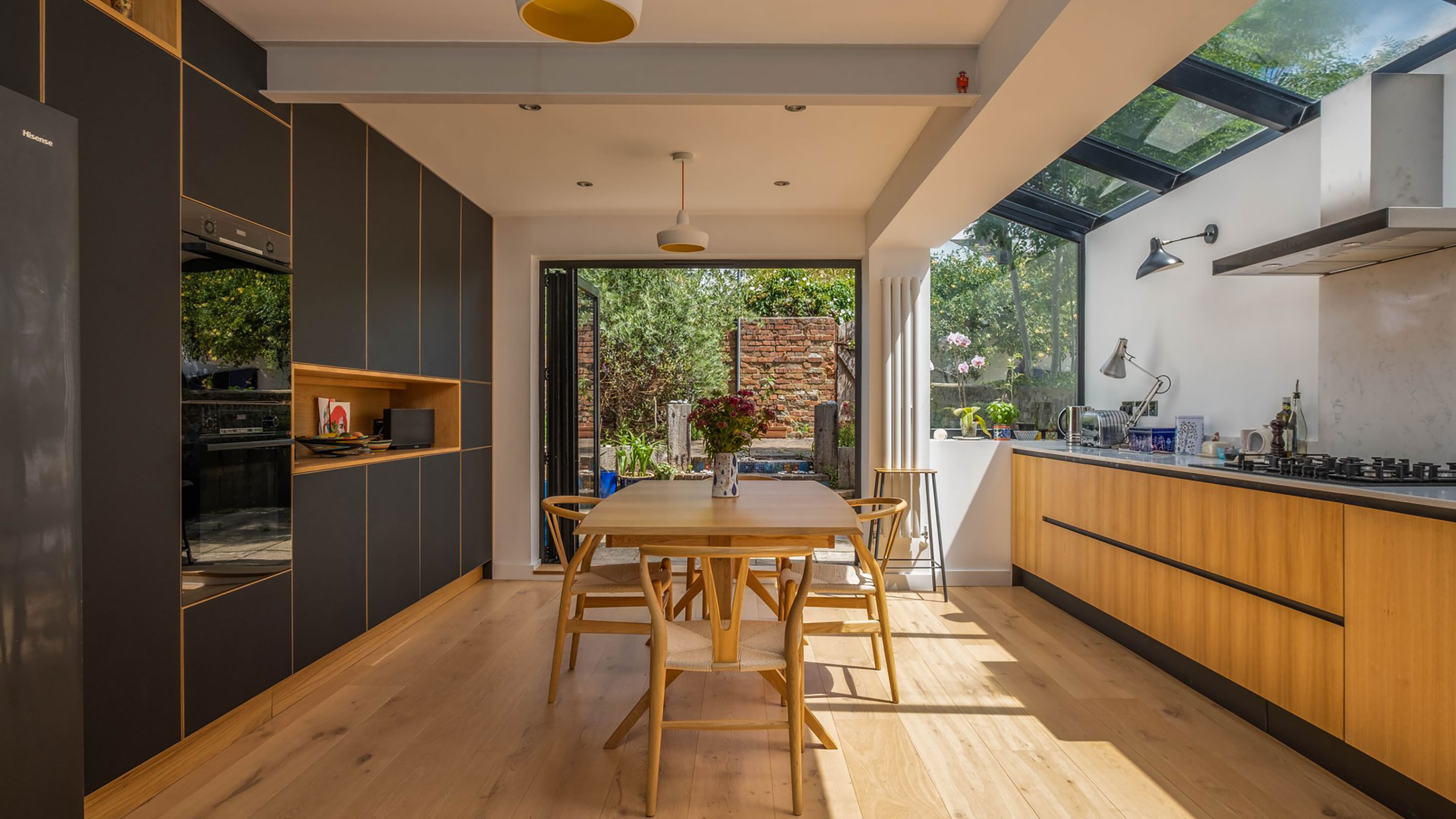
In order to make a long kitchen feel more interesting and multi-dimensional it is a fantastic idea to vary the materials used on either side of the kitchen — it really can help a room feel wider and more even in its proportions than it really is.
This kitchen space, designed and fitted by Woodworks Brighton, has been enlarged thanks to a side-return extension. One side has been fitted with surfaces from Fenix that do a great job of absorbing light, while the opposing run of units are of warm, golden oak.
15. Use an island to house some appliances
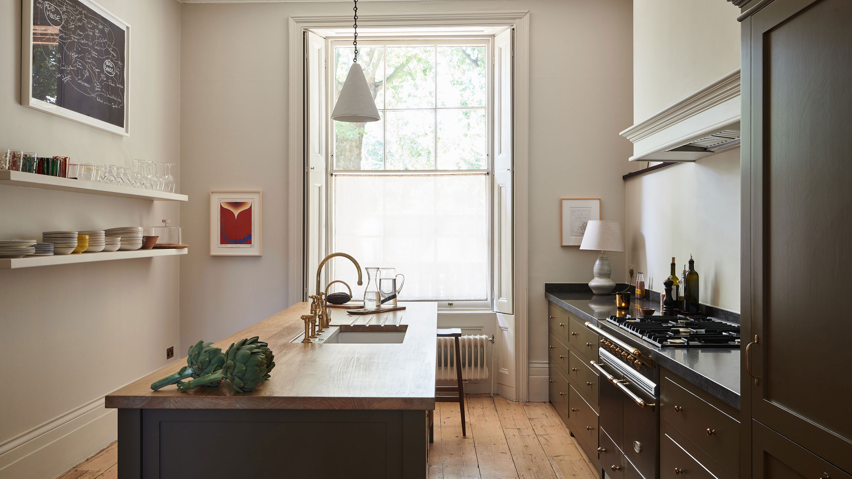
If you are going to include an island within your kitchen layout ideas then really make the most of it and ensure it works for your particular space.
This DeVOL kitchen might be on the narrow side, but the island really enhances the room, offering storage, plenty of space for food preparation and the kitchen sink too, as well as a dining area at one end.
Get the Homebuilding & Renovating Newsletter
Bring your dream home to life with expert advice, how to guides and design inspiration. Sign up for our newsletter and get two free tickets to a Homebuilding & Renovating Show near you.
Natasha was Homebuilding & Renovating’s Associate Content Editor and was a member of the Homebuilding team for over two decades. In her role on Homebuilding & Renovating she imparted her knowledge on a wide range of renovation topics, from window condensation to renovating bathrooms, to removing walls and adding an extension. She continues to write for Homebuilding on these topics, and more. An experienced journalist and renovation expert, she also writes for a number of other homes titles, including Homes & Gardens and Ideal Homes. Over the years Natasha has renovated and carried out a side extension to a Victorian terrace. She is currently living in the rural Edwardian cottage she renovated and extended on a largely DIY basis, living on site for the duration of the project.

