10 Great Entrance Design Ideas
The entrance sets the tone for the entire house and the interiors beyond. Let’s take a look at 10 design ideas for achieving a visual impact, and for gaining useful additional space too
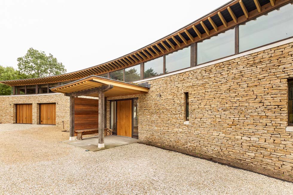
The entrance to your home fulfils a multitude of functions: it should be designed carefully so as to create a sense of arrival but must also be a cohesive part of the exterior scheme. And in practical terms, it should aid with the smooth running of daily life.
So, here are some ways to create something beautiful and functional, to greet new guests and to welcome you home.
1. The Multifunctional Porch
While a simple canopy above the front door will shelter visitors from the rain, a designated ‘porch’ – whether it’s a portico, an open-sided structure supported on columns, or entirely enclosed – is an altogether more useful addition.
Take this contemporary ‘porch’ (above) which visually breaks up and softens the wide expanse of drystone walling, but also provides sheltered seating for pulling off boots and for storing wood for the stove inside.
Insetting a porch within the footprint of the house is another idea; this can impede on internal floorspace, yet provides much more protection against the elements for storage and for sitting out with an evening drink (as above).
Alternatively, an enclosed porch can be the perfect place for storing away coats and for getting the kids ready.
Another solution is to introduce two entrances: one for guests and an informal entrance which fulfils the roles described.
“You may even have a couple of porches with the second serving the boot/utility room. The design of this should be of a similar nature to the front porch and it should be slightly subservient in its proportions so as not to compete with the ‘star-player’,” advises design expert Pete Tonks.
2. A Healthy Dose of Colour
Whether it’s a bold front door or a vibrant door surround, a burst of colour is one sure-fire way of drawing visitors’ eyes towards the entrance. It’s particularly effective on contemporary homes with understated entrances; as below-right, where bright yellow marks out the front door against the cladding.
Picking up the same colour throughout the interiors is a great way of creating a sense of cohesion between the inside and exterior of your new home, too.
3. Sloping Site Solutions
Sloping sites can present a particular challenge — how do you create a welcoming, practical entrance (not to mention one which is accessible, complying with Part M of Building Regulations) without introducing an imposing set of steps?
Thankfully, some rather innovative solutions from architects across the country have set a precedent for show-stopping entrances to homes on difficult plots. Among them, the ‘bridged’ entrance is somewhat of a trademark feature to some of the homes designed by Stan Bolt Architects — no strangers to sloping sites, having worked over a portfolio of coastal self builds.
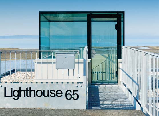
Meanwhile the entrance to the below project by AR Design consists of a glass box protruding from the flat roof of the 180m² home below, which is barely visible from street level. “It’s the name of the house; visually it provides a structural backbone,” says architect Andy Ramus of AR Design of the glazed entrance space.
4. The Hidden Front Door
The entrances to some contemporary homes are so discreet that they can even confuse the postman, blending in so as to allow the materials to do all the talking.
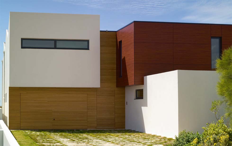
One such example is the new build home of Giuseppe Sironi and Todd Copper (above), whose front door and garage have been purposefully designed to disappear into oak-strip cladding; even door furniture is minimal. “It does sometimes confuse people, but we didn’t want to distract from the overall look of the entrance,” explains Giuseppe.
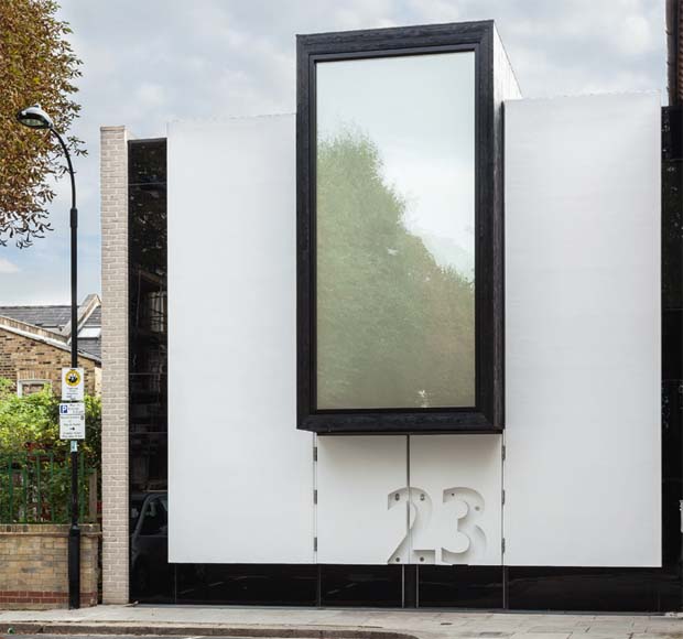
Again, the front door to this contemporary home, designed by MATT Architecture (above), lacks traditional door furniture, with the oversized house number indicating where to enter. What’s more, when the bell is rung, the door illuminates the word ‘hello’ in the render.
5. The Classic Cottage
The quintessential oak frame porch is a characterful addition to the cottage-style home, but attention to detail is required to ensure this addition looks just right.
Pete Tonks, the Oakwrights architectural designer behind this stunning design (below) explains: “If you plan on a traditional project then why not consider a classic gable-fronted oak frame porch on posts? The ridge of your porch should be set below the eaves line if you want to create a cosy cottage feel, but if you want to make it more imposing then the ridge could be up higher, with valleys cut into the main house roof.
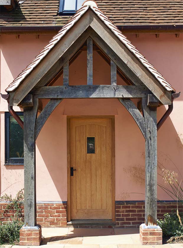
“You also need to keep an eye on scale: there is a fine line between too small and too large. Roof pitches should be kept steep – starting at around 42° up to 50-55° – for a classic look, too. You may also want to consider a porch wide enough to stack logs on one side and to drop boots and dog leads off on the other,” concludes Pete.
6. The Internal Courtyard
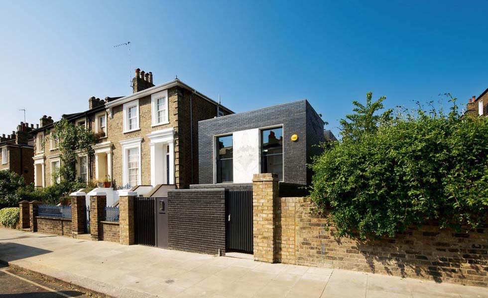
A particularly good solution for the urban home, the internal courtyard not only brings privacy, but provides a place to tuck away the bins and for outdoor storage. This London-based property (by Liddicoat & Goldhill), built on a incredibly tight plot, is a case in point.
7. The 21st Century Carport
The porte-cochère or ‘coach door’ – an open-sided addition which grew in popularity in the 18th century – was originally designed to accommodate carriages at the entrances to large homes and buildings. Its design enabled wealthy travellers to step out of their carriages without being exposed to the elements (heaven forbid!). Fast forward to the 20th century and to the rise of the carport, which was popularised by architect Frank Lloyd Wright.
Today, a porte-cochère or carport can be designed in to suit both period and contemporary houses alike, forming a practical arrival space: a dry spot to load and unload the contents of the car (the shopping, flatpack furniture, dogs, kids, you name it). Such additions can also provide useful outdoor amenity space.
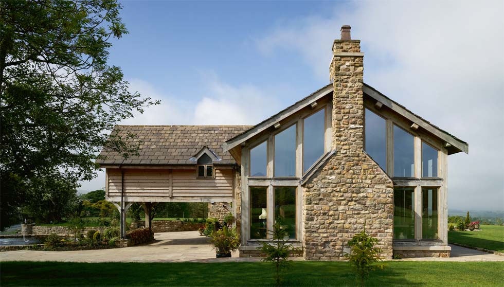
There’s a further benefit, as this stunning barn conversion (above) reveals: a porte-cochère can be an ideal means of creating extra floorspace above (housing a first floor en suite bedroom in this case). The key to introducing such additions is in ensuring that they do not impede on light entering the ground floor rooms.
8. Extending the Roofline
Extending the roofline can be a seamless means of creating an arrival space or amenity area below. For the modern home, continuing a flat roof above the front door is a sleek idea (see below) — what’s more, the space can provide extra floorspace or, in this case, a terrace, above.
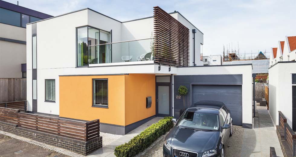
9. Continuing the Outside In
One trend which sees no sign of losing traction is the introduction of a continuous palette of materials, running from inside to out. It’s a concept that’s all about making the surroundings feel integral to the interiors. It’s a look that is often paired with lots of glazing too — allowing the materials on display to be fully appreciated on both sides of the front door.
A key consideration is choosing materials which are suitable for both indoor and outdoor use.
10. The Oversized Front Door
A staple of the contemporary home, the oversized front door lends grandeur without being grandiose.
“Door trends are shifting dramatically at the moment,” says Elizabeth Assaf of contemporary door design and manufacturer Urban Front, who provide external hardwood doors of up to 1.5x3m in size. “More and more of our customers want to maximise their entrance and include as large a door as possible with simpler lines and smarter technology. At the moment, very wide doors are popular with glass and fingerprint entry.
“Illusions of larger doors are popular too, so the actual door isn’t too large but the entrance itself gives that impression,” adds Elizabeth. One such example crafted by Urban Front for this Paul Humphries Architects’ project (below), gives the appearance of height and is complemented by sleek, oversized door furniture.
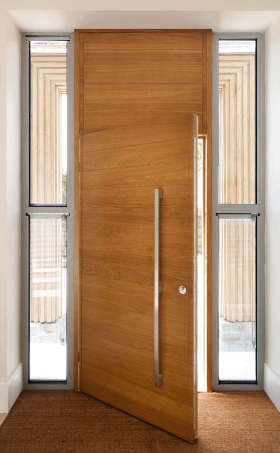
“There is also a definite move away from too many fancy details and a real belief in using natural products and achieving high U values.”
In addition, there is a move away from fancy detailing, with importance being placed instead on natural products and achieving high U values (which is a mark of good thermal performance). Flush threshold and pivoting doors are other on-trend solutions which bring wow-factor.
Get the Homebuilding & Renovating Newsletter
Bring your dream home to life with expert advice, how to guides and design inspiration. Sign up for our newsletter and get two free tickets to a Homebuilding & Renovating Show near you.
Claire is Brand Development Editor and the former Editor in Chief of Homebuilding & Renovating website and magazine. She became Editor of Homebuilding & Renovating in 2016 and has been a member of the team for 16 years. An experienced homes journalist, her work has also appeared in titles such as Real Homes and Period Living.
She has a particular interest in green homes and sustainability, and interior design is a passion too; she has undertaken qualifications in this area.
After finishing a major renovation of a period cottage, she is now onto her next project: overhauling a 1930s property in the Shropshire countryside.

