5 design lessons from this cutting-edge cottage extension on the Cornish coast
Set above the Cornish coast, Paul and Sue Landreth’s property brings together a traditional granite house with cutting-edge design in the form of a spectacular contemporary extension

The Cornish coast is no stranger to trailblazing design, with traditional properties eagerly snapped up by those hoping to transform them into homes that fully embrace the dramatic and, at times, demanding landscapes that they were built on.
The home of Sue and Paul Landreth, designed by Devon-based architect Stan Bolt, has certainly risen above and beyond this challenge when building an extension.
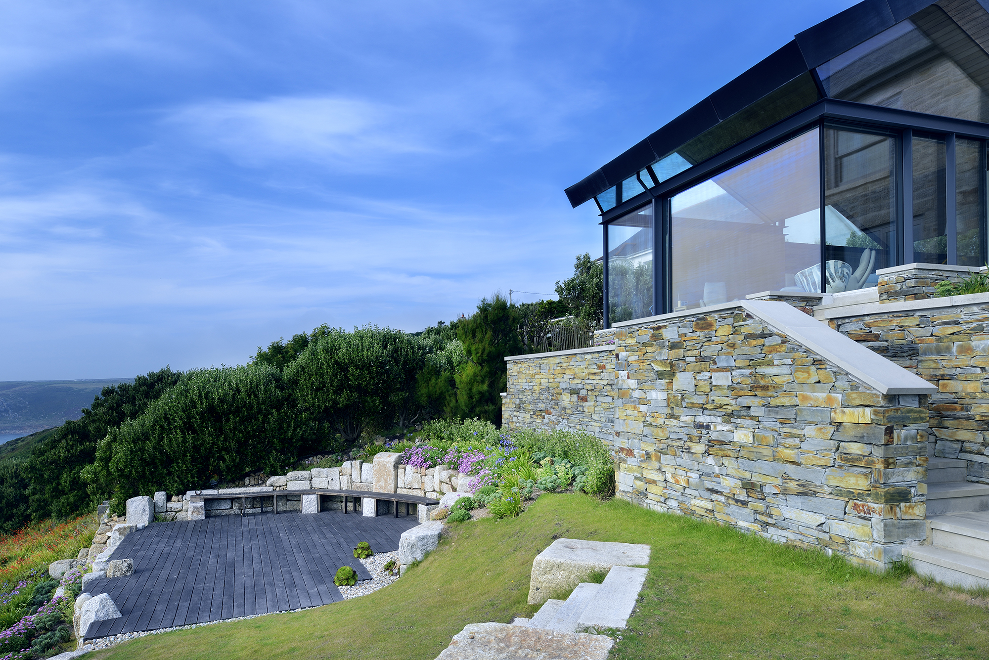
The house Paul and Sue purchased was a typical Cornish building, constructed from local granite in 1890. While the original property was in sound condition for its age, it had been unsympathetically extended over the years, once during the 1920s and again in the 1970s. Located on a gently sloping site, the house is graced with unbroken panoramic views to the western Atlantic approaches of the Cornish coast.
Here, the couple and their architect explain the design details which went into creating this stunning home.
1. Staying true to the original building
“The house was very run-down inside and out,” says Paul. “But structurally it was sound. We made the decision to retain the house rather than demolish it — although starting from scratch would have been cheaper from a VAT perspective. Knocking it down would have seemed like vandalism.”
Paul and Sue were drawn to the designs of award-winning architect Stan Bolt, who has designed a wealth of homes around the Devon and Cornish coasts and is well-versed in the challenges exposed sites can present.
“The landscape here is rugged, wild and just phenomenal,” says Stan. “The building is very much of the site and archetypal of the domestic architecture at the time it was built. It provided a good starting point for the rest of the design.”
The decision was taken to demolish both the extensions, which comprised something of a hotchpotch of felt flat-roofed buildings and a pitched roof construction.
“We stripped it back,” explains Stan. “Some of the old building had to be repaired and original openings reinstated — but essentially we could start again from scratch.”

3. Adding a contemporary extension
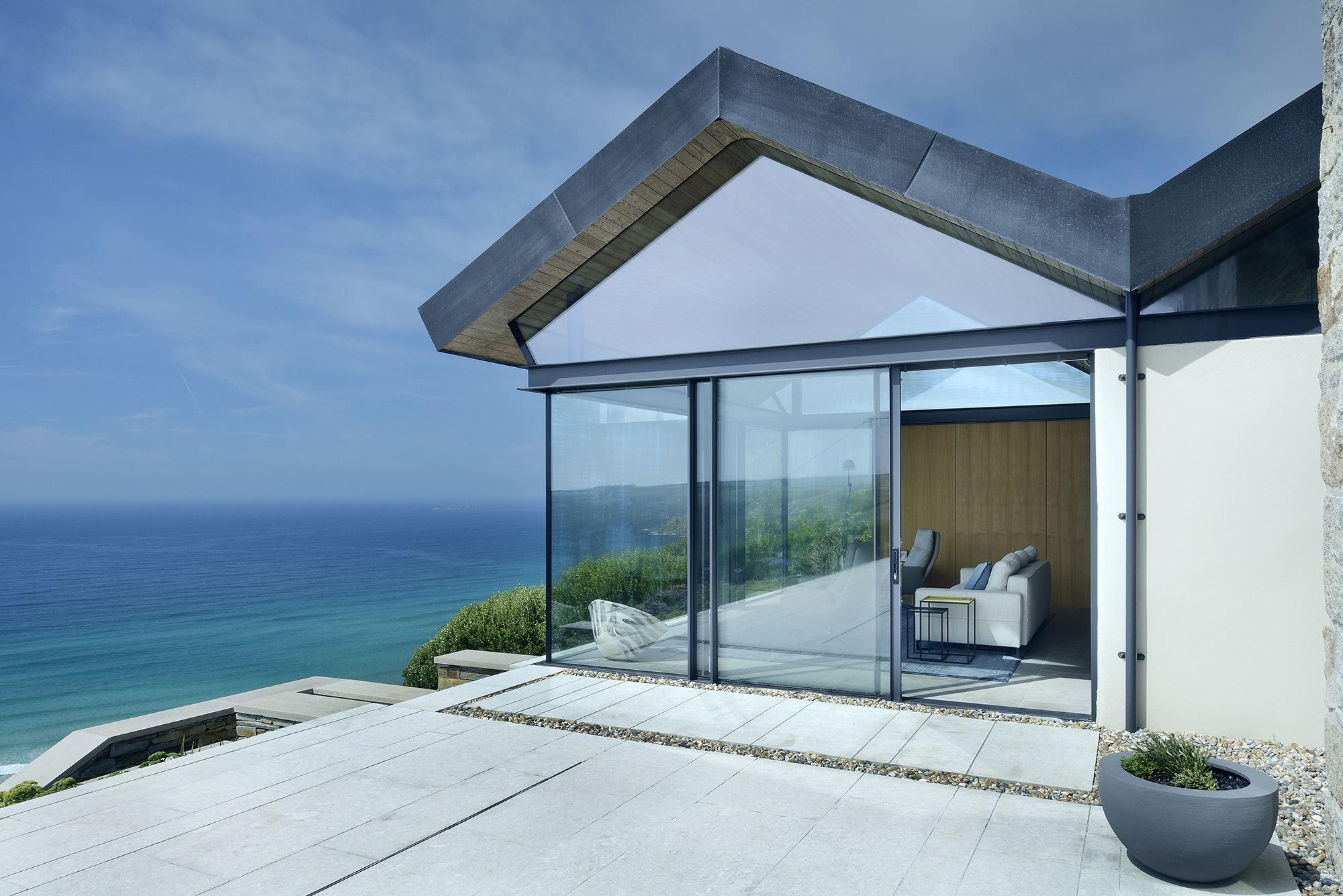
“We wanted to create a cottage extension that was modern but that fitted in with the existing house — and we wanted to walk in through the front door and be faced with sea views,” says Paul.
“Faced with these panoramic, unobstructed views and this amazing dynamic vista, the natural inclination was to make the glass extension very lightweight, but the initial schemes didn’t quite hit the nail on the head,” remembers Stan.
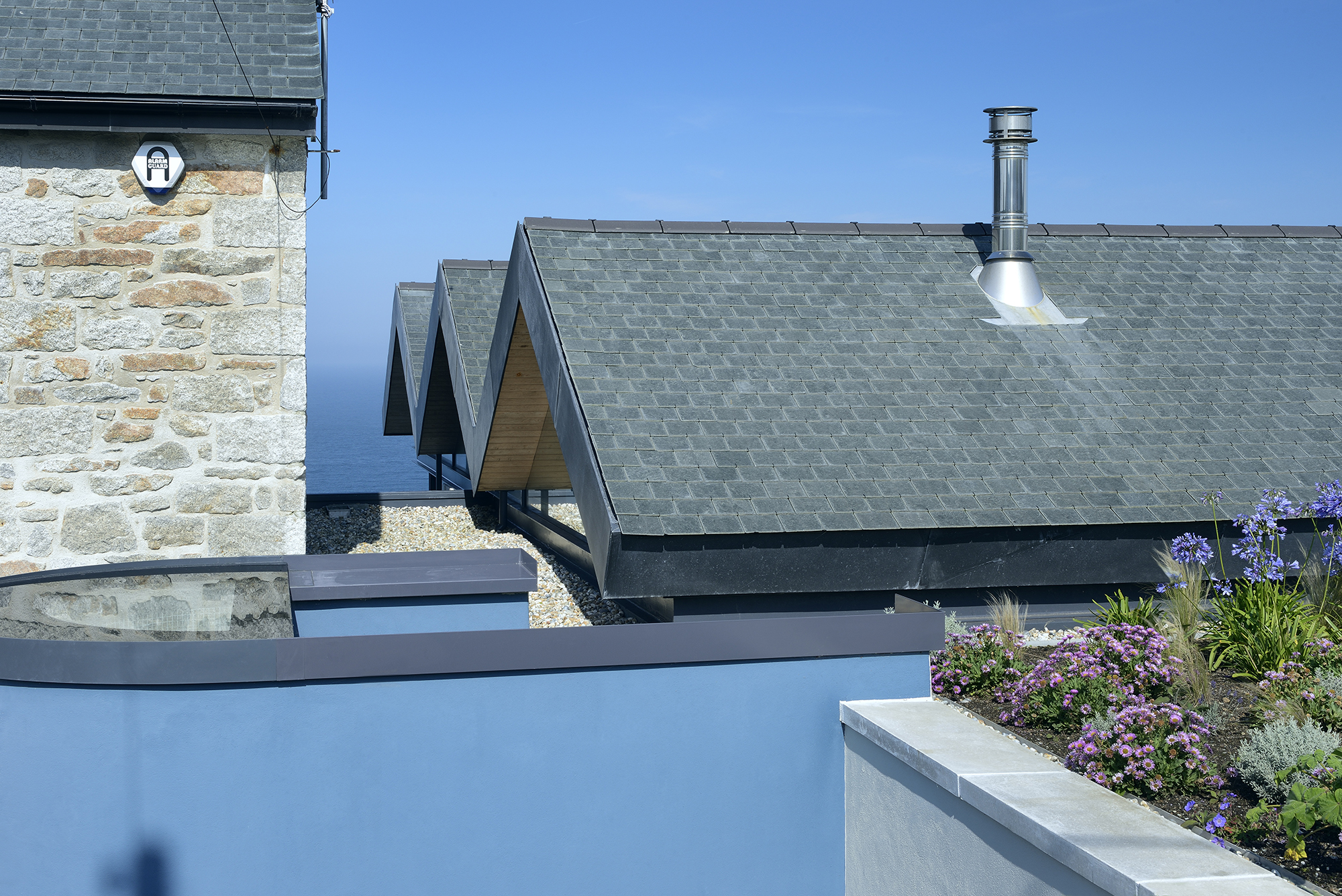
“So we came up with the idea of the three pitched roofs; a ‘saw-toothed’ design. It was a step back to something more vernacular and referenced the existing building through the pitches and slate covering — tying them together."
3. Balancing old and new
“The design of the existing house is very introverted. With massive blocks and relatively small windows — it deals with the outside spaces as hostile and something to be protected from,” explains Stan.
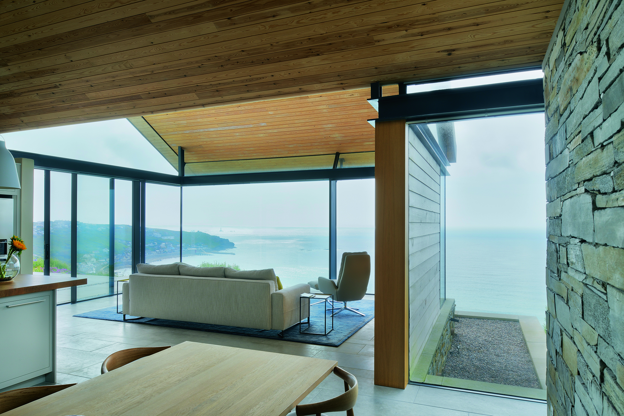
“We wanted the extension to do the opposite — to be an extrovert, open-plan kitchen and living space that eroded the distinction between the inside and out. We also wanted the extension to be subservient to the existing house, which is cubic and dominant and very proud.
“Despite their differences, the two buildings share a language and enter into a dialogue,” says Stan. “And the fully glazed gables of the three-pitched sections of the roof look out at the original building — it is always in your frame of vision from the inside.”
4. Designing a cutting-edge roof
The distinctive three-pitched roof, with its fully glazed gables, is supported by a continuous exposed ring beam, and appears to levitate above the single-storey extension.
“The ring beam is a ring of steel formed from inner and outer steel channels,” explains Stan. “It is welded as one continuous piece and is propped up on the masonry where it meets the walls, or on steel columns where it meets the full-height glazing — all the walls and glazing goes up to the underside of it.
"Between the two steels is a void to take the heads of the sliding doors and the fixed glazing so that no frames are visible. The glazing for the gables also runs into these voids, leaving a very crisp, clean visual line.”
5. Creating warm interiors
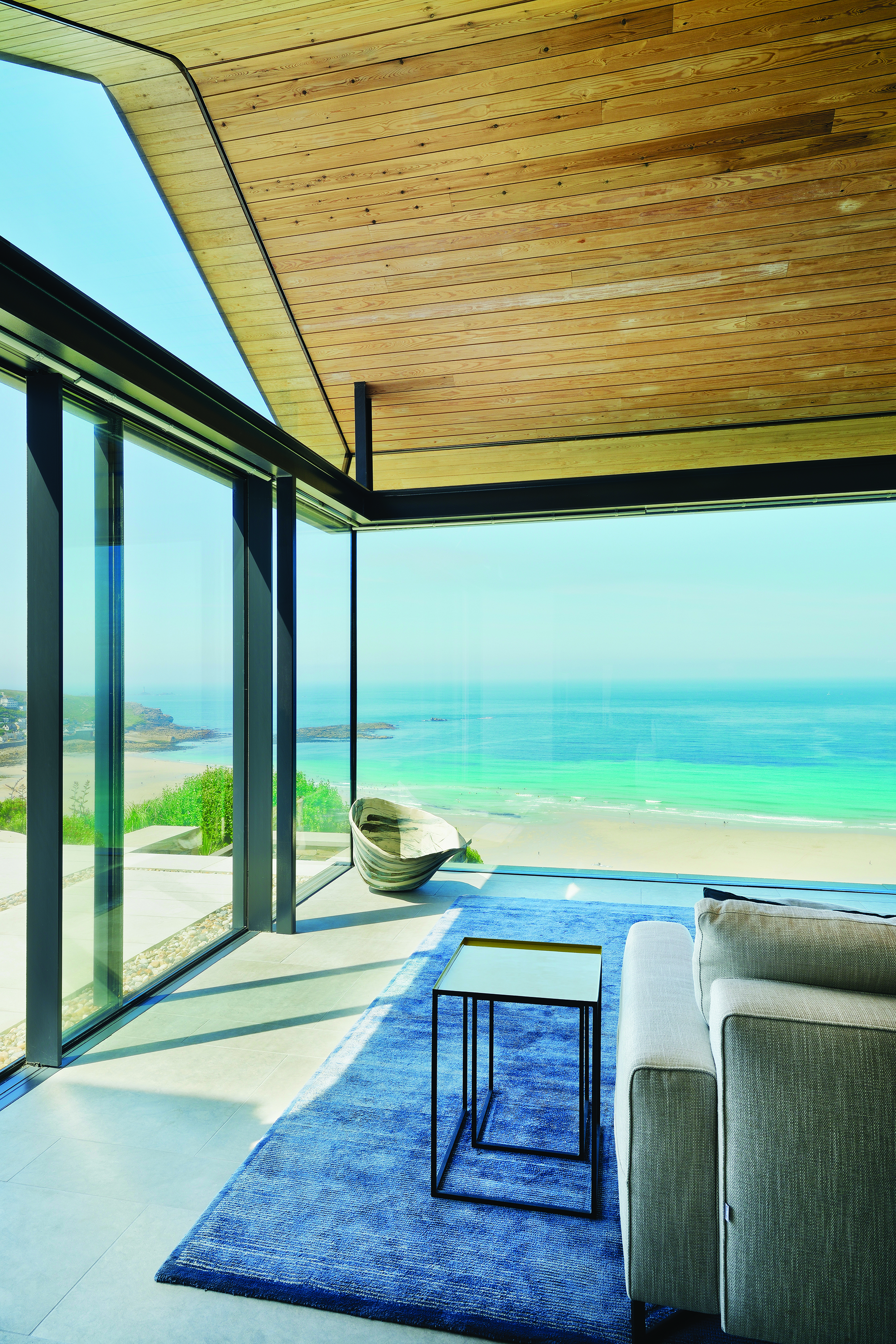
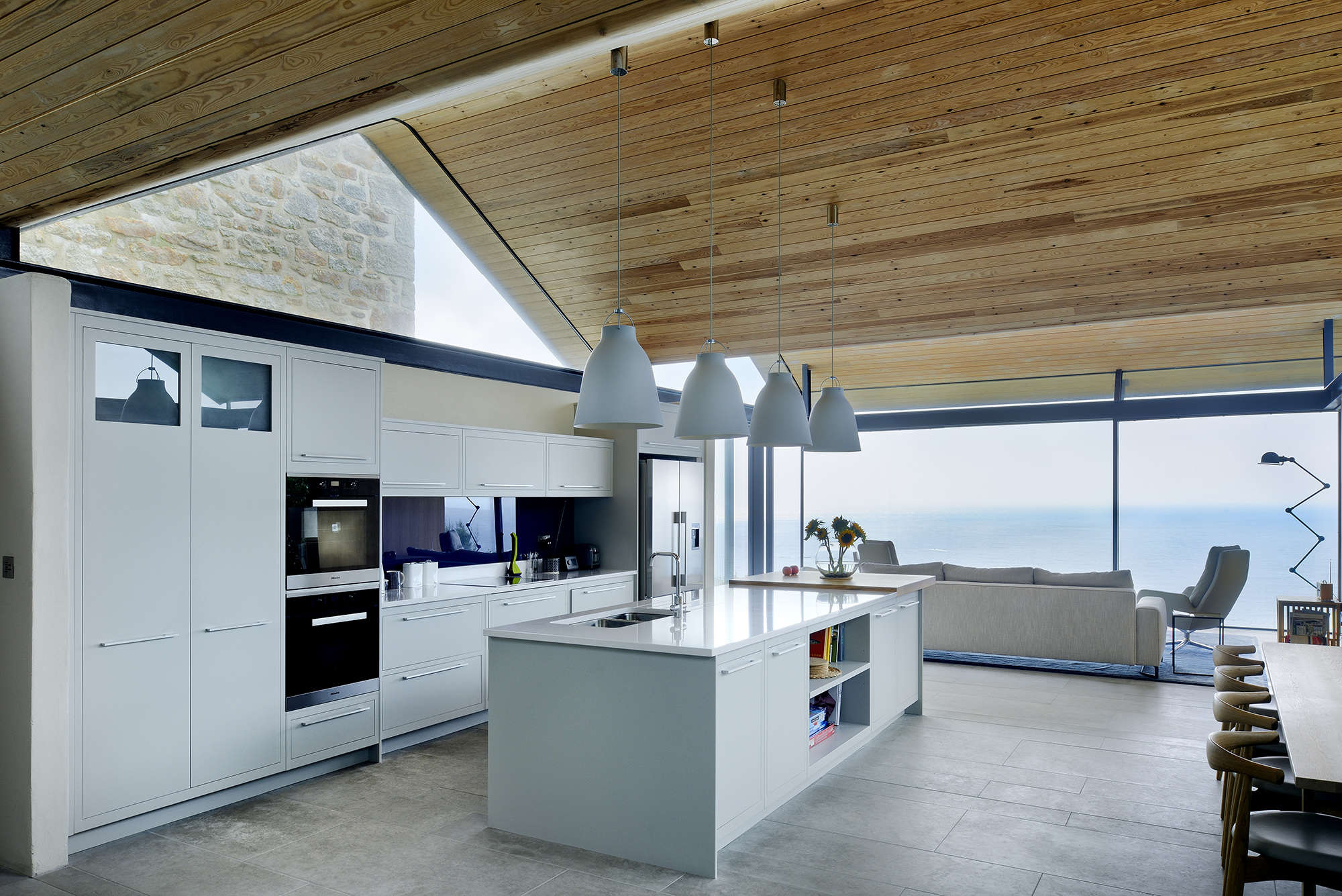
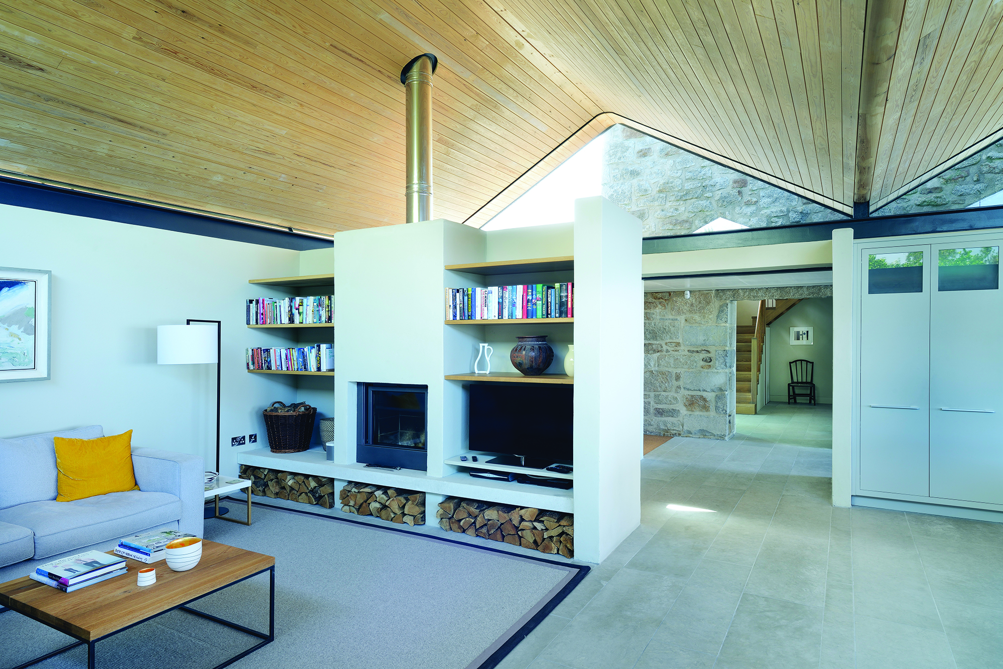
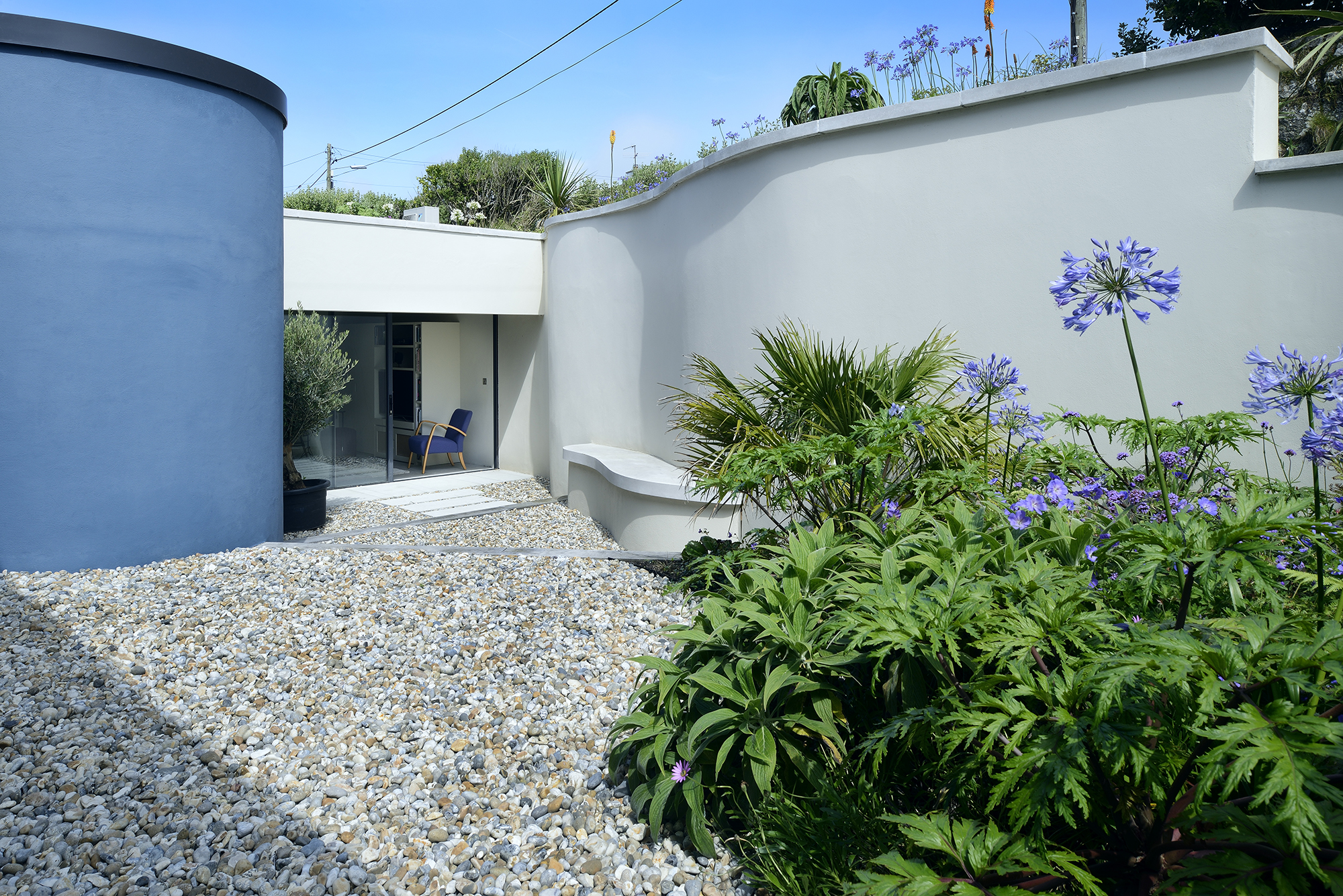
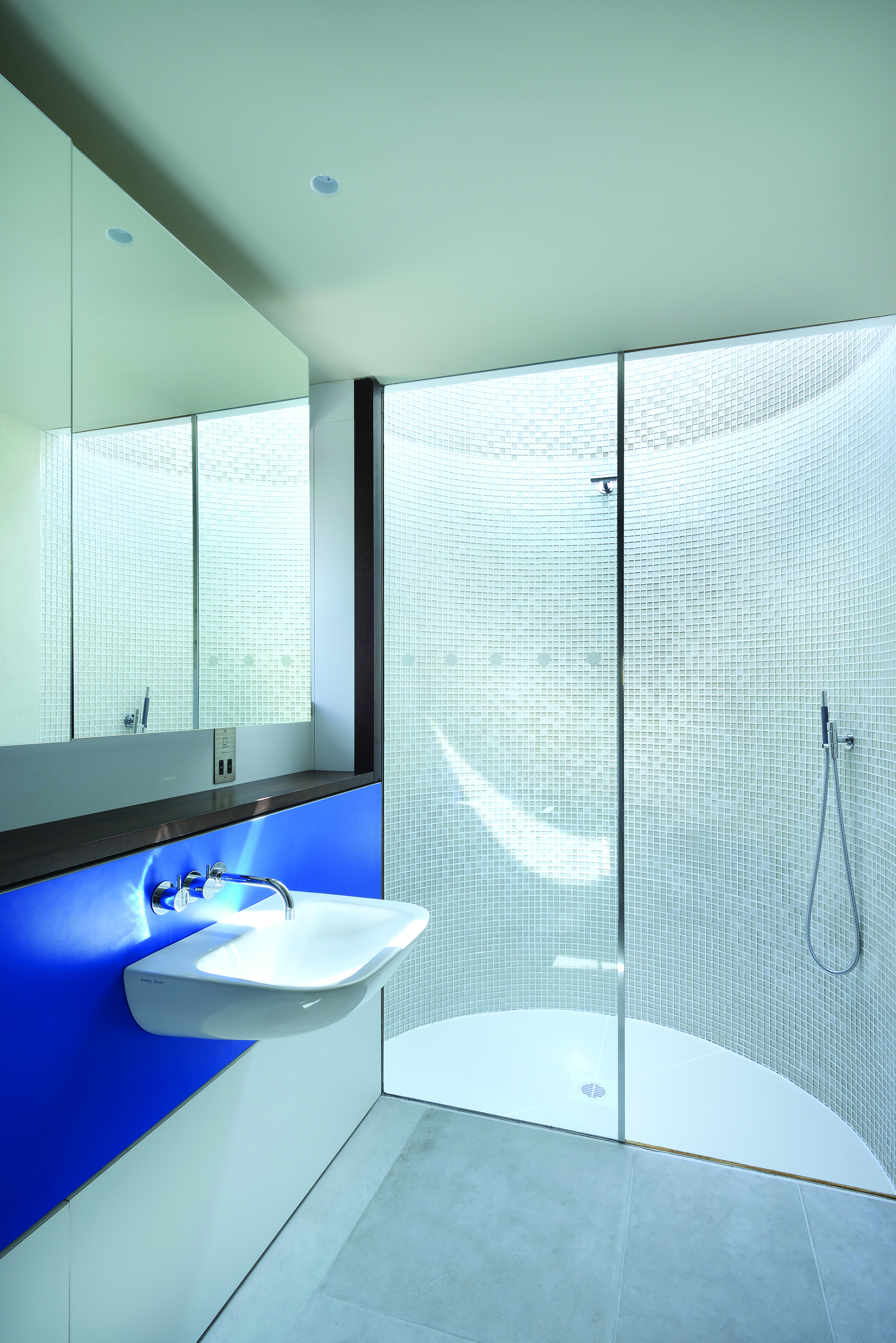
Internally, the triple vaulted ceiling extension has been clad in European redwood, curved at the eaves and ridges to reference the rolling waves. The pitches also add definition to the open-plan layout of the extension, which includes living spaces, kitchen/diner and, accessed down several steps is the plant and utility spaces, along with a shower room within the entrance rotunda, lit by a glazed ceiling.
“The spaces were designed to get more extrovert as you move towards the sea,” says Stan. “And more introvert the further away you get — you can move in and out, a bit like the tide.”
These new spaces all look out to sea through an expansive swathe of full-height fixed and sliding glazing that wraps around the rear elevation, with a selection of terraces set over varying levels, all either sheltering or embracing the elements.
“We have a saying in the office: visual simplicity equates to constructional complexity,” concludes architect Stan. “If any house exemplifies this maxim, it must surely be this one.”
“The house works brilliantly,” adds Paul. “It is a fabulous house — just wonderful.”
Get the Homebuilding & Renovating Newsletter
Bring your dream home to life with expert advice, how to guides and design inspiration. Sign up for our newsletter and get two free tickets to a Homebuilding & Renovating Show near you.
Natasha was Homebuilding & Renovating’s Associate Content Editor and was a member of the Homebuilding team for over two decades. In her role on Homebuilding & Renovating she imparted her knowledge on a wide range of renovation topics, from window condensation to renovating bathrooms, to removing walls and adding an extension. She continues to write for Homebuilding on these topics, and more. An experienced journalist and renovation expert, she also writes for a number of other homes titles, including Homes & Gardens and Ideal Homes. Over the years Natasha has renovated and carried out a side extension to a Victorian terrace. She is currently living in the rural Edwardian cottage she renovated and extended on a largely DIY basis, living on site for the duration of the project.

