6 Ways Glazing Frames the View in This Amazing Rural Home
Large swathes of glazing used in this self build let the gorgeous countryside take centre stage — find out how it informed the design
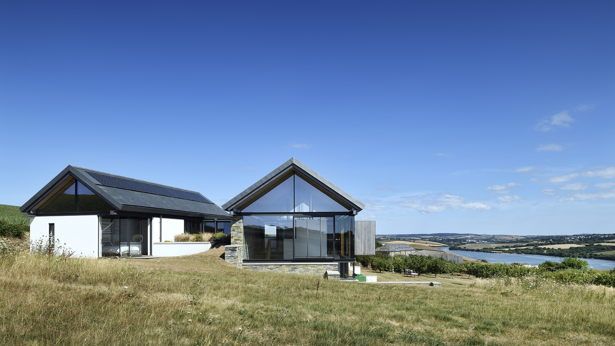
Tim and Suzy Powell had been regular visitors to Cornwall for some time before they put bought a dated bungalow with outline planning permission for a new dwelling in the area.
The bungalow stood some 200 yards away from the adjoining working farm it once belonged to, with the site gently sloping away to the south and affording panoramic views. After living in the bungalow for a year, before hiring architect Stan Bolt to create a new design for a replacement self build.
“We knew the size of the house we wanted and the feeling we wanted to create. We wanted a house that would be big enough for the whole family but intimate enough for just the two of us,” says Tim. “We were also keen on using plenty of natural building materials and glass, as well as a design that would be sensitive to the farm buildings next door. Beyond that we just said to Stan, ‘over to you!’"
The resulting design not only meets the couple's requirements for a flexible, futureproof home, but frames the amazing views on offer. Here's six interesting ways they have introduced glazing to maximise effect, and what you can learn.
1. They Introduced Glazed Gables and a Floating Roof
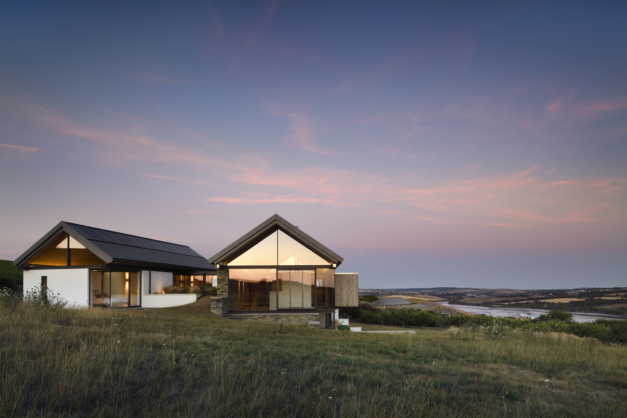
“Stan came to us with the idea of these two ‘units’ connected by a floating roof,” says Tim. “It wasn’t what we expected — but we loved it.”
The north, single-storey wing is just visible from the road where it nestles inconspicuously into its rural site, with the two visible fully glazed gables giving a hint to what might lie within.
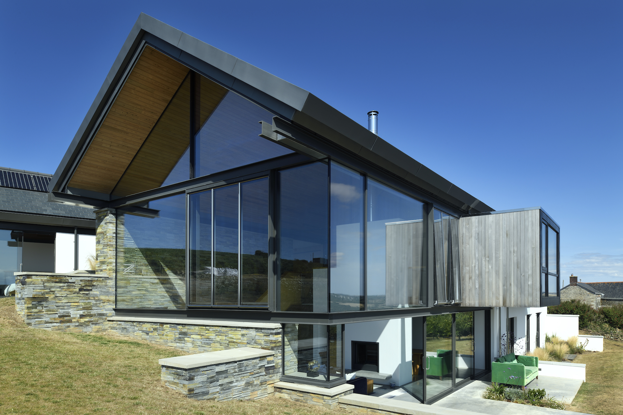
“The roofs are conceived as folded plains forming umbrella structures which marry together all the open spaces and more introvert ‘boxes’ that form the house,” explains Stan, founder of Stan Bolt Architects.
“The roofs sit on a continuous, visually exposed, open steel ring beam (like a picture window frame laid horizontally) which, in tandem with frameless fully glazed gables and internal screens within the roof space, give the appearance of ‘floating’ and complete transparency throughout the lengths of the buildings.
“The overall impression is that the house comprises simply an enclosed portion of the external environment — a real erosion of the distinction between inside and out allowing the surrounding vistas to be enjoyed in their entirety and each space to be bursting with natural light," says Stan.
2. Walk-on Glazing Brings Light into the Heart of the House
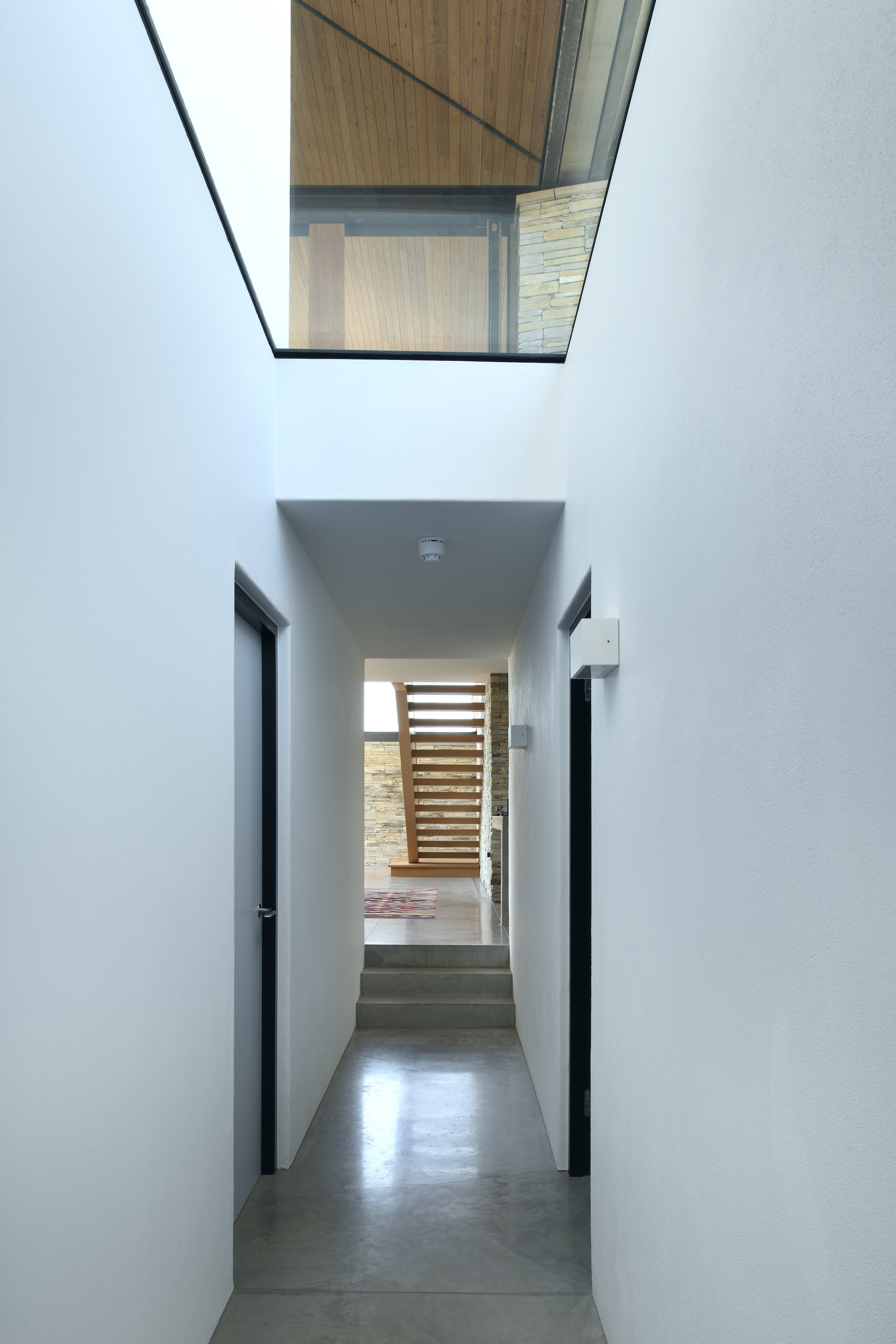
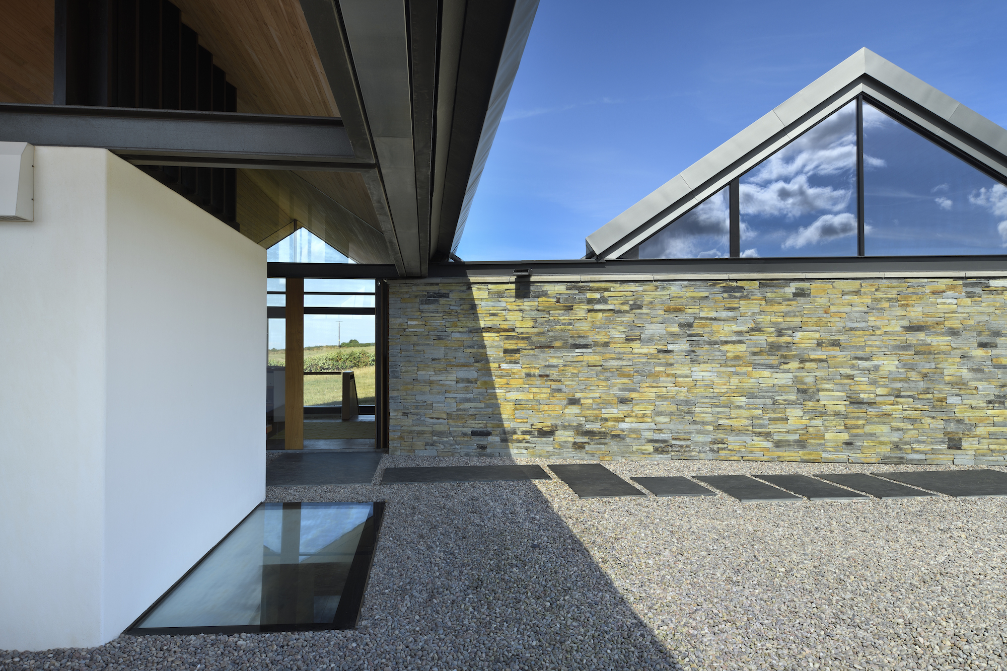
Everything about the house has been designed to embrace its rural, coastal setting, from the expanses of wraparound glazing with overhanging gables that shield it from the elements, to the double-height internal spaces and glazed walkways that ensure views and natural light are taken full advantage of.
Glazing has also been used to clever effect to bring natural light into spaces deep within the floorplan. For instance, a glazed walk-on panel not only pulls light down into the corridor leading to the lower ground floor bedrooms, but also allows artificial light to illuminate the porch at night.
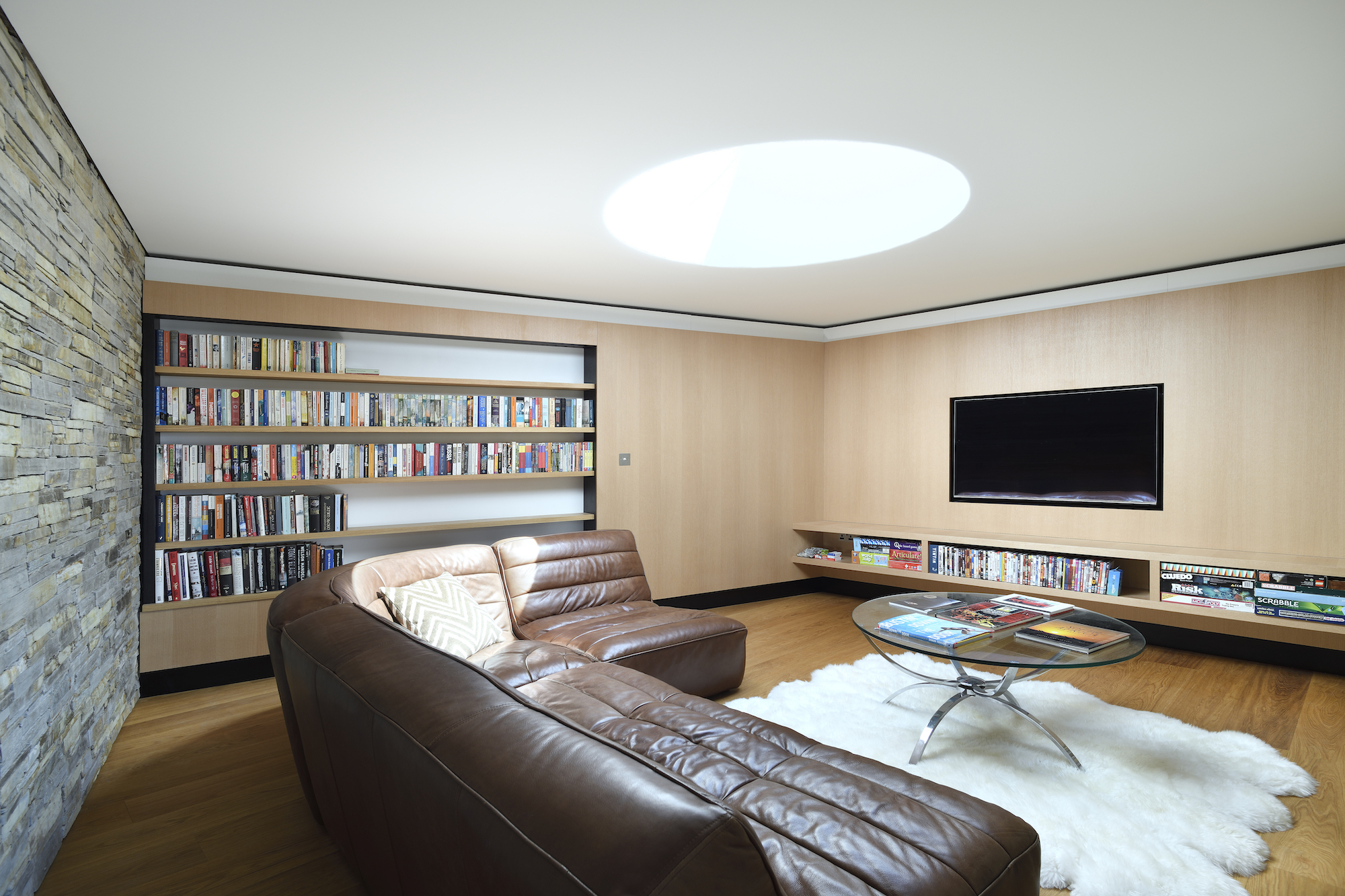
Private spaces, such as the snug, only give away its existence through a circular rooflight nestling within the green roof that covers it.
“The snug is my favourite space,” says Tim. “It is completely different to the open-plan areas of the house and, as its name suggests, feels very snug.”
3. Glass Balustrades Are a Clever Touch

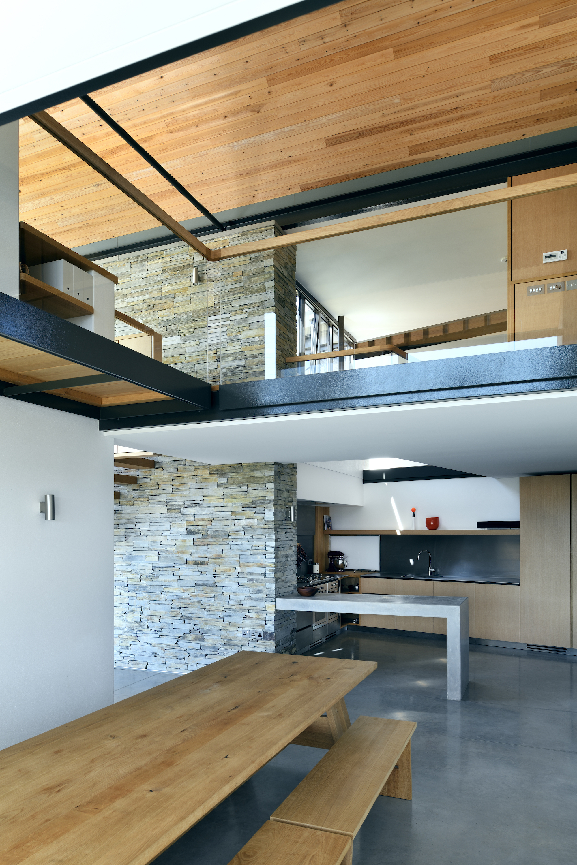
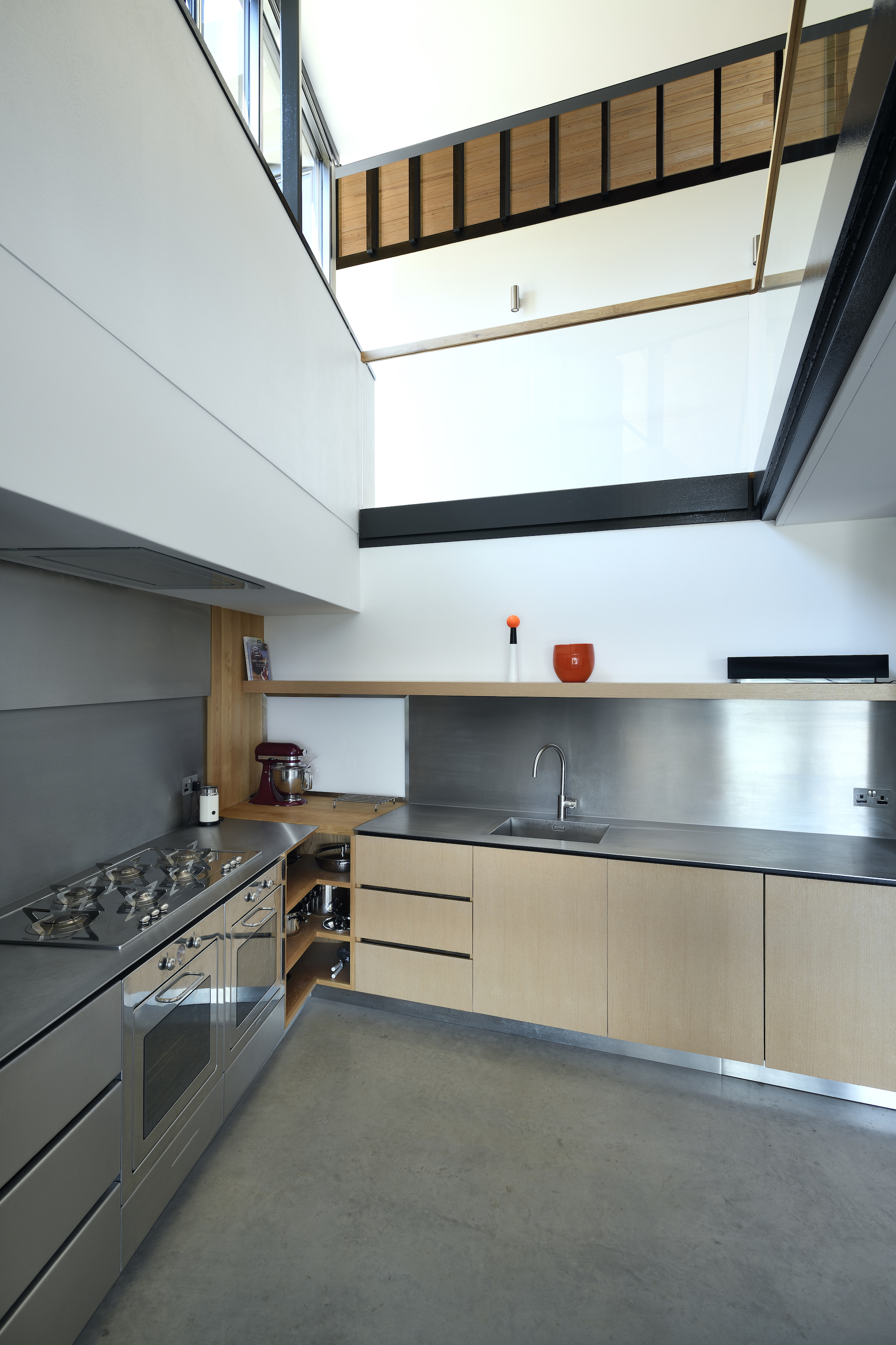
On the lower ground floor of the south wing are the ‘public’ spaces, such as the living and dining spaces, along with the double-height kitchen, overlooked by a gallery from the floor above.
Combining a glass balustrade with a more practical timber handrail is a great landing idea. The glass balustrade allows uninterrupted views from the gallery and more natural light to reach the areas below.
What's more, it offers guests below a view of the different textures and materials on offer in the double-height spaces. The whole house feels unified as a result.
4. A Through-View From the Front Door Greets Guests
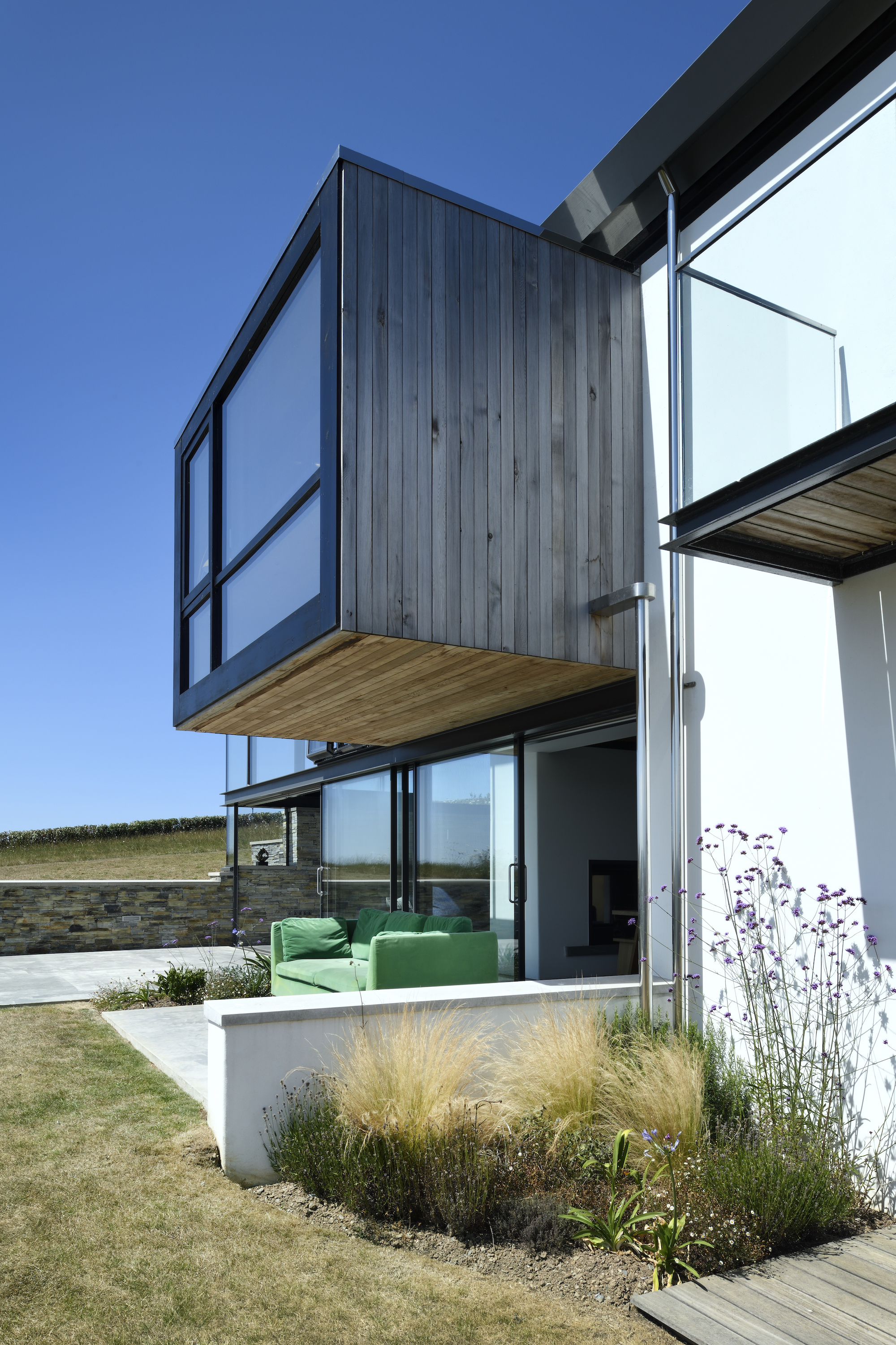
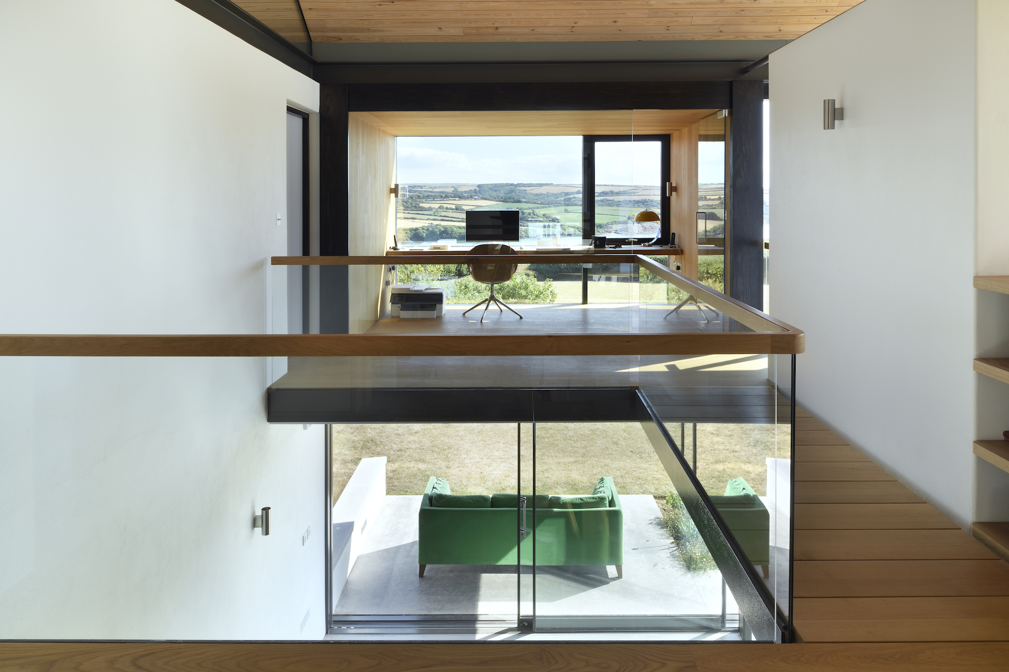
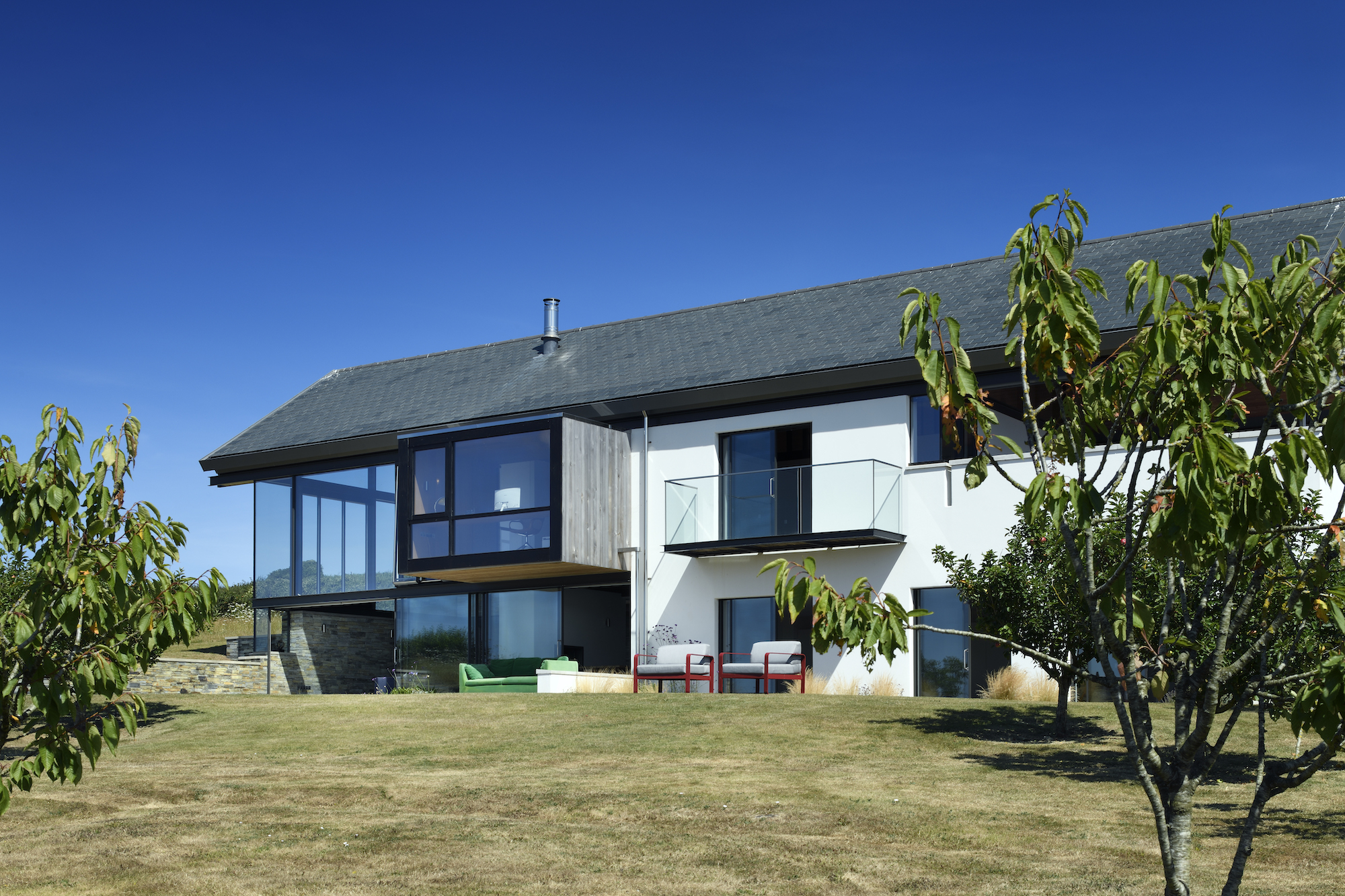
For anyone looking for house design ideas and inspiration, look no further as Tim and Suzy's striking cantilevered bay window.
On entering the house, visitors are greeted by through-views out of the study in the projecting bay which houses the home office design. Tim describes the views a 'distracting'.
Also on the upper ground floor of the two wings lies the entrance hall, utility, a guest bedroom with en suite.
5. They're Created the Ultimate Inside-Outside Experience
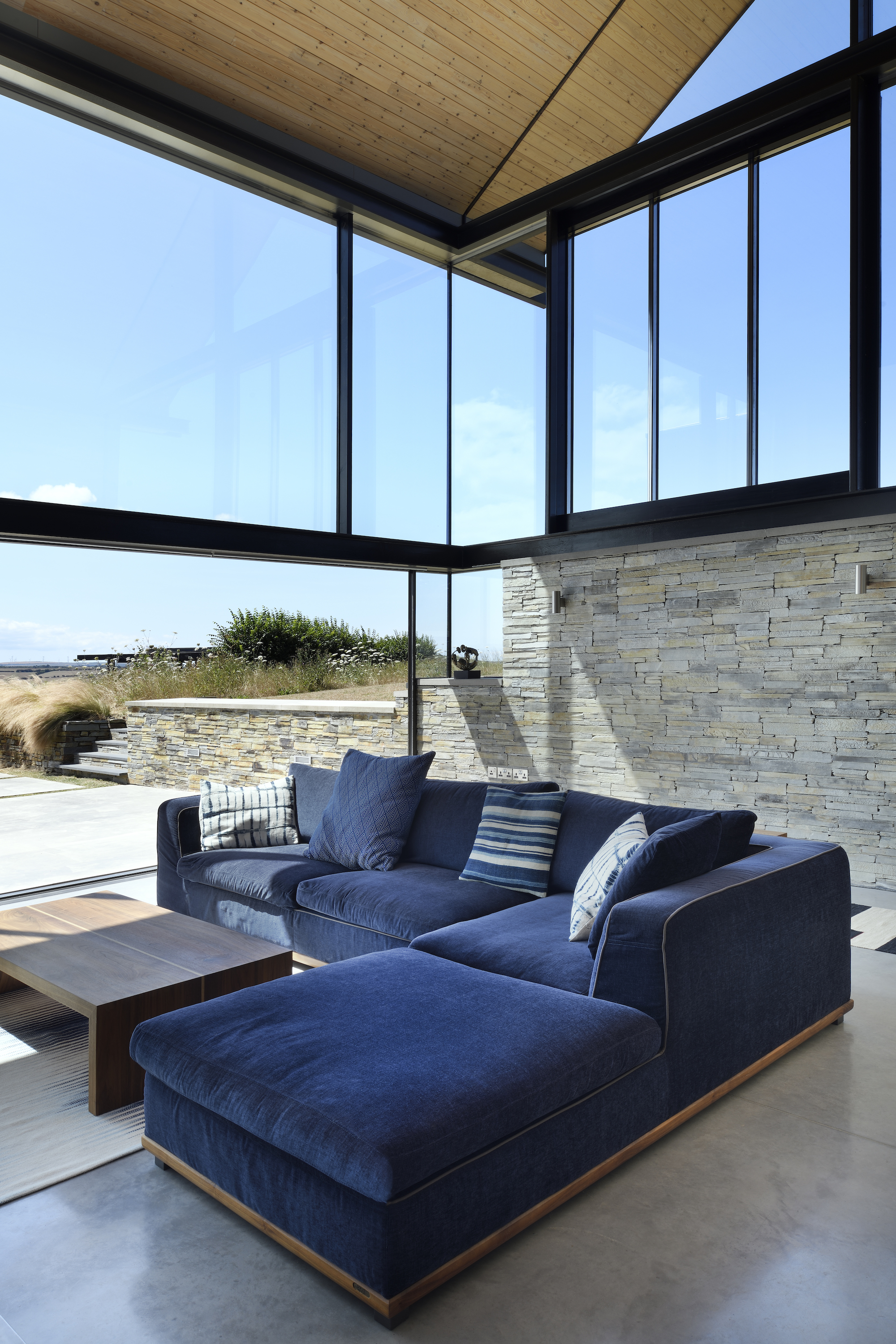
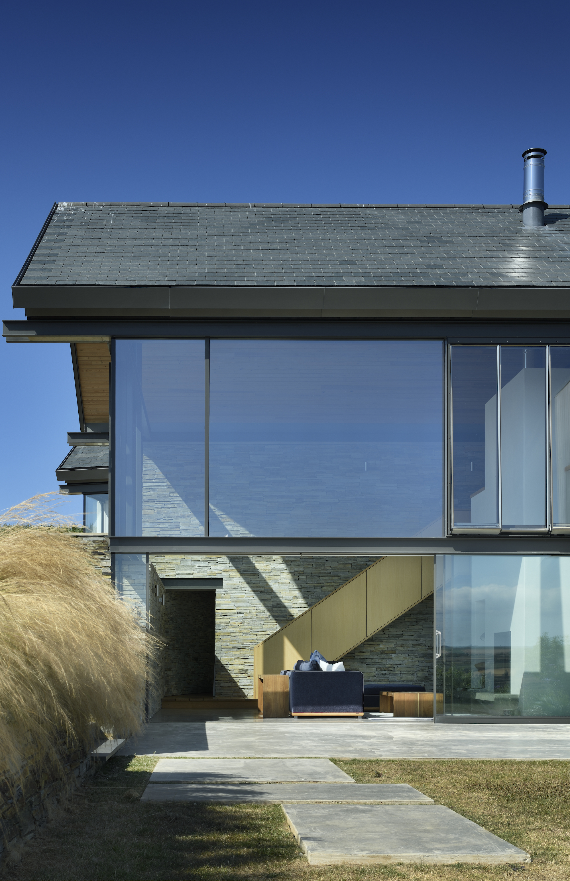
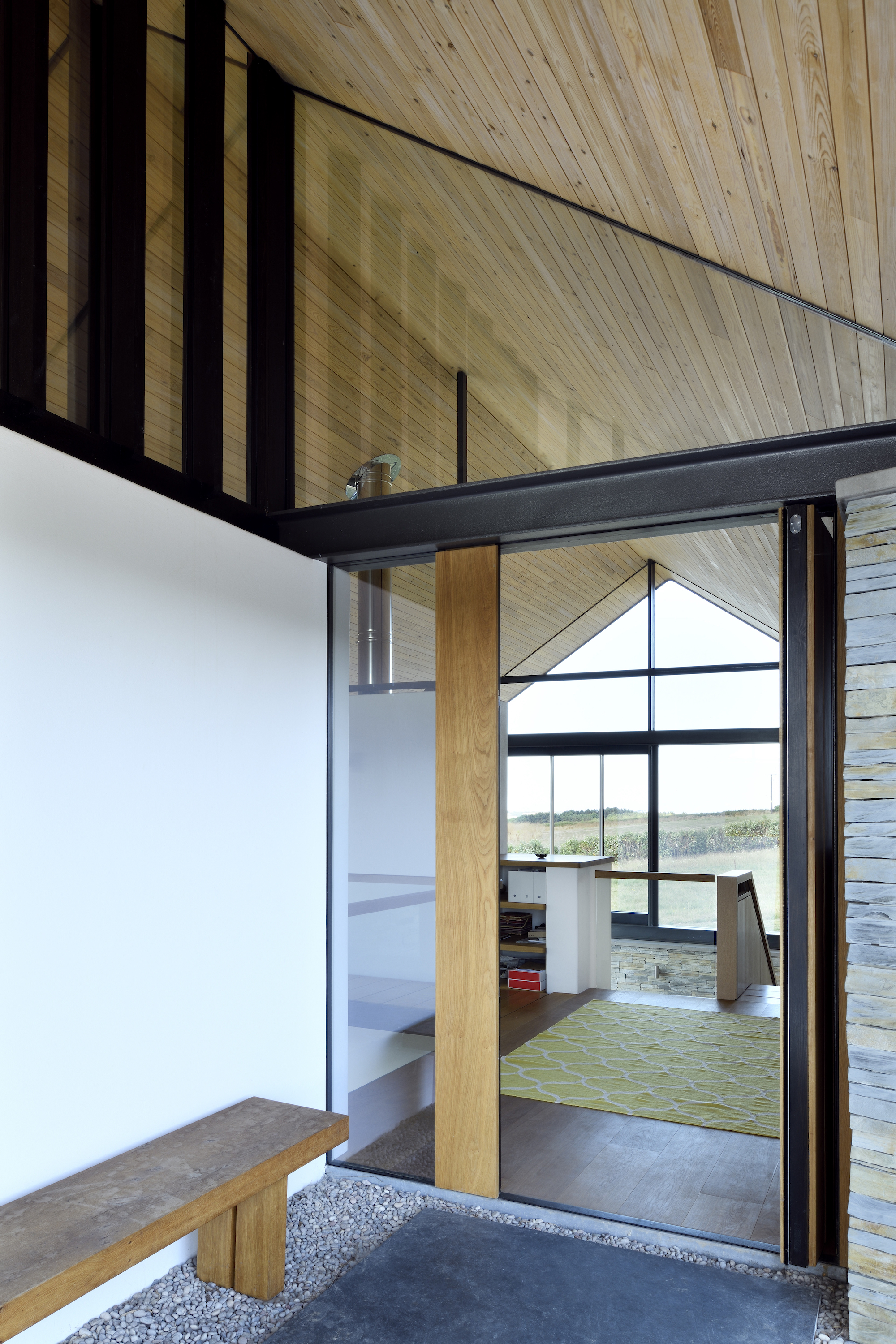
The house is made up of a combination of horizontally and vertically open spaces, such as the soaring living space that spills out to the rear terrace through an expanse of glazing.
Internally the house has a simple backdrop of raw natural materials, including European redwood-clad ceilings, and polished concrete floors.
“The Cornish slate wall that runs along to the west side of the entrance courtyard comes in through the front door, into the hallway and then becomes a wall that spans two storeys as you descend the staircase into the double-height living space, before finally leading you out on to the terrace to the rear,” says Stan. “It is like this tendril that runs through and out of the building."
6. Strategically Placed Glazing Means Even the Bedrooms Have Amazing Views
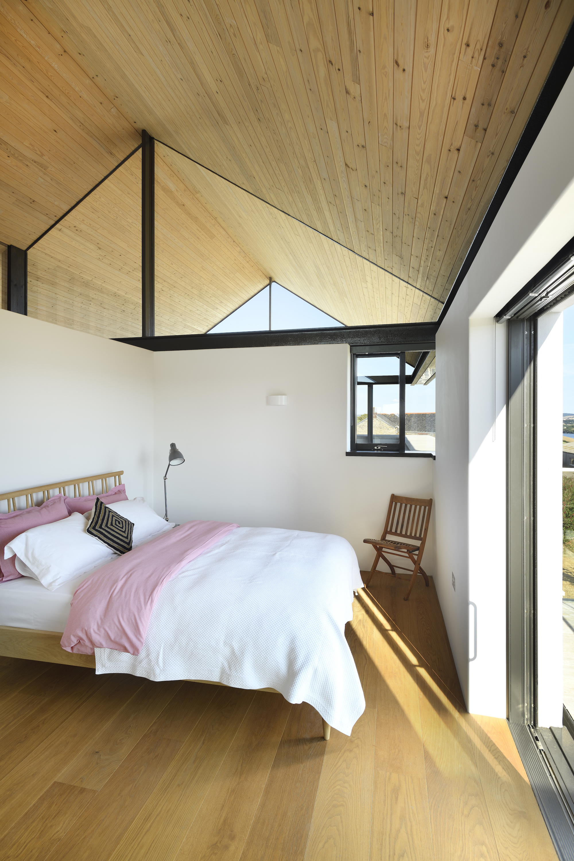
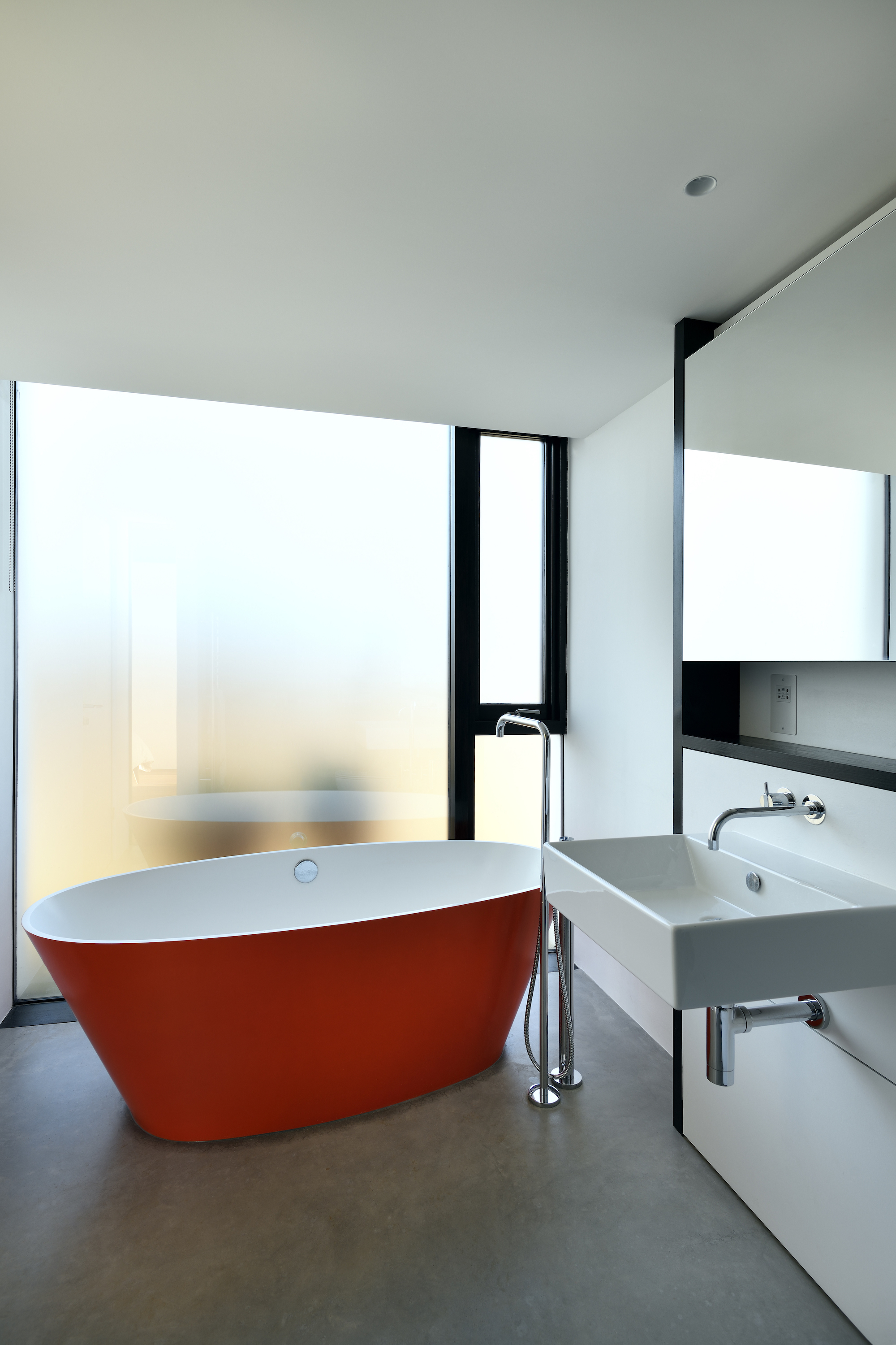
“Three bedrooms are accommodated on the lower ground floor of the southern wing,” explains Stan. “Each with access to terraces.”
Not only do the bedrooms have an amazing views, thanks to large sliding doors, but glazed gables bring natural light flooding into the bedrooms.
“We love it here — the house just works so incredibly well,” says Tim. “We continually have these ‘wow’ moments. It makes the very most of its exposed setting. Ordinarily you could feel a bit miserable on a stormy grey day, but not here — the dramatic landscape is just another part of the house.”
Get the Homebuilding & Renovating Newsletter
Bring your dream home to life with expert advice, how to guides and design inspiration. Sign up for our newsletter and get two free tickets to a Homebuilding & Renovating Show near you.
Amy is an interiors and renovation journalist. She is the former Assistant Editor of Homebuilding & Renovating, where she worked between 2018 and 2023. She has also been an editor for Independent Advisor, where she looked after homes content, including topics such as solar panels.
She has an interest in sustainable building methods and always has her eye on the latest design ideas. Amy has also interviewed countless self builders, renovators and extenders about their experiences.
She has renovated a mid-century home, together with her partner, on a DIY basis, undertaking tasks from fitting a kitchen to laying flooring. She is currently embarking on an energy-efficient overhaul of a 1800s cottage in Somerset.

